
Hijacking the R Visual
Power BI comes stocked with a great set of visuals that keep getting better (more options to do multiples, please)
Power BI comes stocked with a great set of visuals that keep getting better (more options to do multiples, please)

Five years on from my life-changing encounter with PowerPivot, my pilgrimage to the Nirvana of Modern Excel continues with some occasional detours.

It’s time again for the March Madness tournament and another excellent opportunity to introduce/teach people at your company/organization about Power BI.

When working with clients or students, I like to challenge them with this seemingly-controversial statement: Informing people is worthless.

Greetings P3 Adaptive Nation! I’m here today to talk about maps, maps, globes, charts, topographical representations, and…well frankly I’m out of map synonyms. However there’s at least twice as many […]
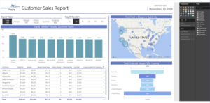
I’d like to drop some reporting knowledge. I’m going to share some of my best practices for Power BI Reporting I’ve developed over the years

By Avi Singh [Twitter] If you want to look for trends based on weekday (Sunday…Saturday) or month-of-the-year seasonality (January…December), Cycle Plots can be a potent visualization tool.