By Avi Singh [Twitter]
If you want to look for trends based on weekday (Sunday…Saturday) or month-of-the-year seasonality (January…December), Cycle Plots can be a potent visualization tool. Some clever folks thought of this back in 1978, but my education on cycle plots has been from Naomi Robbins’ excellent paper. This question was asked during one of our Q&A sessions for the Online Class. In this post I’ll discuss the Cycle Plot and then we would build it step by step using Power Pivot. Here is the end result we will achieve (animated gif):

Cycle Plot showing Weekday values for each Week Number and the Average. A slicer also lets the user select the weekday chart should start at
Cycle Plot showing Weekday values for each Week Number and the Average. A slicer also lets the user select the weekday chart should start at
Looking for Periodic Trends
We’ll use sample data showing eight weeks worth of web traffic and we are looking for trends based on the weekday (Sunday…Saturday).
Try 1: We might plot Visitors by Weekday. While this does show the overall pattern of visitors across weekdays, we have no information of how visitor count is changing over those eight weeks.
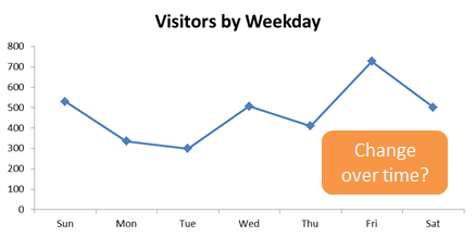
Try1: No information on how visitors trend changes over the eight weeks
Try 2: We can plot visitors by date. This shows a trend over time and the cyclical pattern is apparent. However, it is hard to track the performance of a single weekday, say Monday over the eight weeks.
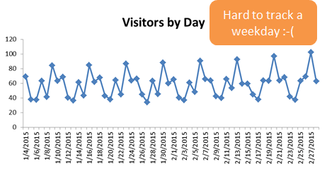
Try 2: Hard to track a single weekday (say Monday) over the eight weeks
Try 2: Hard to track a single weekday (say Monday) over the eight weeks
Try 3: We plot by weekday but add Weeknum as a series. This has a lot of information coded in the graph, but that is also the problem. Viewer is overwhelmed and it is hard to look for the patterns we want to see.
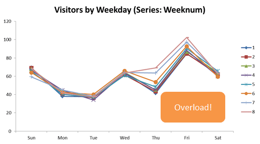
Try 3: A little too much information
Try 3: A little too much information
Cycle Plot
A Cycle Plot would show data for each weekday broken by the Weeknum. With the same data now rendered as Cycle Plot, you can see the trend for each weekday and see them in relation with other weekdays. Insights just start hitting you on the head!
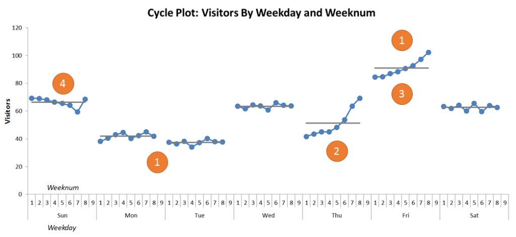
Cycle Plot: Click to enlarge, see numbered insights below
1) Friday is the peak traffic day and Mon/Tue are the low traffic days.
2) Thu shows strong growth, especially in the recent weeks
3) Fri shows steady growth
4) Sunday shows a gradual decline (except for last week) and may need closer monitoring
Building a Cycle Plot Using Power Pivot
Data Set: We will be using a very simple dataset, but the same steps would apply for a real data set. The added benefit being the “Define Once, Use Everywhere” benefit of Power Pivot.
“Define Once, Use Everywhere” with Power Pivot
Once you define the measures to build the Cycle Plot Pivot and Chart, you would be able to slice and dice it using any of the columns available in your data model. For example, if you build a cycle plot using Sales data; you can analyze it by your Product Category, Country/State (Geography), Customer attributes etc.

Sample Data Set: VisitorCount Table, Calendar Table
You can build a basic pivot by adding Weekday and Weeknum on rows as below and a very simple measure.
Visitors:=SUM(VisitorCount[VisitorCount])
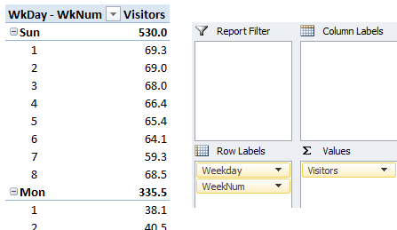
This simple pivot might do the trick for creating Cycle Plot
This simple pivot might do the trick for creating Cycle Plot
But when you insert a chart for this Pivot Table, it does not quite render the way we want it to for a Cycle Plot.
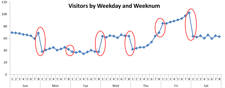
Excel joins the line across the Weekdays, totally ruining the effect of the Cycle Plot
Cycle Plot Step 1: Inserting a Gap in the Line Chart
To insert a gap, we would want to show an additional Weeknum past the data values shown, but have the “Visitors” measure be blank.
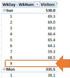
To break the line chart, we need to show an additional blank value
To break the line chart, we need to show an additional blank value
For this we will define a Dummy Measure which will return 0 for that additional Weeknum that we want to show and blank for everything else. That would be sufficient for us.
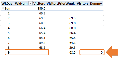
Define a dummy measure to force the additional Weeknum to show
Define a dummy measure to force the additional Weeknum to show
VisitorsPriorWeek is an intermediate measure we use to create our dummy measure (BTW, it just uses the pattern of the Greatest Formula In The World a.k.a. GFITW! Also tweaked here). Here are the measures:
VisitorsPriorWeek :=CALCULATE (
[Visitors],
FILTER (
ALL ( Calendar[WeekNum] ),
Calendar[WeekNum]
= MAX ( Calendar[WeekNum] ) – 1
)
)
Visitors_Dummy :=IF (
ISBLANK ( [Visitors] )
&& NOT ( ISBLANK ( [VisitorsPriorWeek] ) ),
0,
BLANK ()
)
We clean up our pivot and change the options for the “Dummy” Series on the Chart so as to hide it completely from the display.
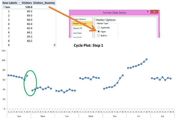
Hide the Dummy Measure from Display and we have a clean start towards Cycle Plot
Cycle Plot Step 2: Showing the Average Line
You might have noticed on the cycle plot image we showed at the top that it also shows a line indicating the average Visitor count for that particular weekday. We will add that line using the measure below.
AvgVisitorsAllWeeks:=IF(NOT(ISBLANK([Visitors]))
, CALCULATE (
AVERAGEX ( VALUES ( Calendar[WeekNum] ), [Visitors] ),
ALL ( Calendar[WeekNum] )
)
)
AVERAGEX being an iterator, we are essentially instructing it to go through all the Calendar Weeks and average the [Visitors] count across them all. Here is the result:
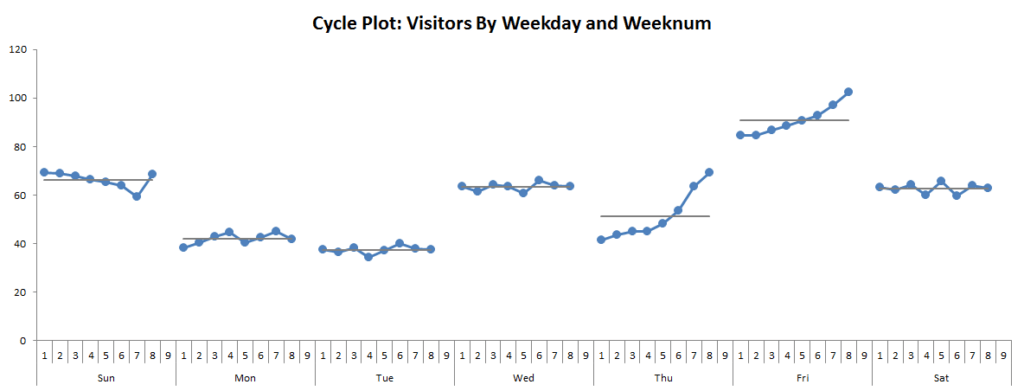
Cycle Plot now showing the average line (click to enlarge)
Cycle Plot Step 3: Rotating the Chart to Start at a User Selected Weekday
Naomi Robbins’ paper said the following was a “nice-to-have”
“It is sometimes useful to rotate the subseries in a cycle plot; that is, to start the subseries at a value other than January for months or Monday for days. If your main interest is in peaks in the months December through February, then it would be better to begin around July so the months of interest appear together in the center of the figure.”
Well, I just had to build that into our model 🙂
In the animated GIF below you can see that user can select any weekday and the Chart adjusts to “start” at the user selected weekday.
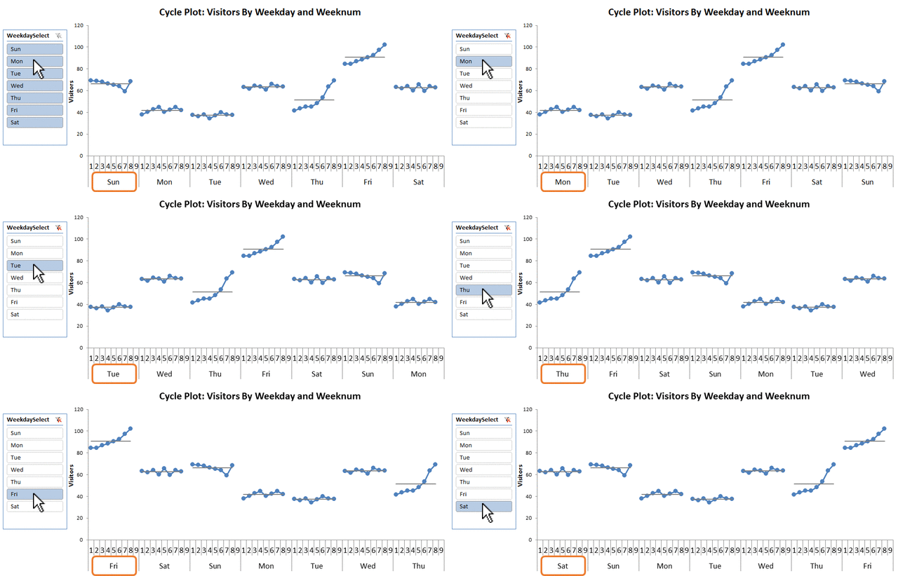
Our slicer lets the user select the weekday chart should start at
Our slicer lets the user select the weekday chart should start at
This post is running a bit long, so I will point out that this technique is based on “Disconnected Slicers – Part 4” Module in our Online University. Our existing students can review the module for more explanation on this technique.

Using Slicers to change sort order in Pivot? Heck yeah!
Others can download and examine the file using the links below.
Cycle Plots.xlsx
Power On!
-Avi Singh
Get in touch with a P3 team member