Post by Rob Collie

Can Excel Pros Make the Jump?
For 5+ years, Excel was the ONLY “place” where we could get our hands on the awesome power of the DAX engine (aka Power Pivot) and the M engine (aka Power Query).
It wasn’t until recently that we were given ANOTHER place, in the form of Power BI Desktop, where we could use those incredible analytical engines.
And even today, Excel remains REMAINS the best STARTING place for the world’s tens of millions of Excel Pros (who I have long defined as “anyone who uses PivotTables, VLOOKUPS, and/or SUMIF multiple times per week.”) We’ve seen this over and over again, both with other tools like Tableau and now with the new Power BI: these Excel folks are quite wary of new tools, leading to widespread poor adoption.
So, given that there’s a sizeable number of humans using the Excel version of these tools, and that the Excel version is by far the best “on ramp” to the new languages of DAX and M, it’s a natural question…
…how hard is it to pick up Power BI Desktop if you are already competent with Power Pivot? (and perhaps also with Power Query?)
But First… WHY Make the Jump at All? SHOULD We?
I am 100% sympathetic to the Excel Pro stance of resisting new tools. Ich bin ein Excel Pro myself, as I’ve said before, and in the early days of Power BI Desktop’s existence, I kept it at arm’s length.
New tools are “scary” to me when my existing tools WORK, and work well. Most people aren’t all that fond of technology, and don’t get excited about a new tool just because it’s new and shiny. That’s true for me, too, even though I worked at Microsoft for 13+ years. (But at Microsoft, I was generally the exception – most of my colleagues voraciously devoured new tech).
As long as my existing tools work well, a new tool generally comes along to serve someone ELSE’s agenda, not mine. The software vendor’s agenda. IT’s agenda. Not my agenda.
And the Excel-based version of Power BI (aka Power Pivot, with its newer sidekick Power Query) has worked VERY WELL – for me personally, for my colleagues here at P3 Adaptive , and most importantly, for our many clients.
So why even LOOK at the new Power BI Desktop? There are 3 primary reasons:
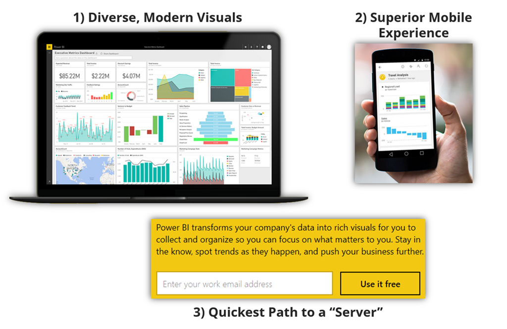
The Three Main Reasons Why Excel Power Pivot Users Benefit from Power BI
- Diverse Modern Visuals: Power BI offers a wider variety of charts than Excel – an ever-growing list in fact. Furthermore, these visuals don’t have a 30-year history to them, so they feel “more modern” than Excel, even though Excel has made significant strides in that department lately. And multi-interactive “dashboards” where clicking any one element filters the other elements are simple in Power BI versus “requires a lot of elbow grease” in Excel.
- Superior Mobile Experience – yes, Excel has also made great strides here, but fundamentally, Excel (and Web Excel) are PC-oriented applications, and don’t “translate” all that well to mobile devices. Power BI has purpose-built apps for displaying dashboards on specific devices. The people who consume you work will love this. It’s a monster sales pitch for how valuable YOU are.
- Quickest path to a “server” – in the past, publishing your work to the web (and mobile devices) required an expensive and complicated SharePoint install. For those of us who are cloud-friendly, we can be up and running with a free (yet fully functional) Power BI publishing site in mere minutes. In many cases, you don’t even really need to tell IT you’re doing it. Heh heh.
So How “Learnable” is Power BI Desktop for Excel Power Pivot Folks?
Enough of the “Why,” let’s talk about the “How.” If you’re already familiar with the Excel-based Power Pivot/Power Query world, how “foreign” is Power BI Desktop?
I’ve been waiting awhile to perform this analysis even for myself. But the latest public version of Power BI desktop added a few critical missing pieces, and it’s go time.
Download, Install, and Launch: Simple
- Download from here
- Run the installer (the MSI file)
- Launch Power BI Desktop from the Desktop/Start Menu
OK, it’s a Ribbon-Based App. We Understand Those.
A lot like Excel…
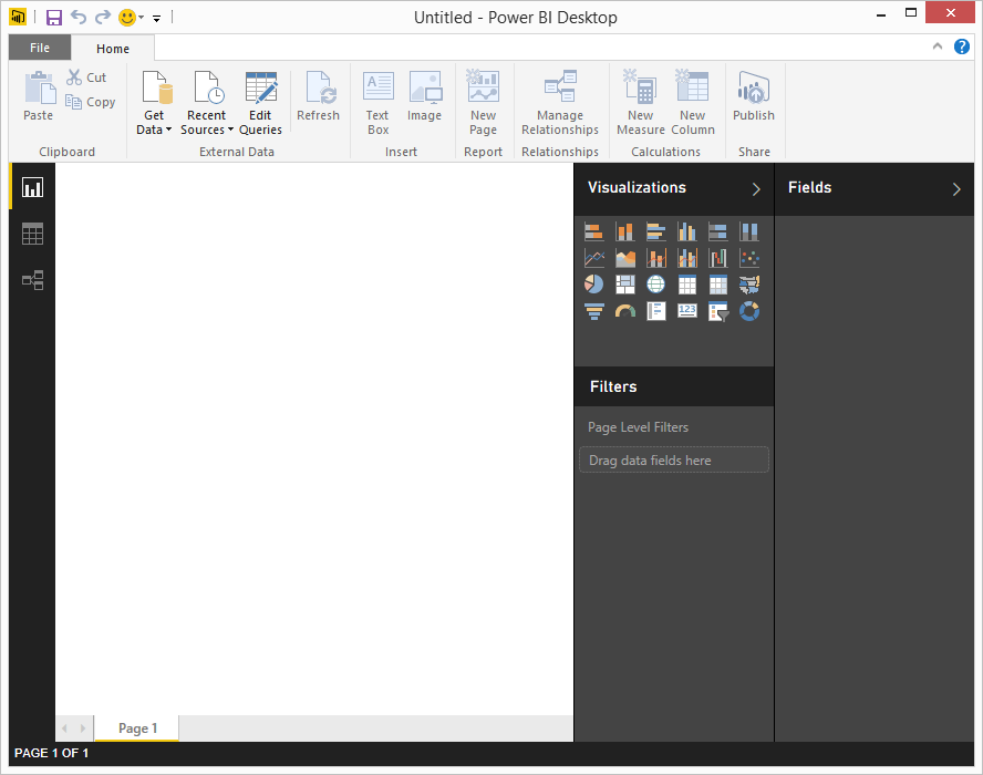
It’s a Windows App with a Ribbon, Just like Excel
And the most obvious starting point is Get Data, just like it would be in Power Pivot…

Getting Started: It is Pretty Obvious What to Click First
Get Data = Power Query (but just not named that)
If you’ve used Power Query in Excel, Power BI’s list of data sources should look quite familiar:
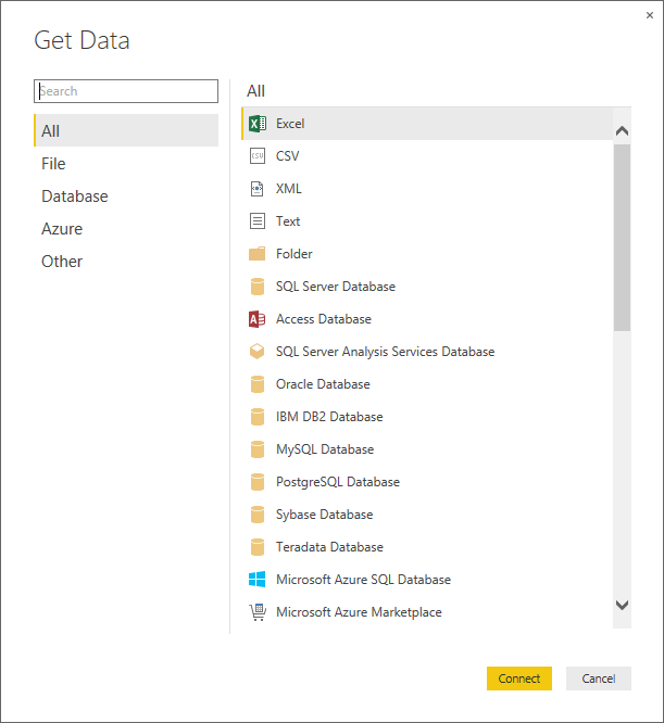
Basically the Same List as Power Query.
(But Even if You’ve Never Used Power Query, This Isn’t Going to Cause You Any Trouble.)
I chose Access, because I want to step through my usual teaching script. I browse for the file and get this:
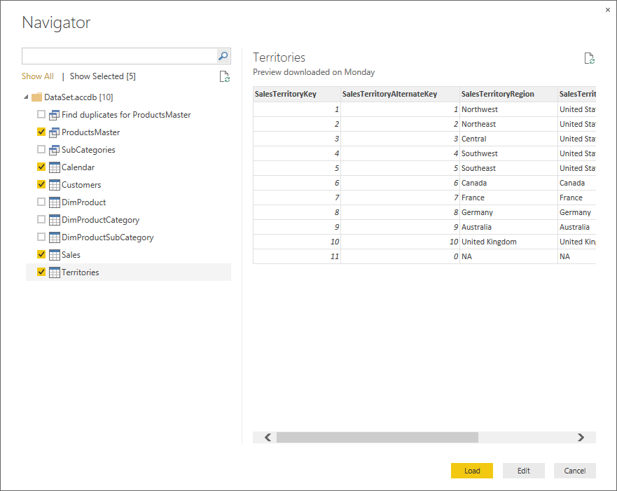
Next Step is a Lot Like Power Pivot’s “Import from Database” – Allows Multi-Table Import, Preview of Each Table, Filtering, Etc.
After Import…
Once you’ve loaded some data, the “whitespace” occupying the left side of the app is still blank. This is where you’re going to assemble your Dashboard(s), which we Excel folks can think of as our pivots and charts.
Just like in Excel/Power Pivot, the field list IS now populated:
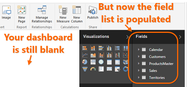
Field List, Reporting for Duty!
But Seriously, SHOW ME THE DATA!
One of my “turnoffs” with Tableau is that it seems to stubbornly refuse to show me the tables of data that I’ve loaded. Until this most recent build, Power BI Desktop also lacked a Data View, but that was not due to some religious, visuals-centric silliness like in Tableau’s case. It was just “we haven’t had time to build that part yet.”

We Now Have a Data View, Which is Very Important in My Experience
(It’s simply impossible to write some calculations, and almost always impossible to debug, w/out seeing the data)
Data View is CRUCIAL, But Since It’s New, It Still Needs some TLC
My First Nitpick: making us use the field list to switch between tables in Data View may seem like an obvious and elegant choice, but forcing me to sacrifice multiple columns of displayable data is not the best tradeoff. I encourage the Power BI desktop team to bring back sheet tabs as the navigation method here, because unlike in Dashboard view, the field list is NOT something intimately involved with my activities in Data View (ex: no drag and drop gestures), and the real estate does make a difference.
Second Nitpick: I can’t yet filter in Data View. I assume this is still coming, because it’s a crucial navigation tool during debugging.
But please don’t take those nits as an indictment! I am still super, SUPER happy to see Data View appear in the tool. Excel pros, rejoice. I was worried we wouldn’t get Data View this soon.
Is there a Diagram View? Yep!
The other important view in Power Pivot is Diagram View, and Power BI absolutely *does* have an equivalent:
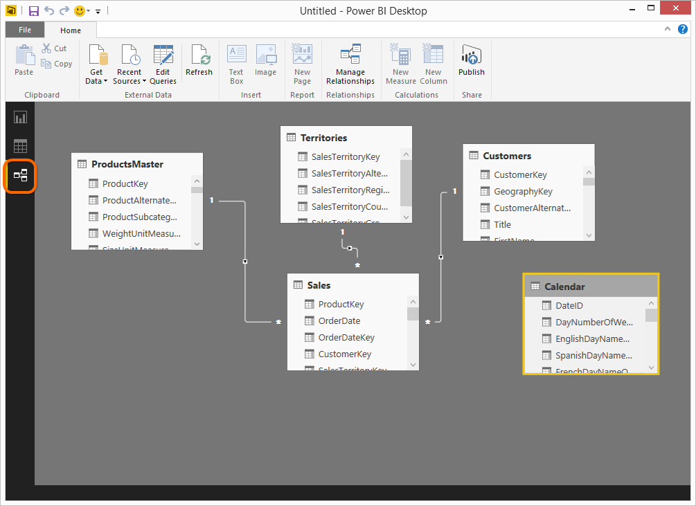
Look Familiar? Just Click the “Relationship” Button (Highlighted)
Nitpicks with Diagram, I Mean, Relationship View
Again, I am suspecting/hoping that these are in the plans, just not built yet:
- I can’t drag/drop to create relationships in Relationship View. Super nice feature that will be missed until it shows up here.
- In fact I can’t do seemingly ANY editing in Relationship view yet. Can’t delete tables, rename tables, etc. – this is actually encouraging, since it seems to suggest that “read only” was their first milestone, and “editable” is still to come. So we’re likely to soon see drag/drop relationship creation too, I’d think.
OK, so How DO You Create Relationships?
First off, you know that “Autodetect relationships” feature that has been lurking around Power Pivot since 2010? It’s back, and it actually performs relationship detection during import. So the three relationships pictured above were auto-created, I didn’t have to do anything other than import the data. I’m cautiously optimistic about this, but will need more real-world experience.
Second, there’s a Manage Relationships button on the ribbon, and it leads to a familiar-looking friend:
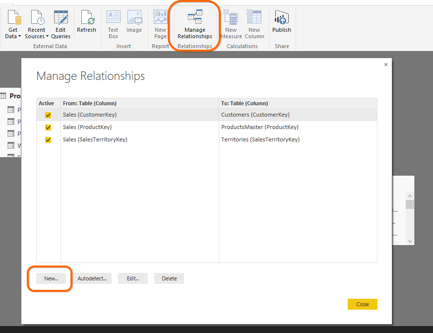
Displays the Existing Relationships, Just Like in Power Pivot
What happens when you click “New…” however is a wholly-unexpected surprise:
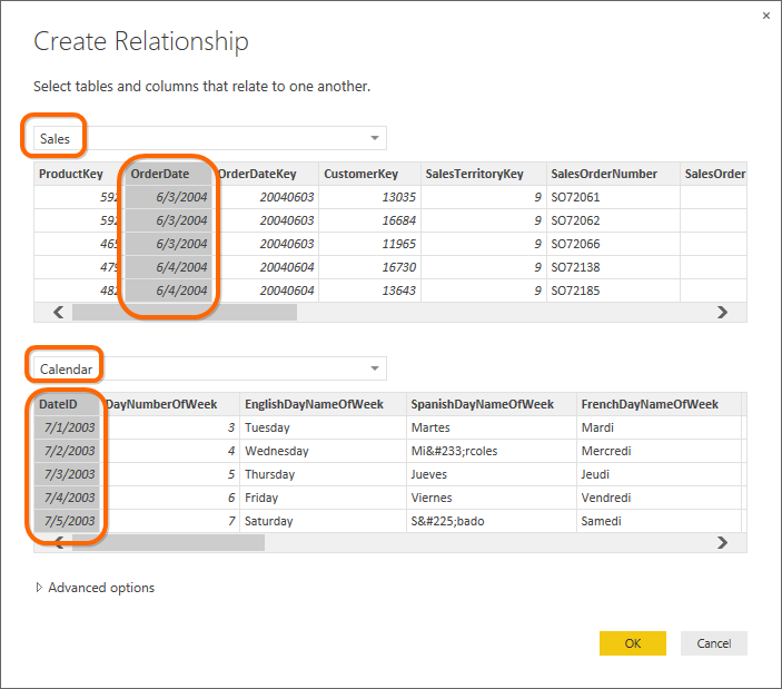
OMG OMG OMG! This! THIS is an example of UX Design in its Highest Form.
(Seriously, I want to write lovesongs about this dialog and everyone involved in its creation.)
One of my longstanding concerns about the Power BI team goes something like this: in software circles, there are Engine Teams and Experience Teams. Engine teams give us massively complete and robust things like SQL Server and the DAX engine. Experience teams give us beautiful, easy-to-learn and fun-to-use things like the iPhone. Teams like Excel sit somewhere in between. I hated Power View primarily because it reflected an Engine team (the SQL folks) underestimating the myriad little details that go into building good User Experiences (UX). When it takes me 20 minutes to notice that there IS indeed a button to increase font size… yeah. I just can’t.
I’m not trying to be mean here! Engine teams always underestimate the difficulty of building good UX, and Experience teams always underestimate the difficulty of building good engines. It’s a cultural shift for the SQL team to become an Experience team, and it doesn’t happen overnight. We can forgive the Dark Ages (ahem, Power View) if they give way to a Renaissance.
Anyway, this dialog is a beautiful example of the tide turning. “What’s the big deal Rob,” you ask? “It’s just a silly little thing, and we already had one.” Well that’s my point. No detail is too small when it comes to UX. The old “four picker” relationship dialog forced me to go on the basis of column names alone. I never got to see the two tables’ DATA during relationship creation, EVER (no matter how I did it.) That led to a lot of canceling-and-flipping-between-tables to make sure I knew which two columns actually match. This new dialog finally lets me do it without leaving the dialog and coming back.
That they even took the time to redesign the existing “4-picker” relationship dialog is an Amazingly Good Sign. Attention to detail, folks. It’s what made Steve Jobs great.
But now that I’ve expressed my heartfelt love, let me pick some nits with the Advanced section of this dialog. Terminology is the enemy of understanding. And we’ve got some serious terminology here:

Yes, BI Pros May Know the Word “Cardinality,” But Excel Folks File it Under “WTF.”

I’m chuckling right now, because when I teach classes, I ALWAYS teach my students the meaning of the word “cardinality.” Not because it’s important, AT ALL, but because it makes us sound smart. I explicitly tell people that if they throw this word around a lot, people will be impressed but won’t understand. And here it is in the UX. (The other “smart” word I teach is the word “scalar.” Both words are taught as a means of adding levity, which is a fancy way of saying, they’re jokes.)
I actually think the meaningless word “Type” would be a better choice here. And there should be a little “i” in a circle so I can click or hover to get an explanation. Words like this just scare people without adding anything.

OK yeah, this IS under Advanced. But Excel people will look here, and we want Excel people to not feel like they are missing some sort of magic decoder ring or secret handshake of the Royal Society of BI.
Next, what is the meaning of “cross filter” in this case? I don’t know. That’s the term I coined for the performance problem in Excel Slicers. We also have a DAX function called ISCROSSFILTERED. The waters are muddy here.
Maybe Cross Filter is exactly the right term, technically, to use in this dialog. I am not smart enough to know. But it begs the question whether there are different kinds of filtering aside from direction. It raises unnecessary questions.
So how about “Filter Direction” instead? That sounds good, and the choices could be “One Way (from one to Many)” and “Two Way.” I think those would be more accessible to the masses. Like I said, these are nits, but in good UX, all the nits get attention.
Lastly, I was expecting to see “Many to Many” in the dropdown list, but try as I might (I even tried linking two Data/Fact tables to each other), I couldn’t get that option to appear. More on this as I learn more.

I was expecting to also see “Many to Many” in the list.
(But admittedly my data just might not have been the right fit to “trigger” that option)
Moving on to Formulas!
In Power Pivot, we have Measures and Calculated Columns. Both are easy to find and add in Power BI Desktop:
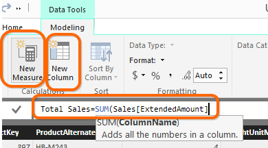
Clearly-Discoverable and Convenient Buttons for Measure and Calc Column.
Both Use the Same (and Much-Improved!) Formula Editor
I don’t even have any nits here. It’s all good.
And, of course, it’s all still DAX, so if you’ve been using Power Pivot, you already just know it.

Check Out the Paren-Matching on the New Editor! Hubba Hubba!
(My heart is all aflutter over nice touches like this)
(Ooh and we don’t have to do the := arcane dance anymore, just = … Nice!)
Editing from the Field List!
This is a nice touch, and in many ways is better than the equivalent Excel experience:
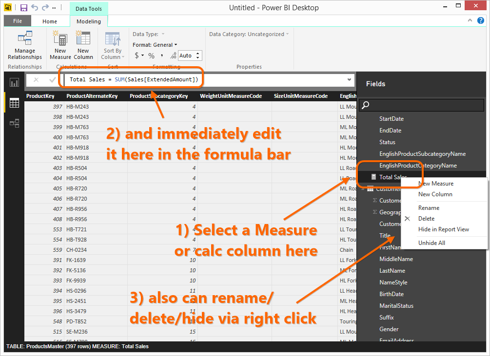
Doesn’t Matter Whether it’s a Measure or Calc Column:
Just Click it and Edit in the Formula Bar
One Last Trip Back to Nitpick Corner
Just a few more things I noticed before I wrap up in a decidedly positive manner.
- On my computer, the field list’s scroll bar is impossibly narrow and hard to “grab.”
- When I’m in Data View, there’s a search box in the field list (yay!), but it’s NOT there when I’m in Dashboard view (why?). We would benefit from it both places.
- If I accidentally put a measure under the wrong table, or just subsequently decide I want to move it, I don’t know if there’s a way to do it. (I didn’t find one.)
- I find the wall-to-wall use of greyscale a bit fatiguing. I would like a bit more color – both because it would make the tool more fun to look at and use, but also because I think some extra contrast would help users spot the things they need.
“Wait! You Didn’t Talk About X!”
That’s right, a lengthy “review” with nary a mention of visuals! Does the Funnel Chart deliver the goods? Are the dashboards sufficiently interactive?
Yes, I am leaving that for later, but honestly, I’m pretty sure those things are already Pretty Darn Good. The visuals are getting a lot of attention for sure, and my long-simmering worry was that the basics would get botched. Specifically, whether it would be Alien to the Excel crowd, and specifically, Alien to the Power Pivot crowd.
THAT is the #1 worry I’ve been carrying, but my recent time with the Desktop has me feeling MUCH better about it.
My Verdict is in…

One last word about the nitpicks: for perspective, I have LIVED with, no, LIVED IN, the Power Pivot and Power Query toolset for the past 6 years. And to boot, I’m an ex designer of software for Microsoft with a penchant for detail. For me of all people to pick up a tool that was developed on a rapid-iteration schedule, and that is intended to parallel that entire toolset, and find only ten small-ish things to complain about, is a pretty strong endorsement.
Get in touch with a P3 team member