COMMON QUESTION: “Hey, will this chart render unchanged in Excel Services, or will it look different?”
MY STOCK ANSWER: “Hmm, I forget, let’s try it out”
I hate giving that answer. So today, I ran a little test. Simple workbook, 12 charts that are all flavors of fancy. Not an exhaustive test, but a reasonable sample. Here are the 12 charts in Excel client (desktop). Click for a larger version.
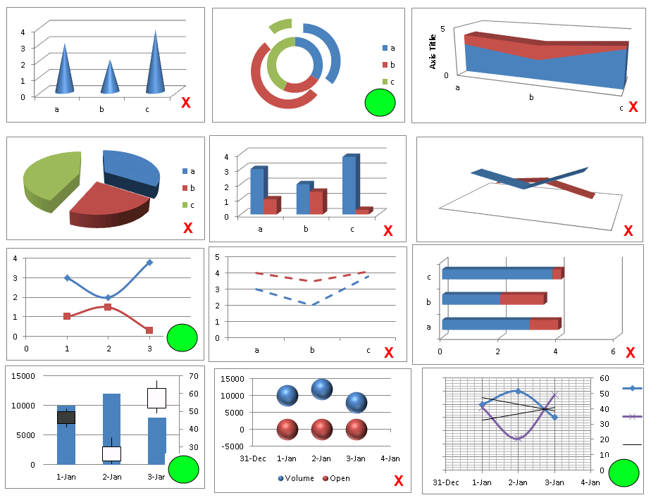
12 Charts in Desktop Excel
Green Circle = Renders 100% identical in Excel Services
Red X = Renders less than 100% identical (sometimes small differences, sometimes large)
Now, here are the same 12 charts rendered in Excel Services:
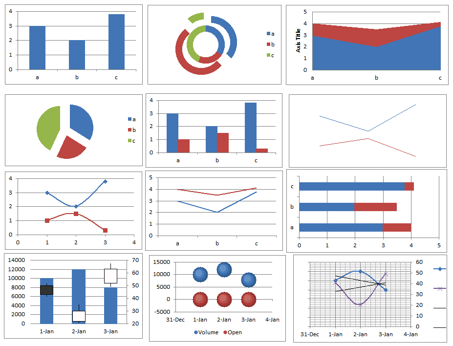
Same 12 Charts, As Displayed on SharePoint (Excel Services)
Again, note that being flagged with an X isn’t the kiss of death – I just didn’t want to bog down in “grading” the differences. Sometimes the changes are big (top left chart) and sometimes the changes are astoundingly small (bottom middle chart).
Either way, having an illustrated reference is going to be helpful for us, so I thought I’d share it. Feel free to submit questions/comments/other examples. I may expand this reference over time.
Get in touch with a P3 team member