Guest post by Colin Banfield [LinkedIn]
After completing the Part 3 extension of Rob’s Dynamic TopN Reports via Slicers, Part 2 post, I did not plan on a forth installment. However, I did plan to write about creating dot plot PivotCharts sometime in the future. Later, it occurred to me that the TopN reports model provided the perfect foundation upon which to create dot plot charts.
The dot plot is not a standard chart type in Excel, so most users haven’t heard of, let alone used one. The dot plot is an alternative to a horizontal bar chart, and there are many situations where it is a better fit for analysis. For a good introduction to dot plots, see this excellent article by data visualization expert, Naomi Robbins.
The following summarizes some of the potential advantages of the dot plot over a bar chart:
- When there are a lot of category items on a chart, a bar chart can look cluttered. Because a dot plot uses less “ink” to represent the same data, the resulting chart tends to be less cluttered.
- The dot plot is often better than a stacked bar chart. The values in a stacked bar chart can be hard to compare because only the bottom bars have a common baseline.
- Depending on how the dot plot chart is organized, you can gain better insights than using a clustered bar chart (see example in Naomi’s article).
- Since the absolute length of a bar chart encodes its value, the value axis must start at zero. If the values in the chart are all a distance from zero, you can’t make good use of interval values on the value axis. On the other hand, the dot plot values are judged by position along the axis – length is not involved. Therefore, you can have more optimal intervals on the value axis.FIgure 1 shows dot plot PivotCharts based on the data used in Part 3.
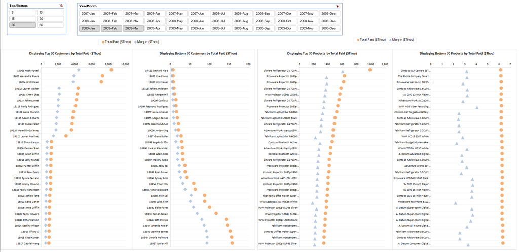
Figure 1 – Dot plot PivotCharts (Click figure for an expanded view)
Creating the Chart
The first step in creating any chart is organizing its source data. I’ve modified the model used in Part 3 as follows:
1. The MeasureForTopN table now has only two items – Total Paid and Margin. Our dot plots compare TopN/BottomN Total Paid with Margin, so the other measures are not required.

Figure 2 – Revised MeasureForTopN table
2. Modified the Selected TopN Value measure to reflect the two measure items in (1).
[Selected TopN Value] =
SWITCH([Selected TopN Measure], 1, [Total Paid]/1000, 2, [Margin]/1000)
3. Removed the TopN/BottomN slicer, as it’s no longer required for the present analysis.
4. Added the “By” column of the MeasureForTopN table to the column area of the PivotTables as shown in Figure 3 for TopN customers.
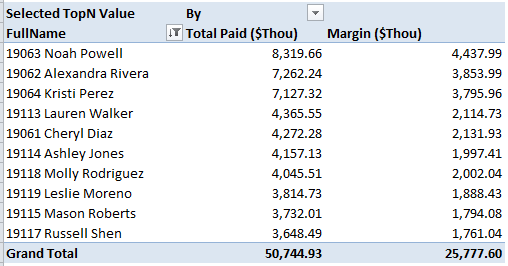
Figure 3 – By table column added to the column area of the PivotTable
The first step in creating the dot plot is to create a bar chart from the source data. By default, Excel creates a clustered bar chart from the data in Figure 3, both with the same series color. In figure 4, I altered the series colors for clarity.
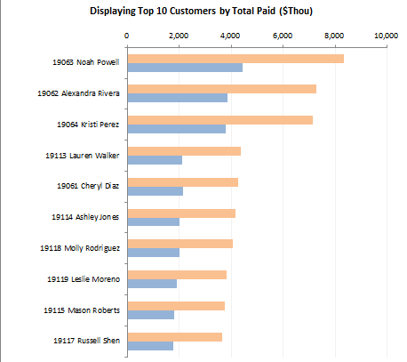
Figure 4 – Clustered bar chart from data in figure 3
We next move the blue series of figure 4 to the secondary axis so that it overlaps the orange series. To make this change, I right-clicked on the blue series, chose Format Data Series from the context menu, and in the Format Data Series dialog box, clicked Secondary Axis for the axis on which to plot. The result of this operation is shown in Figure 5.
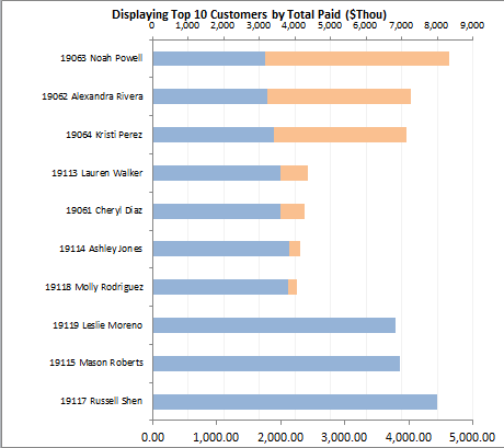
Figure 5 – Moving blue series to the secondary axis
In figure 5, Excel plots the blue series (Margin) with the lowest value at the top and the highest value at the bottom. Most of the time, you want to show the series in reverse order, i.e. with the highest value at top and the lowest at the bottom, without resorting the source data. The orange series, which is plotted on the primary axis, shows the order that we want. For the charts in Part 3, I right-clicked the vertical axis, chose Format Axis from the context menu, and clicked Categories in reverse order in the Format Axis dialog box. To reverse the order of the blue series, we must first temporarily display the secondary vertical axis. From the PivotChart Tools context tab, I chose Layout—>Axes—>Secondary Vertical Axis—>Show Default Axis. The result of this operation is shown in Figure 6.

Figure 6 – Secondary vertical axis on chart
Everything in Figure 6 looks wrong. We have the clutter of both secondary axes, the blue baseline is in the opposite direction, and the series in still in the wrong order. Noah Powell is at the bottom instead of on the top, and the bars are all the wrong length (same problem in Figure 5). We shall fix all of these problems shortly. The purpose of displaying the secondary vertical axis is to allow us to reverse the blue series order. I therefore right-clicked the axis, chose Format Axis from the context menu, and clicked Categories in reverse order in the Format Axis dialog box. See Figure 7.
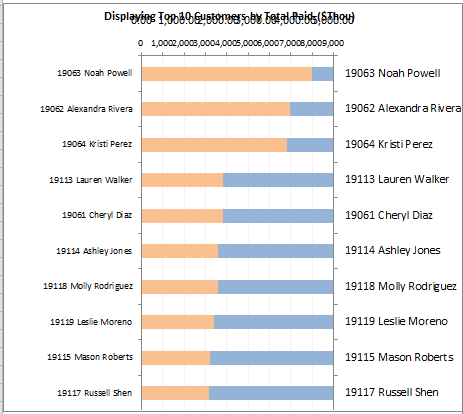
Figure 7 – Secondary vertical axis series plotted in reverse order
We’ve made a bit of progress (the series is in the correct order), but the series is still being plotted in the wrong direction, and the secondary horizontal axis moved to the top, obscuring the title. It’s time to remove the secondary axes! I clicked the secondary vertical axis and pressed delete. Next, I set the secondary horizontal axis to none in the Layout tab (it’s hard to select when it’s overlapping the chart title). The result of these operations are shown in Figure 8.
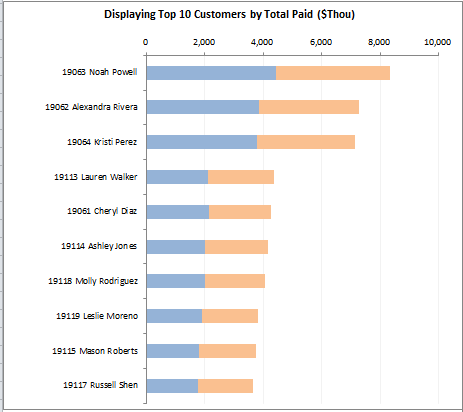
Figure 8 – Overlapping bar series
Finally, we making some real progress. Without the secondary axes present in the chart, the blue series simply uses the primary axes scales. However, we’re now faced with another hurdle. The dot plot needs markers. Where do we find them? The markers come from an unlikely source – error bars!
To continue the process, I selected one of the series, and from the PivotChart Tools Layout tab, I chose Error Bars—>More Error Bar Options…. Excel displays the Format Error Bars Dialog box, and puts default error bars on the series, as shown in Figure 9.
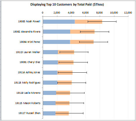
Figure 9 – Error bars on bar chart
In the Format Error Bars dialog box, I chose a fixed value that is much smaller than any of the bar values. I entered 1 in this case. The line is now so small that the error bars all but disappear. Next, I selected the line color and selected a bar color for the Solid line option. In the Line Style tab, I set a width of 3 pt. Finally, in the Arrow Settings section, I chose a Begin type of Oval Arrow as shown in Figure 10.
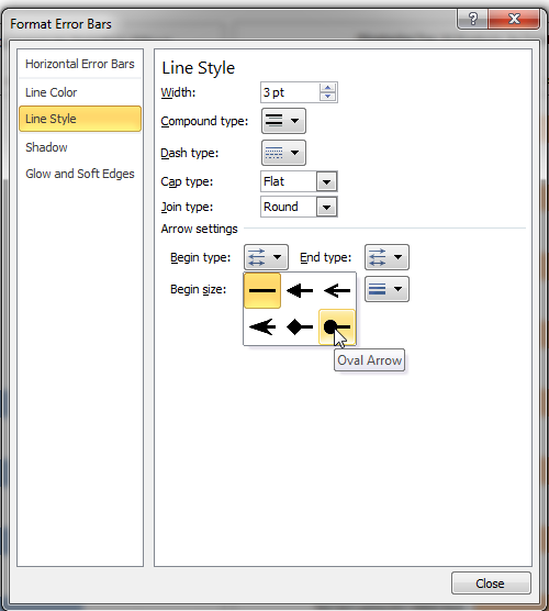
Figure 10 – Arrow type selection
We now have our dot plot markers! The next step is to remove the bar color, so that the bars are now shown. If the dialog box in Figure 10 is still open, you can select the series, and the dialog box changes to the Format Data Series dialog box. From there, select Fill—>No Fill to remove the bar display.
You next have to repeat all of the error bar steps for the remaining series. However, you need to use a “marker” that’s different from the Oval Arrow selection. I chose Diamond Arrow, which is to the left of Oval Arrow. Another useful option is the arrow just labeled “Arrow,” which is just above Diamond Arrow (I use “Arrow” in the TopN product charts in Figure 1).
As a final step, I removed the vertical gridlines that you see in Figures 4-9, and added horizontal gridlines. To add the horizontal gridlines, I right-clicked the vertical axis and chose Add Major Gridlines. Excel’s default gridlines are way too distracting – gridlines should disappear into the background, and never compete the data you’re analyzing. Therefore, I toned down the color considerably. The final results are shown in figure 11.

Figure 11 – Completed dot plot
Phew! There are a lot of step involved in the process, but the good news is that you only need to perform the steps once. After completing the dot plot chart, I selected Save As Template in the PivotChart Tool’s Design tab. In Figure 1, after setting up the source for the other charts similar to the table shown in Figure 3, I right-clicked each chart, chose Change Chart Type from the context menu, and applied the dot plot chart template.
Creating a Legend
There’s still one last detail to take care of. In figure 11, how do we know which marker belongs to the Total Paid series, and which belongs to Margin? It might be obvious in the above context (Margin can’t exceed Total Paid), but what if we’re comparing two series that can overlap? We need a legend of some kind. Legends apply to data series, not error bars, and since we removed the fill colors in the real data series, we can’t use the standard chart legend. How then did I create the legends you see in Figure 1?
We can create a legend for the dot plot by by creating & reformatting line charts, and hiding most of the chart elements. First, click a blank cell in the worksheet that contains the dot plot chart(s). From the Ribbon, choose Insert—>Line—>Line with Markers. With the blank chart selected, click the Select Data button in the Chart Tools Design tab. In the Select Data Source dialog box, click Add, and in the Edit Series dialog box, enter the name for the first series (Total Paid ($Thou) in my case), and enter 0 for the series value. Repeat the preceding steps to add the second series. You should end up with a chart that looks like the one in Figure 12.
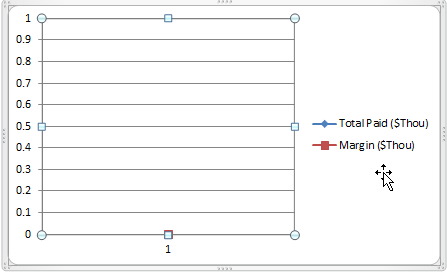
Figure 12 – Line chart for legend
Next, remove the gridlines and both axes. Then right-click the legend, choose Format Legend in the context menu, and select Top for the legend position.
Next, click in the plot area, and drag the bottom right border handle (see figure 12), all the way to the top left border handle. Your chart should look similar to the chart in figure 13.
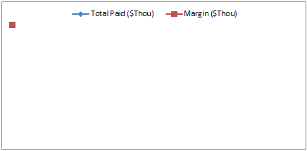
Figure 13 – Minimize plot area
Next resize the chart until just the legend is showing. Then click the legend and drag the border handles so that the legend border overlaps the chart border. See figure 14.

Figure 14 – Legend border overlapping chart border
We still have a residual series marker on the top left corner to remove. Right-click the legend and choose Format Legend from the context menu. In the Format Legend dialog box choose Fill—>Solid Fill, and select White for the fill color. The legend should now look like the one in Figure 15.

Figure 15 – Legend without residue from data series
Finally, by navigating to the Chart Tools—>Layout—>Current Selection group, you can use the available tools to select and format each series – i.e. remove lines from the series, change marker type, change marker color and so on. After making these changes, you should end up with a legend that looks like Figure 16.

Figure 16 – Completed legend
Tip: The size of the icons in the legend doesn’t increase beyond a marker size of 6. However, increasing the marker line style width (I used a width of 2.5 pt in Figure 16) does further increase the size of the corresponding legend icon.
You can download the completed workbook here.
Get in touch with a P3 team member