Post by Rob Collie

If We Use Excel’s Built-In Top N Filter to See Our Top 1,000 Customers, It Hides the Other Customers Completely. But Using DAX, We Can Just “Split” the Audience into Two Groups.
This Came Up Recently…
Hey, I absolutely ADORE the TOP N filter capability offered by all Excel Pivots. It kicks major booty and we use it all the time:
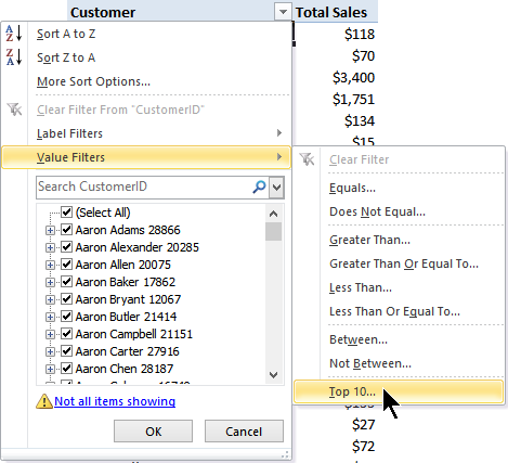
The Top 10 / Top N Value Filter in Pivots: Get to Know It, It Does Amazing Things
But If we set that to show us the top 10 customers, it shows us JUST those 10 customers:
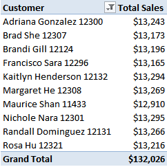
OK cool, we see those top ten customers, and that they collectively purchased $132,026 of stuff from us.
But we want to ALSO see how much the OTHER (non top 10) customers are worth too.
No problem, we can then change the pivot option setting to Include Filtered Items in Totals:
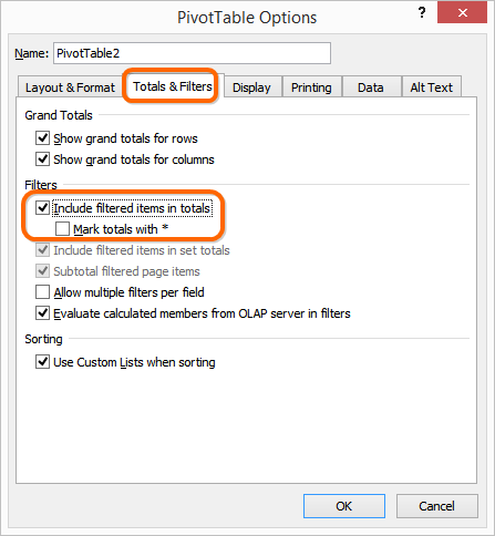
Changing This Checkbox from Off (Default) to On Yields the Pivot Below…
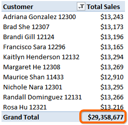
OK, Now We See the Total for ALL Customers. But We Have to Do the Math Ourselves,
AND We Can’t See Those Other Individual Customers
So, we’re still left a bit unsatisfied.
A Solution via Power Pivot, DAX, and Disconnected Tables
I’m onsite all week with a customer this week so I am going to race through this a bit, without quite as much explanation as usual, and then we can chat in the comments.
First, let’s create some Measures (aka Calculated Fields):
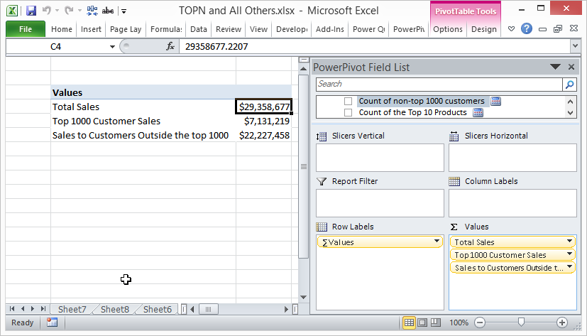
Three Measures Created. [Total Sales] is simple. The Other Formulas Are Below.
[Top 1000 Customer Sales] :=
CALCULATE([Total Sales],
FILTER(Customers,
RANKX(ALL(Customers), [Total Sales])<=1000
)
)
[Sales to Customers Outside the top 1000] :=
CALCULATE([Total Sales],
FILTER(Customers,
RANKX(ALL(Customers), [Total Sales])>1000
)
)
Note that these two differ only by the highlighted comparison operator.
Why FILTER instead of TOPN?
I *do* have a reason, but no time to explain. Just trust me for now that it was needed
Next, a Disconnected Table!
Now, create this table and link it over into Power Pivot:

Manually Create a Table Like This in Excel, and then…
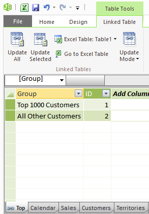
…Link it Over Into Power Pivot, as Shown Here.
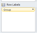
Then, WITHOUT Creating Any Relationships, Put That Group Field on Rows of Your Pivot
Now for a “Wrapper” Measure!
Create the following measure:
[Wrapper Measure for Top 1000 Customer Sales] :=
IF(ISFILTERED(‘Top'[Group]),
SWITCH(MAX(‘Top'[ID]),
1, [Top 1000 Customer Sales],
2, [Sales to Customers Outside the top 1000]
),
[Total Sales]
)
Put THAT measure on the pivot:

And now you can put Customer ID on the pivot too if you want:
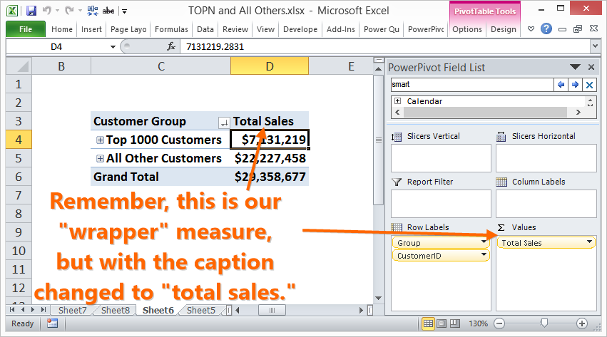
Boom!
Note – there are 1,013 Customers in the Top 1,000
Because of ties, there are actually 13 more customers in the top 1000 than we’d expect:

Repeat for Other Metrics!
Let’s say we also have another “base” measure like this:
[Sales per Customer] :=
DIVIDE([Total Sales],COUNTROWS(Customers))
If we then repeat the entire pattern – the “top 1000” measure, the “outside the top 1000” measure, and then the “wrapper” measure, but substitute [Sales per Customer] in the right places, we get these (apologize for the formatting – time pressure).
CALCULATE([Sales per Customer],FILTER(Customers, RANKX(ALL(Customers), [Total Sales])<=1000))
CALCULATE([Sales per Customer],FILTER(Customers, RANKX(ALL(Customers), [Total Sales])>1000))
IF(ISFILTERED(‘Top'[Group]),
SWITCH(MAX(‘Top'[ID]),
1, [Top 1000 Customer Sales per Customer],
2, [Sales per Customer Outside the top 1000]
),
[Sales per Customer]
)
And the following pivot!

Note that We Could NOT Get the Highlighted Value By Subtracting $7,040 from the Grand Total – So The “Included Filtered Items in Totals” Checkbox Would NOT Have Done the Trick.
Questions? Fire Away!
Get in touch with a P3 team member