Intro from Rob: today, Colin finishes in Percentile Measures topic from last week.
Note that 1) this technique requires the new release of PowerPivot that is currently still in beta (the Denali release)…
…and 2) I would rate this one a solid 3 or 4 on the spicy function scale. Not one of the beginner techniques, in other words
Guest Post by Colin Banfield
October 01, 2011
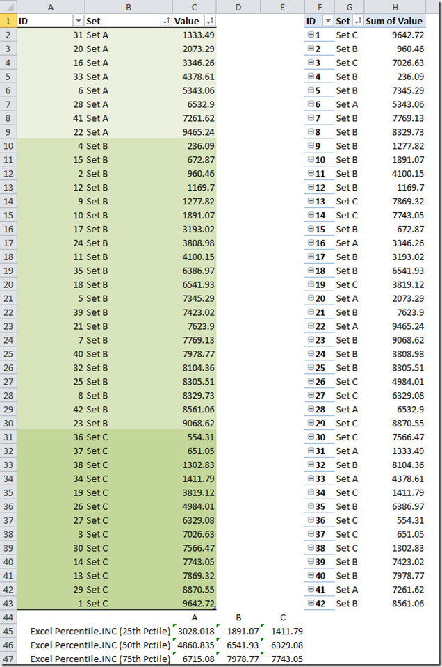
In Part I, I discussed my approach to creating percentile measures in DAX. In this part, we will add an extra dimension to our dataset and create a box & whisker PivotChart. The expanded dataset is shown in figure 1, with the source table on the left, and the resulting PowerPivot PivotTable on the right.

Figure 1 – Expanded dataset with Set column
In the expanded dataset, I have added a column called Set. The goal is to create percentile measures that are constrained to each set. Following the 4-step approach outlined in Part I, we start with the rank calculation. Recall that our rank formula in Part I was:
=RANKX(ALL(Data),[Sum of Value],,1)
This formula works when we are working with the entire table. However, with the addition of the Set column, we need to calculate values for the sets A, B, & C in a new filter context (i.e. one that excludes the ID column). We need RANKX to rank the values for each set independently. We employ the CALCULATETABLE function to achieve the desired result:
=RANKX(
CALCULATETABLE(
Data,
ALL(Data[ID])
),
[Sum of Value],,1
)
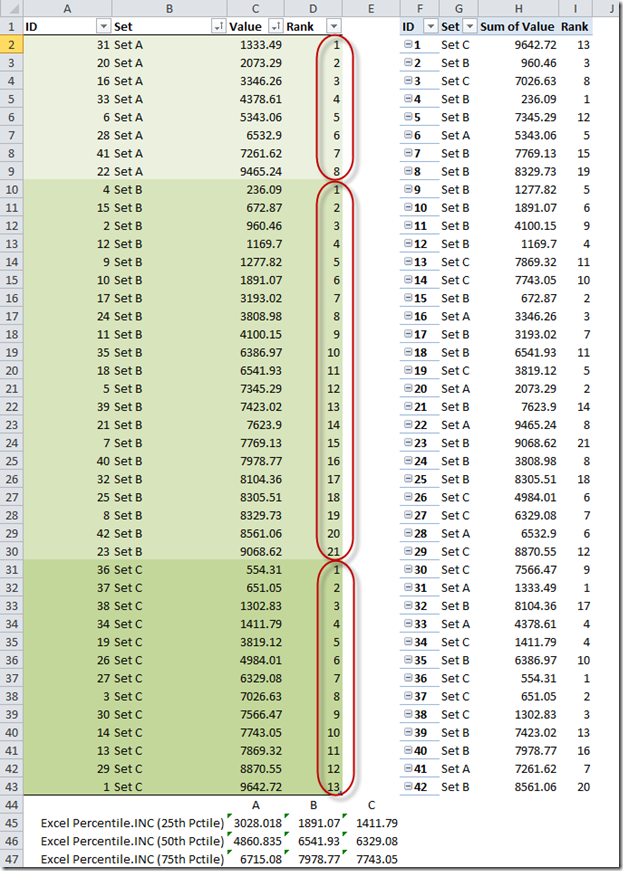
To show the ranking within each set more easily, I’ve sorted the source table by set and value, both in ascending order. Next, I created a calculated column that uses a lookup formula to get the rank measure from the PivotTable.

Figure 2 – Rank measure
With the inclusion of the Set column in the PivotTable, we must also modify other measures used in Part I.
Rank for 25th percentile ([25PctRank_INC])
=CALCULATE(
(COUNTROWS(Data)-1)*25/100+1,
ALL(Data)
)
To:
=CALCULATE(
(COUNTROWS(Data)-1)*25/100+1,
ALL(Data[ID])
)
PercentileDown
=MAXX(
FILTER(
ALL(Data),
[Rank] = ROUNDDOWN([25PctRank_INC],0)
),
[Sum of Value]
)
To:
=MAXX(
FILTER(
ALL(Data[ID]),
[Rank] = ROUNDDOWN([25PctRank_INC],0)
),
[Sum of Value]
)
PercentileUp
=MAXX(
TOPN(
ROUNDUP([25PctRank_INC],0),
ALL(Data),
[Sum of Value],
1
),
[Sum of Value]
)
To:
=MAXX(
TOPN(
ROUNDUP([25PctRank_INC],0),
CALCULATETABLE(
Data,
ALL(Data[ID])
),
[Sum of Value],
1
),
[Sum of Value]
)
Or:
=CALCULATE(
MAXX(
TOPN(
ROUNDUP([25PctRank_INC],0),
Data,
[Sum of Value],
1
),
[Sum of Value]
),
ALL(Data[ID])
)
The preceding alternative formulas are provided to illustrate how the same scalar result can be obtained using either CALCULATE or CALCULATETABLE. Similarly, we can use CALCULATETABLE instead of CALCULATE in the rank for the 25th percentile formula. I point this out because using CALCULATETABLE as an alternative to CALCULATE in applicable situations is rarely, if ever discussed.
25th, 50th, and 75th Percentiles
Recall the interpolation formula from Part I:
=[25thPercentileDown]+([25thPercentileUp]-[25thPercentileDown])*([25PctRank_INC]-ROUNDDOWN([25PctRank_INC],0))
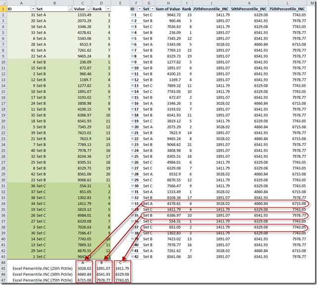
After completing the measures for the 50th and 75th percentiles, our table is as shown in figure 3.

Figure 3 – Percentile measures, with comparisons to values returned by Excel’s PERCENTTILE.INC function
Creating a Box & Whisker PivotChart from Percentile Measures
It is difficult, if not impossible to analyze data directly in a table – whether or not the data is summarized. The purpose of a chart is (or should be) to provide us with insights into the data that we cannot derive by staring at the numbers. One such chart that takes advantage of percentile measures is the box & whisker plot (hereafter called a box plot). This chart is commonly used in areas such as statistical process control (SPC) and Six Sigma, but they can be quite useful for general business analysis. This chart is not native to Excel, so it’s not surprising that its use is not explored more often. The box plot visually shows the distribution of values in a dataset. The most common plots show the minimum value, maximum value, the range between the 25th and 75th percentile (known as the interquartile range), the median value and the mean (average value). The “box” portion is the interquartile range, and the two “whisker” parts are the range between the min and the 25th percentile, and the range between the 75th percentile and the max. The box plot is most effective when comparing the distribution of values across several data sets. A few examples of box plots for general business use include:
· Comparing the distribution of call hold times of agents over a period
· Comparing the distribution of price fluctuations across several products, or product parts
· Comparing the distribution of shipping weights for different service levels (e.g. normal, express, overnight). This data could provide useful intelligence for a shipping company
· Comparing the distribution of actual salaries across different salary scales. An excellent example is provided in this article here. The article explains how to interpret the plot and also illustrates a very important concept for making charts more meaningful i.e. adding additional context to a chart by providing reference information.
Basically, any related entities in your business that could benefit from analyzing a distribution of their values could benefit from a box plot.
The first step in creating the box plot PivotChart is to arrange the data appropriately. The actual construction of the plot is beyond the scope of this post, but the technique is explained in this tutorial by Excel charting guru, Jon Peltier. If you’re new to creating box plots in Excel, you should read the tutorial before continuing. Jon’s excellent charting tutorials have been around for a long time, and recently he has been updating them. In addition to his tutorials, Jon also has a few chart utilities for sale (and no, I don’t earn a commission for this plug).
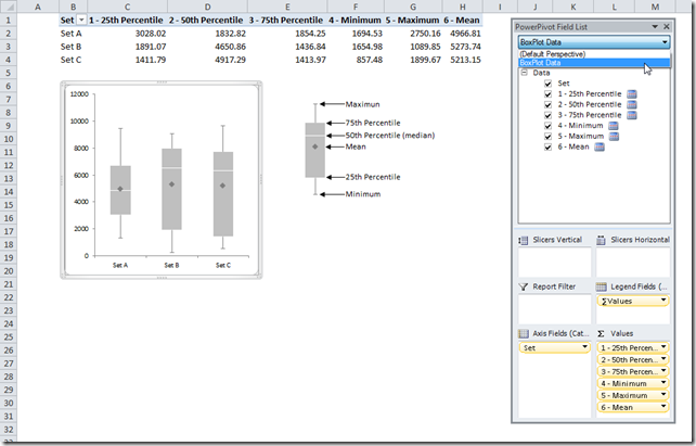
The box plot PivotChart using our dataset is shown in figure 4

Figure 4 – Box plot PivotChart
Notes
1. I created a perspective called BoxPlot Data to contain only the measures required for the box plot
2. The measures are numbered to indicate the order that they must be added to the PivotTable
3. The box plot measure formulas are as follows:
[1-25th Percentile] = [25thPercentile_INC]
[2-50th Percentile] = [50thPercentile_INC]-[25thPercentile_INC]
[3-75th Percentile] = [75thPercentile_INC]-[50thPercentile_INC]
[4-Minimum] = [25thPercentile_INC]- MINX(ALL(Data[ID]),[Sum of Value])
[5-Maximum] = MAXX(ALL(Data[ID]),[Sum of Value])- [75thPercentile_INC]
[6-Mean] = AVERAGEX(ALL(Data[ID]),[Sum of Value])
4. I’ve created a chart template that can be used to create box plots. When creating a new plot, the dimension and measures should be added to the PivotTable before selecting the chart template from the Insert Chart dialog box.
5. After you create the chart from the template, the whiskers will not appear. This occurs because the whiskers are created using error bars, and external ranges are used to specify the data for the error bars. Unlike the rest of the chart, the template doesn’t know which ranges to use for error bars. You must add these manually, using the technique detailed in Jon’s tutorial.
6. The white median lines you see in figure 4 were created using a bit of formatting trickery. I used a white border for the bars. The outside borders don’t show because they are set against a white background.
Downloads
You can download a copy of the workbook & chart template from the following location:
https://powerpivotfaq.com/PowerPivot%20Samples/Forms/AllItems.aspx
Get in touch with a P3 team member