

“Sniff something? Did ya, rat boy?”
Continuity!
Folks I just can’t resist a quick followup on the Rat Sniffing Project. I… just… can’t. Plus I am absolutely worn down and don’t have the energy tonight for anything that isn’t inherently entertaining.
All of those calculated columns from the last post, remember, were just the setup so we could start doing some REAL observational stuff.
You know, something like this:
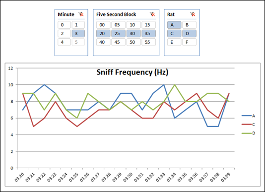
This wasn’t difficult at all.
Remember that I now had a column that flagged each row as “1” if it represented the peak of an inhalation:

Each Row is 0.01 second, Flagged as 1 if
it’s a Peak Inhale, aka a “Sniff”
So now I really just need some measures.
The First Measure I’ve Ever Written in the Unit of Hertz!
(Hmmm. There’s a joke in here somewhere, the first line of which is something like “what do you do if your unit Hertz?” Listen, I told you I was tired.)
Since I have a 1 in the RobPeak column, summing it will yield the number of peaks in an interval – I don’t need to do a CALCULATE(COUNTROWS()) with a filter set to 1.
So the measure formula for Hz (events per second) is:
(SUM(Data[RobPeak]) / COUNTROWS(Data)) * 100
Why times 100? Because each row is actually 0.01 second.
Now THIS is a *Time* Table
This is another first: creating a separate time table that is NOT measured in days. In this case… hundredths of a second:
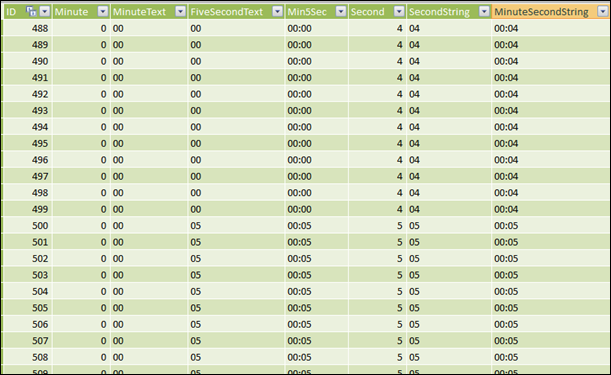
Not a Calendar Table – a Time Table. In 0.01 Second Increments
OK, it’s not a Calendar table but it is VERY similar. Just like a Calendar table has columns like DayofWeek, DayOfMonth, CalendarYear, etc. – those columns represent properties of dates. Well, the columns I have here like Second and FiveSecond are the same sort of thing.
And since I have 6 rats in the experiment, it is wasteful to duplicate those properties in my Data table. Plus there’s that whole speed thing.
So I created this separate table and related it to my Data table.
And this table then “powers” my slicers like these:
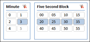
Slicers Based on a Time Table Measured in Minutes and Seconds
These slicers represent a navigation method more than they do a “filter” in the classic sense. I say that because fields from the time table are on the axis of the chart as well:
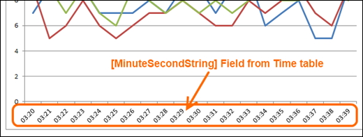
The net effect is that I can use my slicers to quickly move around the data and examine “windows” that are interesting or relevant. Couple of quick clicks and I am now looking at minute 4 instead of minute 3, and just the first 10 seconds of that minute:

Quickly “Jumped” to the 4:00-4:10 Interval
It’s ALMOST like the slider control on a YouTube video:
YouTube Has a Time Slicer Control Too!
Wouldn’t it be neat if Excel gave us a YouTube-style slicer for time? We can dream.
Side Note: Rats Breathe FAST!
Check those charts out. Between 5 and 9 Hz??? Really? Those little rascals inhale between 5 and 9 times per second, on a SUSTAINED basis? Wow. I’m easily amused I guess, but wow.

Get in touch with a P3 team member