OK, last week I showed you a parameterized PowerPivot report that contained no pivots anywhere. How did I build it?
Best Tutorial: Start with a Pivot
The easiest way to show you is to start with a PivotTable, even though once you’ve mastered this technique, you won’t always want to start this way.
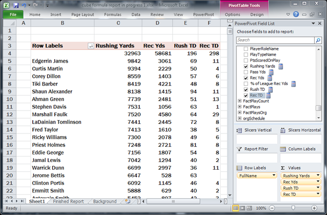
Here I’ve got 4 measures from the Plays table broken out by ‘Clean Players’.[FullName], and the report is sorted by the [Rushing Yards] measure:

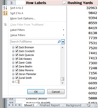
First, I want to get rid of that blank value at the top – over the years, an awful lot of “nobodies” amassed a lot of stats, and apparently STATS did not care enough to capture their names. Accordingly, I don’t care enough to want them in my report.

So, I’ll just filter them out. Easy enough, as shown here at right.
But I also want to limit my report to the top 20 players. How do I do that, now that I have already applied a filter to this field?
When I try to add a Top 10 filter to this field, it clears my filter that removed the blank, and I get that blank, unknown player back in the report.
So how do I do this? Well, I use a feature of PivotTables that Allan Folting argued for, and I argued against, back in 2006. He was right, I was wrong, and the feature has helped me numerous times since 🙂
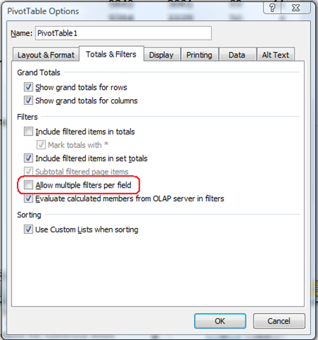
That feature is hidden under the Options button on the PivotTable Options ribbon tab. It defaults to off. Once enabled, I can go back to the Pivot and add a Top 10 filter, set to show the top 20 players as sorted by Rushing Yards:

Checking that checkbox allows me to then add my Top 20 filter on top of the original:

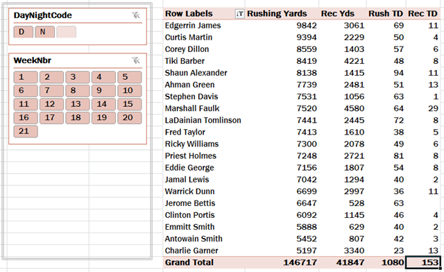
Then I add some slicers, which yields the basic starting point that I want:

Enough with the pivot, Rob! We want the pivot-LESS report!
Indeed. Time to blow this pivot into a hundred pieces. Literally.
On the Pivot Options tab of the ribbon, under a dropdown called OLAP Tools, there is a button named “Convert to Formulas.” On normal pivots, this whole dropdown is disabled… because normal pivots are not OLAP pivots.
But PowerPivot-backed pivots are OLAP, because under the hood, the PowerPivot db engine is an OLAP engine. So this button is enabled:

Watch what happens when you click that button:
[youtube=https://www.youtube.com/watch?v=M1U_pPawalY&hd=1&w=640&h=480]
Recap
Briefly, let’s recap what we see in the video:
- Every cell in the pivot has been converted to a formula
- Each formula returns the same result that the cell previously contained (when it was part of the pivot)
- Slicers still work – the formulas return different numbers reflecting slicer selections
- The formulas can be treated just like regular spreadsheet cells – moved, rearranged, deleted, etc.
- There are two functions involved – CUBEMEMBER() and CUBEVALUE()
- Generically, we call this feature “Cube Formulas”
Cube Formulas are NOT DAX!
I know that cube formulas are new to most of you, and seeing how I am introducing them in the context of PowerPivot, it’s natural to suspect that these formulas are part of DAX.
But they are not. They are built-in to regular Excel and are there before you install PowerPivot. Remember, DAX can only be used on tables in the PowerPivot window, and in the New Measure dialog. DAX cannot be used in normal Excel spreadsheet cells.
Cube formulas are just another way for Excel to interact with certain kinds of data sources. And PowerPivot is one data source that qualifies. That’s good news for Excel pros – a brand-new way to build reports. It’s a free benefit of PowerPivot 🙂
CUBEMEMBER() and CUBEVALUE()
As shown in the video, let’s inspect the formulas in three specific cells to show you what’s going on here.
First, the Edgerrin James label cell:

Brushing over syntax for a moment, that formula says “this cell now represents Edgerrin James” – the string “Edgerrin James” was returned from the PowerPivot database in fact.
Then the “Rushing Yards” header cell:

Again brushing over syntax, that formula means “this cell now represents the Rushing Yards measure.”
And lastly, the 9842 value, which is Edgerrin James’ total Rushing Yards:

I put this one in edit mode to show you that it references the Edgerrin James and Rushing Yards cells. So this CUBEVALUE formula shows the intersection of Edgerrin James, and Rushing Yards, just like it did in the PivotTable.
Notice how it also references the two Slicers. That’s how the formula returns different values as the slicers are manipulated. Again, just like it did in the PivotTable.
More to come
Cube formulas are indeed the core trick behind my “pivot-less” report. But there are several elements yet to be explained, like the parameterization, and even more importantly, how the sort order of the report can change in response to parameters and slicers.
I also want to show you what happens with this report when published to SharePoint.
I think this is enough for one post though 🙂
Get in touch with a P3 team member