“I Built that!”
When I was still with Microsoft, as part of the giving campaign, we volunteered to help at a Habitat for Humanity construction site. The site was very close to my home and it ended up being a fun outing for everyone. We worked together on various oddball projects around the construction site. Granted, what we did was fairly basic work – but it felt like we contributed our small piece. That was several years ago. Since then the community has been fully built.

During Construction and After Completion, a Habitat for Humanity Project
Each time I pass this community, I feel a sense of pride. My chest swells up a little bit. And if there is someone there with me, I thump my chest and say, “You know, I built that!”. Okay, I don’t actually say that, not out loud at least.
But why is it like that? Why does this house evoke that much emotion in me? When I daily pass by numerous communities, some far grander than this one, hardly noticing them at all. Because, in a small way, I helped to shape it.
Power BI – the next generation BI Tool, built for you, by you
The first Power BI idea that I submitted and earnestly gathered support for was “Analyze in Excel”.

We were delighted when that feature was announced at Data Insights Summit in March 2016. And since then Analyze in Excel remains one of those “WOW” features that we love to showcase to any client.
But I also had mixed feelings for the whole endeavor, since I felt – “Gosh, is that what I need to do to get a feature into Power BI? Get 2000+ votes”.
But the other day I got notification for a small little idea that I had submitted, that it was completed.

That new feature is called – Query Dependency View. More on that below. But folks, Power BI team is listening to you. This is our chance to shape perhaps the BI tool for the 21st century. So you can later say…
“I built that!”
Query Dependency View

If you are anything like me, you treat Queries like lego blocks. I build simple modules and then combine them to get the end result that I need. I am always afraid of looking at a 100+ step Query. Instead I prefer breaking out the logic in small pieces and building things step by step. For instance a current production model of mine has 60 Queries (most of them are connection only, i.e. building blocks).
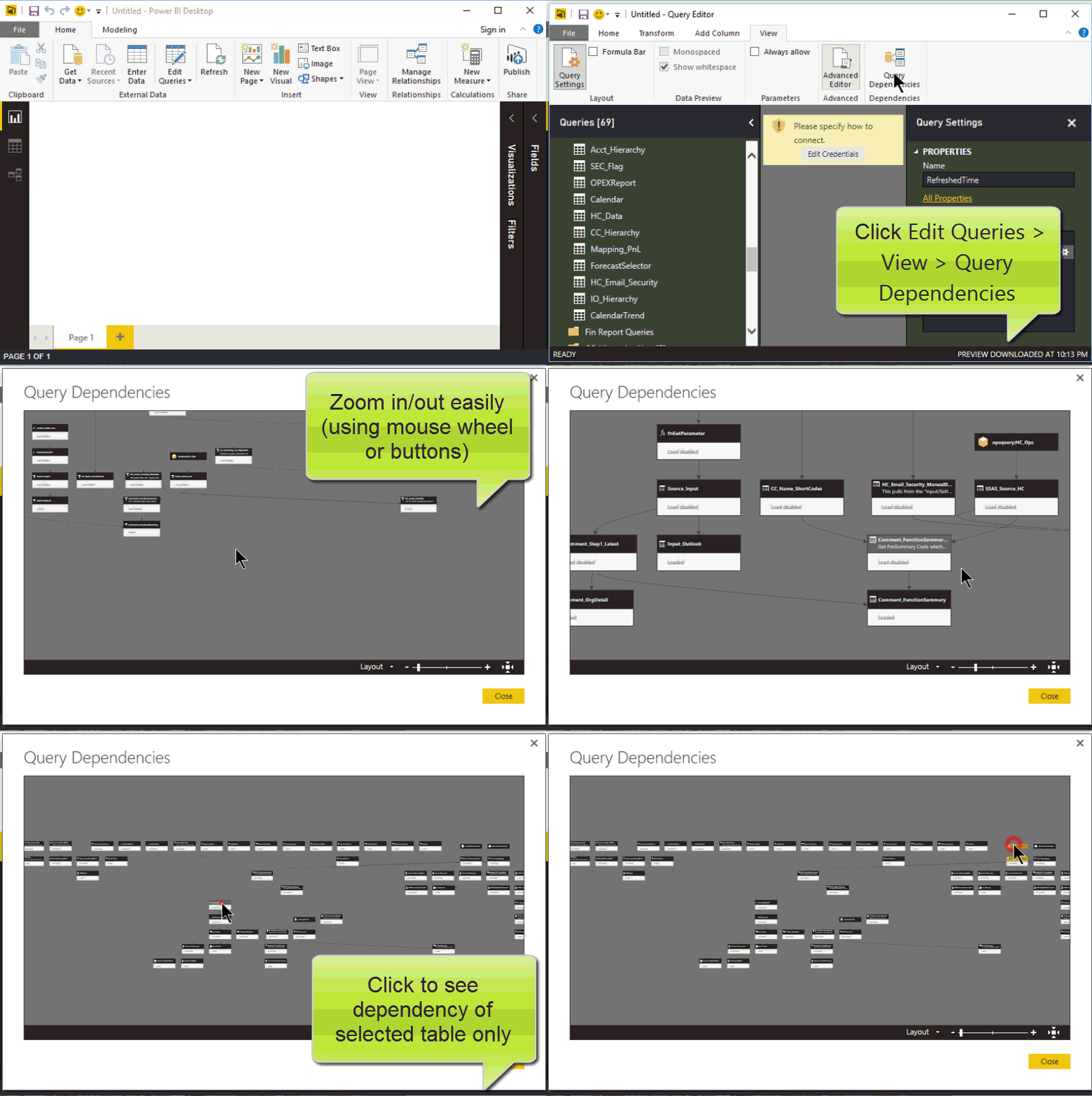
And now you have a phenomenal way to visualize all your queries and how they connect to each other, using the Query Dependency View in Power BI. See the animated GIF below, but our Australian friend has an excellent blog post with more detail.
p.s. : Excel Users can still enjoy the Query Dependency view by simply importing their models into Power BI Desktop.

Animated GIF showing the wonders of Query Dependency View
Matt has his list, but while we’re on the topic, here are the improvements that I would like to see:-
- Hover Over Display: As I hover over tables, it would be great to see the comment that user entered in the “All Properties” box for that query
- Show Descriptive Statistics: This may be displayed on demand, there could be a button, when clicked would show descriptive statistics – like the RowCount of each Query. Those who have seen SSIS would know what I am requesting. I think Alteryx has this in some fashion as well.
- Hover over and select arrows: Sometimes it’s hard to trace an arrow back and forth between it’s source and destination. If hovering or selecting an arrow would highlight both Source and Destination, that would be useful
- Save High Quality JPEG: I can already imagine poster-sized printouts of Query Dependency View hanging outside people’s wall. You can’t get better advertisement than that! Unfortunately taking screenshot doesn’t quite cut it for me, since I have too many queries. But if the View would allow me to save a Hi-Def image that I could print using a plotter, that’s going straight to my cubicle wall!
Measure Dependency View
While I have 60 Queries in the model I mentioned, I have 200+ measures. And I build my measures in the same lego block fashion. I have in fact attempted to build a dependency tree myself. However, it ends up being quite a lot of heavy lifting; and it doesn’t look nearly as good as what I know Power BI team can build. Here are my attempts:-

Using NodeXL in Excel (this was the my preferred view but clunky to build and use)
Using Custom Visuals in Power BI (click to enlarge)
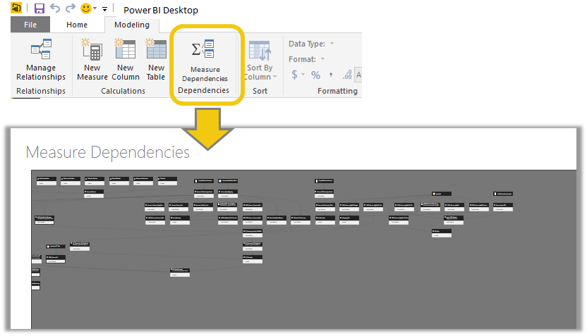
Wouldn’t it be better to have something like this:
Vote for the idea here.
Get in touch with a P3 team member