A Spreadsheet in Excel Services Is No Longer a Document,
It’s an Application
I thought today was going to be a “handful of mini posts” kind of day but then this post blossomed into a bit more than I thought it would, which is a good thing.
Normal Spreadsheets are Usually Ugly and That’s OK
It’s true: most Excel pros are not artists. I certainly am not. We’re number folks first and foremost, and our jobs haven’t historically placed top-level emphasis on aesthetics either. So we don’t spend much time on it, typically.
Besides, Excel itself isn’t pretty. Back in the 80’s or 90’s, even if you made a spreadsheet look fantastic, well, it was still loaded in Excel. So you got all those lovely “battleship grey” toolbars, the title bar, etc.:
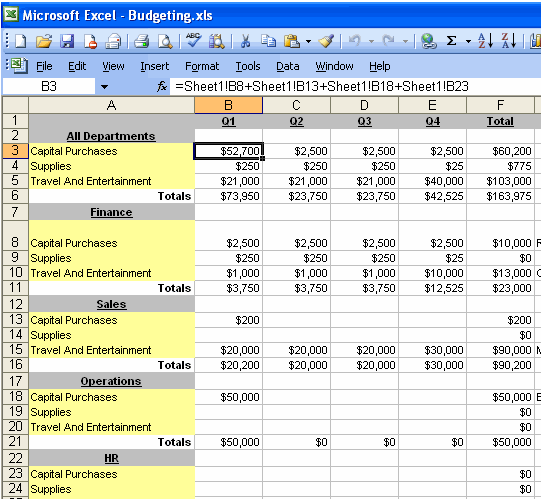
Just by the Excel Frame Itself
I want to be clear: This is NOT a post that is going to encourage you to run out and start putting lipstick on all of your spreadsheets.
Instead, I am going to make the case for why the game changes significantly (for the better too) when you switch to using a server (or a cloud hosting service like ours) to share your work.
The “Excel Frame” Has an Enormous, Underappreciated Impact
Hey, you might say that the old-style Excel screenshot above is an unfair example, since Excel 2007 and 2010 replaced menus and toolbars with the Ribbon. But in a crucial way the Ribbon is NO different really – the point is that either way (ribbon or menu/toolbars) the Excel frame is NOT YOURS. It belongs to Excel. And no matter how much work goes into the document itself, the user of that document still thinks you made them a document.
Let that sink in for a minute. Because the user of your spreadsheet thinks they are “using Excel” and not “using an application built by my favorite Excel pro,” you are receiving a hidden benefit AND a hidden penalty:
- There are many things you will never be blamed for as long as the consumer thinks of Excel as the application. Hey, the overall experience just feels kinda clunky. “No big deal, that’s just how Excel docs always are.”
- But you also don’t get nearly enough credit, psychological impact, or perceived importance that your work deserves. Seriously, your work drives your organizations. If everyone thought of you as a programmer (which you are, even if you don’t write macros), you’d be viewed differently. But people who produce documents are often viewed as “Excel Monkeys.” Honestly I think Excel pros are, for the most part, underpaid relative to their true importance.
When you switch from mailing spreadsheets around to publishing spreadsheets on SharePoint, well, both of those go out the window. Well, if you do it right, anyway.
SharePoint Brings Its Own Frames! Ack!
OK, so you switch over to using SharePoint as your publishing mechanism. Does that get rid of the Excel frame? Well not really. It just gives you a new Excel frame in your browser:
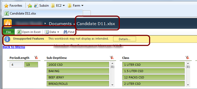
See all of those highlighted elements? Just another Excel frame, ported to the browser. Complete with File tab, toolbar, the .XLSX extension blazoned across the top, and even a warning bar.
Not to be left out, SharePoint adds some of its own at times:

So, you gotta get rid of those. And that means customizing SharePoint. If you’re a SharePoint pro that’s mostly not too difficult, but even then it likely will take you some time to get it tuned just right (we’ve been making tweaks now for two years). And if you’re not a SharePoint pro, well, you are going to need one.
(For more info on the details of these SharePoint elements and what we’ve done to modify/suppress them, see this post and this post).
Going Frameless Turns “Document” Into “Application”
In our Hosted PowerPivot offering, we’ve got all of that suppressed, and the only “frame” you see is just the browser and a typical web header. An example:

The idea for this post struck me yesterday as I was putting together this sample workbook (based on Microsoft’s AdventureWorks data set) that we are going to start including in all of our HostedPowerPivot sites as a tutorial:

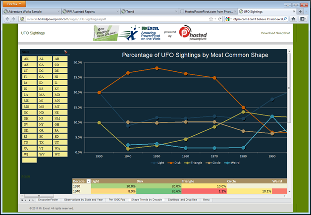
Or try this humorous example (based on real data) that examines UFO sightings – click image to view the application on [link removed due to 404] Mr. Excel’s HostedPowerPivot site.
Completing the Illusion: A Few Simple Steps
Once you’ve gone frameless, there are a few simple things you can do to complete the transformation from document to application. Neglect these and your “frameless” would-be application screams “spreadsheet” to the audience. Follow them, and even if you’re not terribly artistic, your work will be perceived very differently:
- Turn off gridlines and headers. It’s not hard. Two checkboxes on the View tab of the ribbon, but do that for EVERY sheet the consumer sees. Every single one. Crucial.
- Hide or delete all sheets you don’t want them to consume. Don’t leave extra blank tabs in there named “Sheet3” OK?
- Insert some images. So important! Your company logo. Your client’s logo. Something. And make sure you use the Insert ribbon to do this! Simple copy/pasting an image into a worksheet, in my experience, seems to result in that image NOT showing up in the browser.
- Line up slicers, charts, and tables. Takes just a minute or two to make sure the top of your slicers are even with the top of your chart, etc.
- Don’t neglect number formatting. If something is a currency, format it as a currency.
- Use conditional formatting. No need to overdo it, but conditional formatting turns a boring black and white grid (a pivot) into an inviting surface that is actually fun to look at. Plus, trends, patterns, and outliers jump off the page much more readily. I’m especially fond of data bars, color scales, icon sets, and when I have the time, sparklines.
- Create a Menu sheet (Table of Contents), and use hyperlinks for navigation. Yes, the sheet tabs are visible. But why force people to use them? There are a million reasons why sheet tabs are disproportionately old fashioned and cognitively difficult. When it comes to navigating around a web application, nothing comes close to a hyperlink.
“I’ll Take ‘Hyperlinks Between Sheets’ for the Win”
Let’s focus on that last one. Did you know that you can hyperlink between sheets in a workbook? I worked on Excel for years and never really realized this. Our CEO at Pivotstream pointed that out to me, and it works on the server too.
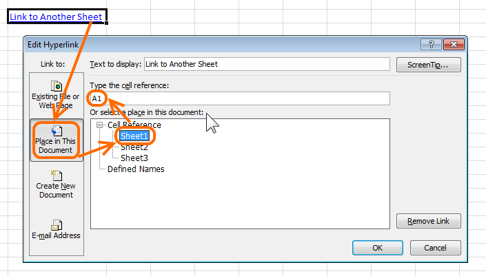
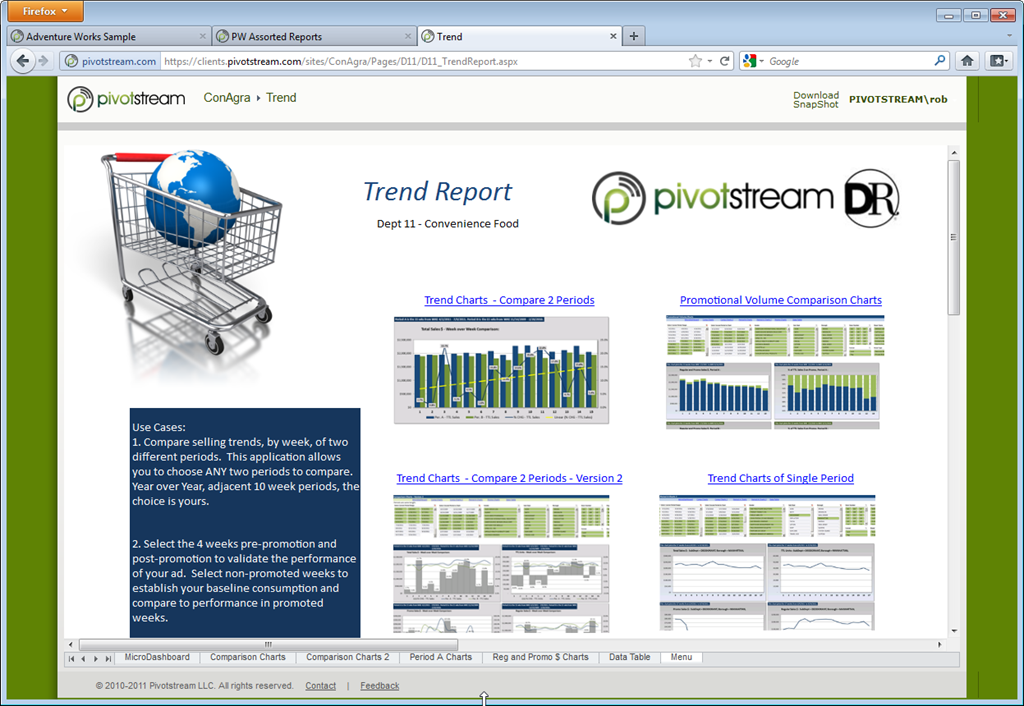
This lets you create menu sheet like the AdventureWorks sheet above, as well as this one at the beginning of the post:

Cool huh? Those chart thumbnails are IMAGES. The hyperlinks above them take you to the full-page interactive sheets that host each of those chart views.
Formatting Macros
I have a number of macros that help me do some of this stuff, and in an upcoming post I will share some of them, once I have time to organize them a bit.
In the meantime, here’s a real simple one whose intent should be obvious:
Sub HideGridAndHeadersOnAllSheets()
Dim oSheet As Worksheet
For Each oSheet In ActiveWorkbook.Worksheets
If oSheet.Visible = xlSheetVisible Then
oSheet.Activate
ActiveWindow.DisplayGridlines = False
ActiveWindow.DisplayHeadings = False
End If
Next
End Sub
How many of you use macros, by the way? I’m really curious. Drop me a comment if you would and just say yes/no. I will also put up a survey at some point if I get industrious.
Conclusion
I know that not everyone who has embraced PowerPivot for Excel has started using PowerPivot for SharePoint yet. That’s changing, but it takes time.
For those of you who are starting that transition, I’m very excited for you. I know it sounds weird. But you cannot appreciate how much more impactful your work “feels” as a web application until you see it in action. And this post is aimed at helping you reap that benefit.
For those of you who are yet to start down that path, file this one in the back of your mind for later.
Get in touch with a P3 team member