As a ‘water cooler’ of sorts for this community, we meet some amazing people. Patrick Mahoney has been inspiring his local community to leverage modern excel and shares with us a really useful technique to create a dynamic dimension table using Power Pivot and Power Query.
One of my colleagues and I have been geeking out the last few years over all things Power (Query, Pivot, View, and now BI). We have made slow but eventual progress on getting people we work with to learn and leverage these powerful tools. We finally have some that get the basics, like using unpivot columns routinely in their queries and not overusing calculated columns (“Rows before Co-s”, I always say), and have created some common resources for our new local community. I suggested one of these to Rob as a potential P3 Adaptive article, and he said “yes” (how cool is that?).
We all use Date/Calendar tables routinely. And what is a Date table but a flexible table of pre-populated columns (calculated with M and/or DAX) that brings some useful time structure to your model? If you build models from multiple transactional systems that contain either the Employee ID or Logon ID of the person doing the transacting, it is also helpful to have a shared common People Table (flexible and pre-populated columns that brings a useful organizational structure to your model) that your fellow PowerPivoters can use. If you work in IT, perhaps you could make this available as a web service or can connect to the database directly, but most may have a report that can be exported/refreshed monthly that has a list of all employees with those IDs, along with other organization/people details (Employee Name, Supervisor, Department, Job Level, Location, Building, etc.).
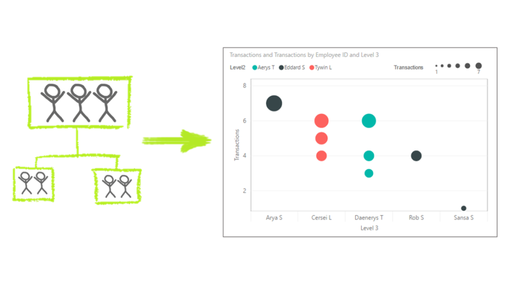
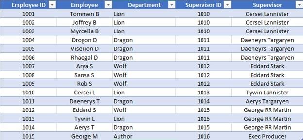
Consider the partial potentially familiar example “organization” below.

Although this is not a true org chart (we know each person’s immediate “supervisor” only), it is straight forward with the PATH() function to generate a virtual org chart, by adding some calculated columns. The PATH() function in this case iterates through your table building a string showing supervisor/employee relationships all the way up the chain (delimited by the pipe symbol ‘|’), as shown in the Path column below. From this Path string, we can generate the calculated columns Level1, Level2, and Level3 that show the management names for the Employee in each row that can be used in slicers, visuals, etc. (see below for the DAX expressions).

If a Supervisor’s name exactly matched one in the Employee field, we would just use those two fields in the PATH() expression; however, in this case, the Employee ID and Supervisor ID fields must be used. Note that the “supervisor” of the boss (ID=1015) is not in our list of employees, which generates a PATH() error; however, we can fix that with a new calculated column with an IF() statement to have the top person in the organization (usually the CEO, but Author in this example) report to themselves. You could work this correction and PATH() into the same column/expression, but here it is done in two steps/columns.
Now that we have the string of Supervisor IDs in each person’s management chain, we need to add more columns to look up the Supervisor Name for each level in the organization, using LOOKUPVALUE() and PATHITEM(). The PATHITEM() picks the ID out at the specified position, and we use LOOKUPVALUE() to find the name for that ID from the Employee column. Here are the DAX expressions for the calculated columns described above.
New Supervisor ID = IF ( COUNTROWS ( FILTER ( People, People[Employee ID] = EARLIER ( People[Supervisor ID] ) ) ) = 0, People[Employee ID], People[Supervisor ID] )
Path = PATH ( People[Employee ID], People[New Supervisor ID] )
Level 1 = LOOKUPVALUE ( People[Employee], People[Employee ID], PATHITEM ( People[Path], 1 ) )
Note: Replace the “1” in PATHITEM() with “2” and “3”, for the last two columns
Since we want this to be a source for multiple data models and files, we need to load the data into a table. If we chose to only load into a data model (Connection Only), the desired data would not be available when we “Get Data” from this workbook. I wasn’t sure the calculated columns would be there at first with Load To… Table (vs. just the query columns), but was relieved when they showed up. Now, when you “Get Data” from your People file, your new People Table is available.
Now that we have a People Table, we can use it. Here are the first rows of a fictional fact table showing order status changes from a transactional system that includes an Employee ID column.

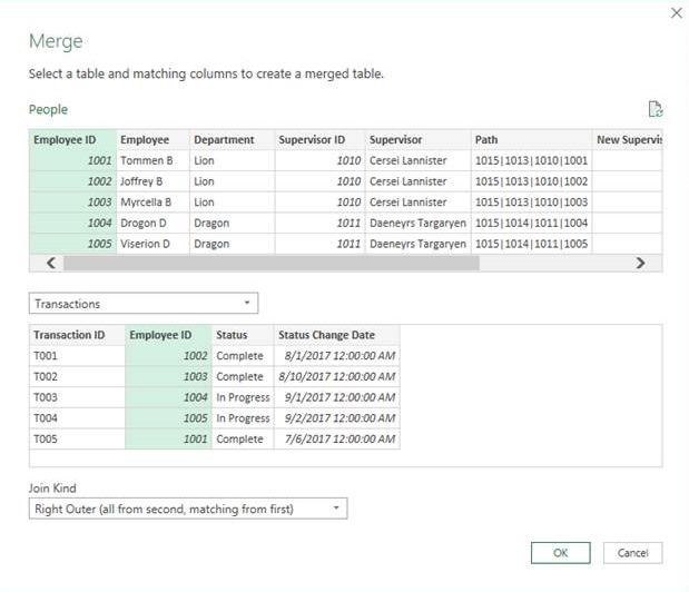
When you bring in the People data to a new model, you often won’t need the entire long list. For example, the transactional system may only used by a small subset of employees. In these cases, you can use a join in the query to only bring in the People rows that match a Logon/Employee ID in the current dataset (similar to adjusting the range of your Date table for the given dataset). In your People query, just do a Merge with your Transactions query with either an Inner Join or Right Outer Join (shown), and then just remove the Transactions column filled with all those “Table” values you see (we don’t need it; remember, we just merged so we could eliminate those extra People Table rows).


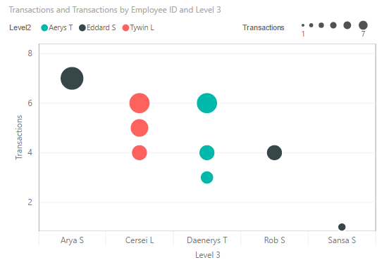
Once the People data are in the model as a dimension table, it’s all downhill from there. You can use the organization/employee metadata fields (Department, Location, Job Level, etc.) or the calculated columns for each Level (drill down through the organization hierarchy is usually a crowd pleaser). I have been liking the Dot Plot Custom Visual by MAQ Software lately, as you can display lots of information concisely; here is the count of transactions for each employee by Level 3, color coded by Level 2 in the organization.

You can spice up the visualization even more by adding in other dimension tables. For example, if you work on a multi-building campus and your People table includes building numbers, you can also add a dimension table into your model with the GPS coordinates for each building and create map visuals over the campus map. I’m sure we aren’t the first to make new friends across the company, trading help with Excel/Power BI for new data for our models. Note: you may need to convince your facilities department that you aren’t planning a missile strike or something before they give you the GPS coordinates for each building.
And while you’ll usually work with the most recent People file, it comes in handy to keep the past files, too. Security access reviews are a breeze when you can quickly see if people have changed jobs/departments and no longer need access, for example. And you can generate some interesting HR metrics for your company (hires/exits, new to/left a given department, level changes, job changes, supervisor changes, etc.). I got some help on these last measures from the Power BI community to get them right and performant (basically a slowly changing dimension (SCD) exercise on an ever-growing table, which is beyond the scope of this article and has been covered by much better DAXers than me).
I hope the concept of a locally shared People Table is helpful to some of you. Thanks to Rob for letting me be a temporary “pro”. And thanks to my powerpivot colleague, Kevin Overstreet, for reviewing this and suggesting the title.
Forget bending spoons with your mind – there’s no money in it.
It takes a special kind of mindset to “bend” data (and software!) to the human will. As this article demonstrates, we at P3 Adaptive can twist Power BI into a pretzel if that’s what an organization needs. (A robust, trustworthy, industrial-strength pretzel of course).
The data-oriented challenges facing your business require BOTH a nimble toolset like Power BI AND a nimble mindset to go with it. And as Val Kilmer / Doc Holladay once said, we’re your huckleberry.
Get in touch with a P3 team member