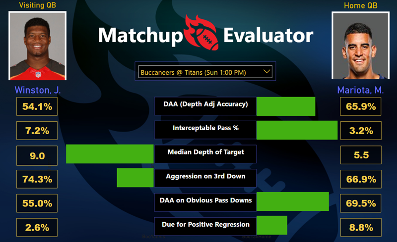
The Desired End Result: Compare Two Entities in a Specific Visual Style
(Used here for football QB’s, but perhaps useful in other “head to head” comparisons – products, ad campaigns, etc.)
Setting the Stage: a “Risk”
This is one of those things where I spent a lot of time figuring out how to do something non-obvious. And hey, that’s usually a good thing to share! Keeps others from burning needless time, pushes the envelope a bit, inspires “riffs” and improvements on the core idea, etc.
But there is ALSO the risk that there was a much easier way to do this, in which case I will end up feeling a little bit silly when the avalanche of comments come in starting with the phrase “why didn’t you just…”
I gladly accept that risk! While the rest of my company LONG ago moved 100% into the Power BI environment, I still clung to Excel, muttering things like “cold dead fingers.” But this recent project has given me a REASON to embrace the Power BI report canvas. Besides, hacking the Excel environment and “inventing” new things was always one of my favorite things about Excel in the first place. So I’m kinda thrilled to be learning the same sort of “knack” in another, highly-capable environment.
Let’s proceed.
The Inspiration
For years, I’ve been seeing infographics like these in the sports world, and since I’ve been working on a sports-themed Power BI project, I thought I’d give it a shot:

A Collection of “Tale of the Tape” Infographics From the Sports World
Some notes on each:
- Courtesy of the Brisbane Lions – I don’t like this one much. SUPER hard to compare the length of bar charts when they’re not lined up on the same axis. Plus, I want a data-driven image to appear for each entity.
- Courtesy of Steel City Underground – Much easier to compare the length of bars. BUT these kinds of infographics only work if you can toggle the colors to match the entity, and that seemed a bit too difficult in my circumstances.
- Courtesy of CBS Local – Side by side like this, I can set an arbitrary color to represent left vs. right, sidestepping the colors issue of #2. And the midline where the scale “tips” toward one entity or the other is… better than #1 in terms of visual comparison, but… still not great.
- Courtesy of Daily Motion / Glory – I have some issues with this one too – being older is not usually an advantage, for instance, and the bars are pretty small relative to the rest of the image, BUT I absolutely DO like that the bars essentially display the delta between the two entities.
So I’m aiming for something like #4.
A (Necessary?) Disclaimer About Visual Clarity
Yes, I know that NONE of the infographics above is a scientifically “good” comparison tool. Too noisy, too flashy, not clean… but every now and then you DO need to cater to your audience. Engagement is the first step in the comprehension funnel, and in this particular example, yep, I’m trying to capture the eyeballs of an audience that likes this sort of thing. The style of #4 is a decent compromise in this case. Know your audience.
First Step: Explore Custom Visuals
Your mileage may vary, but my experience with custom visuals
- Browse the gallery, find 2-3 promising candidates.
- Choose the one that seems likeliest to work.
- Burn 30 minutes on it before finally giving up, and talking myself into trying one of the other candidates.
- Repeat steps 2 and 3 before giving up on custom visuals entirely.
Yes, there ARE some pretty solid custom visuals that I use frequently. Chiclet Slicer by Microsoft and Sparkline by OKViz are two examples. But most times I stray into new territory, I burn a lot of time with nothing to show for it.
This time was no different. I did not find a visual that just “did” the two opposing bar charts for me, but I did burn some time before giving up.
Second Step: Realize I Can Probably Just Use Bar Charts
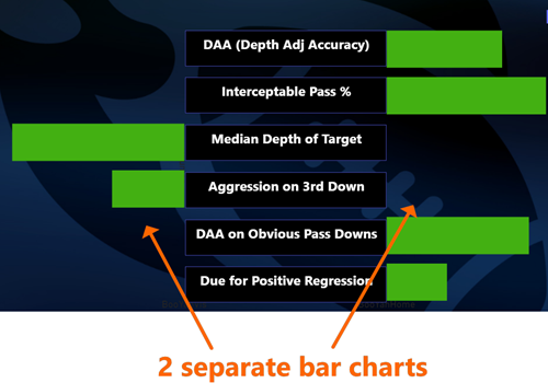
Yeah, two bar charts – one for Visitor (the entity on the left) and one for Home (the entity on the right).
OK, but it IS a bit tricky…
- Each chart needs to “listen” to a different slicer – otherwise they will both be showing the same thing.
- Each chart should display nothing when the other entity has a superior value on that measure.
- The length of each bar should be proportional to HOW MUCH BETTER that entity is. Small advantage, small bar.
- And obviously, we need the left side bar chart to display “right to left” rather than the default left to right direction.
The Slicer(s)
In MOST cases, I think you’d put two slicers on the report – one for the left entity and one for the right. And then the user is free to compare ANY two entities of their choosing.
And that would require two separate tables – one to populate each slicer – otherwise your selection on one will drive the other slicer to match, and you’ll always be comparing a single entity to itself.
In my case though, I don’t want to let the report user arbitrarily select two different QB’s. I want them to see which QB’s are going head to head THIS week!
So I can get away with a single table… with a twist.
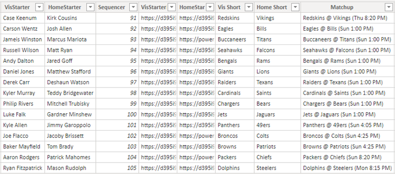
DimSchedCurrentWeek: This is My “All in One” Slicer Table
I am not going to get into how I constructed this table, or how it updates each week, because it’s too specific to my particular data sources to be terribly helpful.
What you DO need to know, however, is how it relates to my data/fact table…
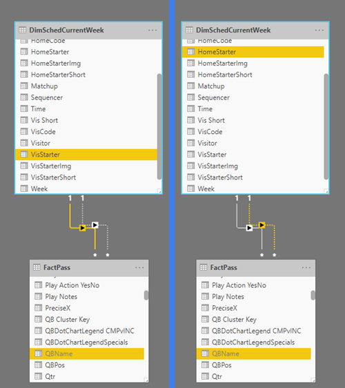
My Slicer Table Has Two Relationships to my Data (Fact) Table: One Inactive by Default
OK, and to make things SUPER clear, here’s how it all ties together…

1) [Matchup] column is used to populate the slicer
2) When a slicer selection is made, by default that filters the FactPass table to the [VisStarter] QB.
3) But if the inactive relationship is activated instead, FactPass will get filtered by the [HomeStarter] column.
OK…
Pairs of Measures: One “Normal,” One with USERELATIONSHIP
In the previous image, you’ll notice that [VisStarter] from DimSchedCurrentWeek “owns” the default relationship to the FactPass table.
So whatever “normal” values we have in our model, we can use those to represent the Visitor (aka the Left-Side Entity).
So for instance, here’s an existing “normal” measure from my model:
Depth Adjusted Accuracy% =
DIVIDE([Sum of Something],
[Sum of Something Else],
“N/A”
)
It doesn’t matter what those SUM measures (the inputs to the DIVIDE) do – I’m just showing you that this is a pretty standard arithmetic measure.
And that measure will evaluate for the Visitor QB (left hand entity in the report) by default, since my default relationship selects for the Visitor.
But what about Home QB? We need to define a new measure for that right-hand entity:
HOME QB Depth Adj Accuracy% =
CALCULATE([Depth Adjusted Accuracy%],
USERELATIONSHIP(
FactPass[QBName],
DimSchedCurrentWeek[HomeStarter]
)
)
Yep, just take the original normal measure, and deploy the USERELATIONSHIP function to “activate” that other (inactive) relationship – the one which “flows” from the [HomeStarter] column (rather than from [VisStarter]).
I need to do define a USERELATIONSHIP measure for each quantity I want to use in my infographic, but I’ll spare you the repetitive formulas and just show you that I have six of them:

Six USERELATIONSHIP Measures
Is that it? Heh heh, not quite.
Nope. If that’s all I did, I’d be headed down the road toward THIS sort of result:

This is NOT What I want.
Remember, I just want the “superior” entity to have a bar, AND the length of that bar to be proportional to the magnitude of that entity’s advantage.
So first, let’s subtract the default measure (Visitor, left hand entity, which owns the default relationship) from the USERELATIONSHIP measure (Home, right hand entity)…
Delta Matchup DAA = [HOME QB Depth Adj Accuracy%] –
[Depth Adjusted Accuracy%]
This will return a positive value when Home is “better” (since higher numbers are better for Accuracy), and a negative if Visitor is better.
Of course, I need all six of these too…
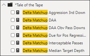
Six of These Subtractive Measures, Too
Subtleties in those Delta Measures: Flipping the Sign & Scaling
Of course, SOMETIMES smaller numbers ARE better. Like… Interceptable passes. Those are bad. You want smaller percentages there.
So for THOSE measures, you need to flip the sign, and I do that by multiplying by a negative value…
Delta Matchup Interceptable Passes =
-4*(
[HOME QB Interceptable Pass %] –
[Interceptable Pass %]
)
Why multiply by –4 instead of –1? Well, the “scale” of the Interceptable measure is small – down around 5% on average, whereas Accuracy tends to be much higher, in the 60-70% range, and that made Interceptable look like “no big deal” by comparison – which is NOT true! Via trial and error, I found that multiplying the delta by 4 put this on a reasonably-comparable scale to the deltas in Accuracy.
“OK… NOW You’re Done, Right?”
Oh my sweet Summer child. No, I am not, but getting close.
Guess what happens when you place multiple measures on a stacked bar chart? Yeah, not what we want for Tale of the Tape!
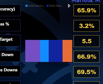
Multiple Measures on a Stacked Bar Chart – Yep, they Stack.
(And we want them laid out as separate bars in parallel)
OK, so we need to introduce some phoney-baloney Axis column…
We Need… a Disconnected Table!
Woo woo! We’re going for Bingo here! Or Yahtzee. Or something. Lots of micro-techniques in this macro-technique!
That’s right folks it’s time for a disconnected table – so we can “trick” the bar chart visual into displaying our measures as separate bars.
Disconnected Slicers/Tables will always have a special place in my heart. Click here for a list of the many relevant articles penned on this site over the years, in fact.
I suggest using the friendly little “Enter Data” button on the Home tab of the Power BI ribbon:
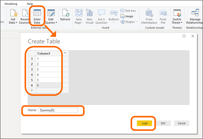
I Named my Table “DummyDC” and Entered the Values 1-6 for [Column1]
I don’t need anything fancy – just a six-row table. Why six? Because I have six measures I want to use in my visual. You may need a different number of rows.
Once I have THAT in my model, I then add a “branching” measure – one that disguises the fact that I’m using six different measures…
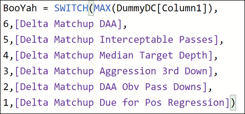
Depending on the “Selected” Value/Row of My DummyDC Table,
This Branches into My Six Delta Measures
Why did I call this measure “[BooYah],” you ask? Well, I tend to do that when I’m nearing the end of some long-running magic trick. Gotta keep the enthusiasm up, and what better way to do that than naming measures in a celebratory fashion? OK fine… in a production environment you’d want this to be named more descriptively. But this is my own personal passion project so… [BooYah] it is!
ONE MORE THING!
Remember that whole “don’t display the value for the inferior entity?” Well, I need some IF action for that, so I create two more measures…
BooYahHome = IF([BooYah]>0,[BooYah],0)
BooYahVis = IF([BooYah]<0,[BooYah],0)
Get it? If [BooYah] is negative, Visitor is “better,” so [BooYahVis] will display it. And if positive, that means Home is better, so [BooYahHome] will display it. Otherwise, each measure returns 0 so that we can an “empty” bar in the bar chart.
Set up the charts!
Phew! Ok, now to set up the visuals…
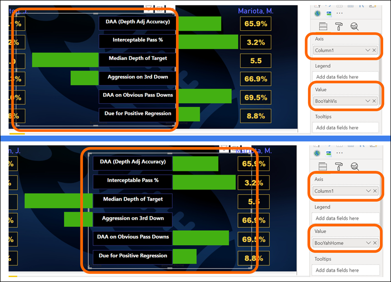
[BooYahVis] on Left, [BooYahHome] on Right.
(Both Charts Use DummyDC[Column1] on Axis).
Notice how each chart overlaps underneath the labels in the center? Yeah, I had to do that in order to make the 0-axis align with the edges of said labels.
The rest of the setup is pretty simple…
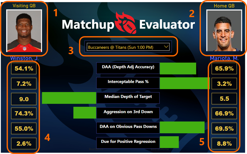
See Below for Explanation of Each
1) and 2) – these ARE actually custom visuals! Image by Cloudscope. They use separate columns from DimSchedCurrentWeek, URL columns for the Vis and Home QB respectively.
3) This is just the built-in Slicer visual. Set to Dropdown of course.
4) and 5) – each of these are groups of individual Card visuals. I tried using Multi-Row Card but couldn’t get it to line up properly. These Cards each display the two families of original measures. For example, [Depth Adj Accuracy%] on the left and [Home QB Depth Adj Accuracy%] on the right, etc.
The labels in the center are just text boxes.
And EVERY “real” visual on here “listens” to the dropdown slicer of course.

Whatcha think? I now await the dreaded “why didn’t you just…”
Get in touch with a P3 team member