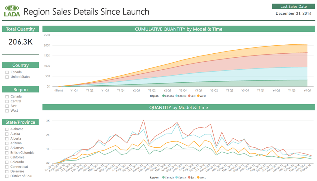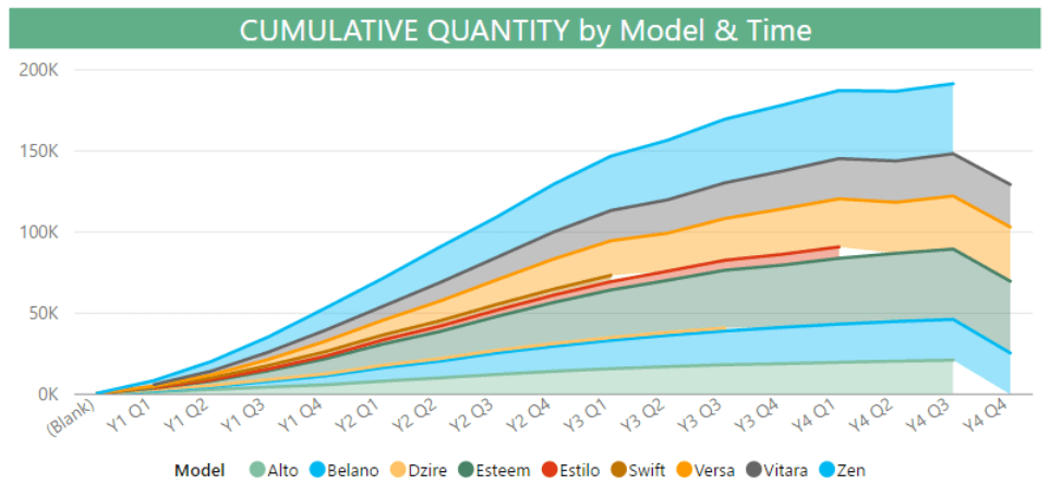

Reports Without Direction Can be “Noisy”
Welcome back readers, to another chapter in the DAX Reanimator Series! The post I’ll be re-envisioning today is one I’m very excited about. It’s an article that does some really cool magic using DAX, business logic, and a clever model design. It showcases a problem and solution that I think a LOT of companies experience. Frankly, if you sell a product or service, good chance you want to know how successful it is after launch.

Let’s Reinvent The Idea of “Time”
Sounds simple enough! We’d just write a DAX Measure to look at that product on a graph over time right? Well that’s where some complexities come in…because the launch of each product started at a different point in time. So placing sales data onto a graph with a date field would result in us comparing apples to oranges, since most product didn’t launch at the same time.
So the clever solution would be to create an artificial time perspective starting from the product launch date. With the launch date being the point-in-time for the release for a given product. Think of sales from product launch as a race, well now we’ve just put everyone on the same starting line. Still with me? Good, because we basically just became time ninjas!

What I Imagine A Time Ninja Would Look Like:

“I Made This!” ~ A Time Ninja – AKA Cumulative Sales by Launch Period:
Highlights From The Original Post
The original post was written by us back in 2014, and can be found here. It’s original intent was to showcase the power of (the now retired) Power View. For those unfamiliar, Power BI Desktop is basically the spiritual successor and evolved form of Power View. The article does a bang up job of explaining all the concepts to of this model, and then walks you through all the steps needed to create your very own version. All of those steps can be transferred into a Power BI Desktop workbook, one of the beauties of the Power BI Desktop!
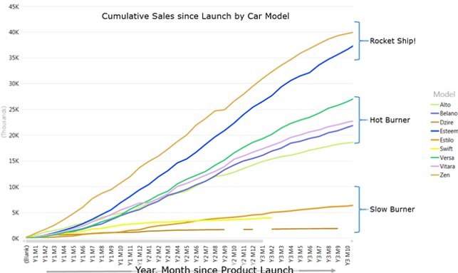
The post also references the coined terms for success rate buckets, originally conceived by some clever folks over at Tableau. They grouped success rates into three categories: the Rocket Ship, the Hot Burner, and the Slow Burner. These categorizations were originally from Tableau’s Tale of 100, and it is an article I would say is worth reading for the intellectually curious. It provides some cool analysis and charting when looking at how fast successful tech companies grow.

Example of the success buckets from the original post:
I want to also give one shout out to our colleagues over at SQLBI. They provided the Cumulative Total DAX formula we modified in the original post. It’s a link I’ve had bookmarked for YEARS, and has some wonderful DAX formulas and explanations. You can find more info about it either in the original post, or at the SQLBI link. Now with that said, here’s the Power BI embedded report! Enjoy, and until next time P3 Adaptive Nation.
Get in touch with a P3 team member