We are back to finish our discussion on the visualizations for Comparing Rows in Power Query!
How to visualize the prices and daily changes
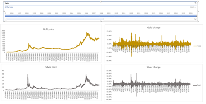
The two metals have very different price ranges so it is difficult to see them in one chart. The daily changes are relative so they can be used to compare the price behavior over long periods of time.
I decided to use four line charts, two for gold and two for silver.
The main tool to drive historic exploration is the timeline slicer (which was added to Excel in 2013). In this case, it is just what the doctor recommended.

This is our starting point. We have fifty years of data and we plot it in four pivot charts all connected to the timeline. Each pivot chart is connected to a pivot table and all pivots are in a separate sheet that can also be hidden. In the Insert tab, you can see an entry for insert pivot chart that is supposed to add a pivot chart without a pivot table.
For some reason, it works only if the pivot is based on the data model and not in our case where all pivots are based on a table. Weird I know.
Now I need to build the pivots one by one. I add a pivot chart to each from the design tab and move the charts to their own sheet. I decided to place them with gold on top and silver at the bottom. I could also have placed prices on top and changes at the bottom.
Notice the very subtle color selection for the charts
The most important element is the timeline slicer that occupies the entire upper part of the canvas.
It starts by showing the entire 50 years. We can use the charts on the left to identify ranges that contain extreme fluctuations and let’s assume we want to investigate them.
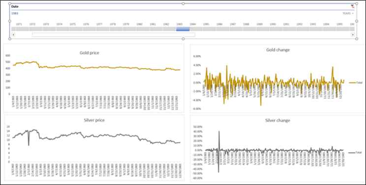
Here is an example of the year 1983. By selecting 1983 I can see the days for just this year.

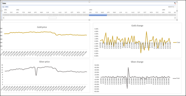
We can see a huge up and down spike in silver prices around February of this year.
Now we can change the timeline to use months and select January to March.

If we choose to we can switch to days and traverse this very long time span following the data.
What about Power BI?
I tried to recreate the workbook using Power BI instead. The query could pretty much be used as is. The only change was that I connected it to an external Excel workbook, instead of an Excel table in the same workbook (It is a best practice to do so, even with Excel).
I am not using any DAX, so the logic is still implemented in the query. The charts do look a bit nicer. Not trying to show 365X50 days in the x-axis helps. The slicer on the years is not quite as flexible as in the Excel version. There are some custom visualizations for Power BI that support time hierarchies, but I didn’t try them out with this dataset.
I used the same type of charts as I did in the Excel workbook, but I invite our readers to come up with a better visualization in PBI. You can download a .zip with all of the files here.
Where It’s At: The Intersection of Biz, Human, and Tech*
We “give away” business-value-creating and escape-the-box-inspiring content like this article in part to show you that we’re not your average “tools” consulting firm. We’re sharp on the toolset for sure, but also on what makes businesses AND human beings “go.”
In three days’ time imagine what we can do for your bottom line. You should seriously consider finding out 🙂
* – unless, of course, you have two turntables and a microphone. We hear a lot of things are also located there.
Get in touch with a P3 team member