
“Who are YOU, who are so WISE in the ways of SCIENCE?”
It’s all about following through…
In a recent post I covered a very simple scientific scenario. It was an interesting diversion from the normal biz-style scenarios but it left me feeling hollow in two ways. First, it was too simple and didn’t account for the possibility of multiple different treatment types, so I pinged the Italians. (They responded, as they always do, and I owe a post on their reply, probably Thursday).
But the other problem was that, while claiming to be a scientific scenario, it was manufactured by me, and hey, I’m no scientist. Then it hit me…
Hey! My Neighbor is a REAL Scientist!
Yeah, Dan Wesson is a “he-runs-his-own-research-lab-at-the-university, is-published-in-prestigious-science-journals” kind of scientist. So I decided to bounce the question off of him – was my example scenario at all useful, and if not, what WOULD be useful? Boy, am I glad I asked.
Perhaps My Favorite PowerPivot Visualization Yet
Click for Full Size!
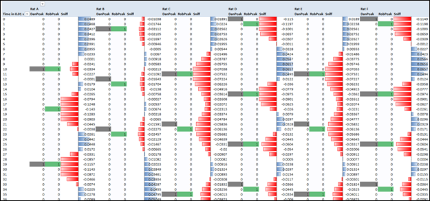
First of all, HOW COOL IS THAT? It looks like the double helix or something. I joked with my wife that I was gonna have it turned into an eight-foot mural for the dining room. (Yeah, I was joking sweetie. Totally joking, I would never do something like that).
What do the Values Mean?
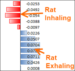
These are measurements of respiration taken from rats in Dan’s lab. Negative values indicate “inhale” and positive indicate “exhale.”
Each value represents one-one-hundredth of a second – how’s that for time intelligence?
What Does “Peak Detection” Mean?
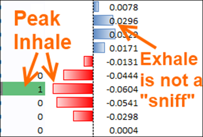
In order to make sense of the data, Dan needs to measure the frequency of how often the rats “sniff.” Sniffing is an indicator of all sorts of things apparently – a sign of interest, a sign of cognition, a sign of dominance… I had no idea.
Anyway, he needs to measure the number of “sniffs” the rats take in a given time frame, and in order to do that, he needs to count the negative peaks in the breathing data:
PowerPivot Can Do This? Yes, Better Than the Professional Tools!
I went into this mostly expecting that PowerPivot was not going to be a good tool for his needs. And as usual, PowerPivot surprised me.
Not only can PowerPivot do this, it outperforms expensive specialized software. Software that is designed to do precisely this task. Let that sink in for a moment:
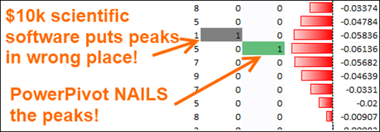
$10,000 Specialized Scientific Software Often “Misses” the Peaks,
PowerPivot is Dead On
How Did I Do It?
It actually wasn’t that hard.
Given a data set like this with 180 thousand rows:
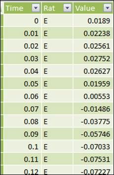
Six Rats’ Breathing Measured 100 Times per Second for Five Minutes
I needed to generate a 1/0, True/False column identifying whether a given row was a “sniff” peak.
I ended up creating a TimeID column so that I could work in integers:
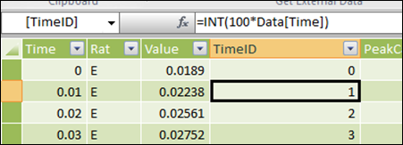
Multiply by 100 So I Can Work in Integer Time Increments
And then I wrote the following calc column formula:
[IsPeakCandidate]
=IF(OR([TimeID]=0,[value]=0),0,
IF([value] > 0,0,
IF(
AND(
CALCULATE
(MIN([value]),
FILTER(ALL(Data), Data[Rat]=EARLIER(Data[Rat])),
FILTER(ALL(Data),
Data[TimeID]=EARLIER(Data[TimeID])-1)
)
>[value]
,
CALCULATE
(MIN([value]),
FILTER(ALL(Data), Data[Rat]=EARLIER(Data[Rat])),
FILTER(ALL(Data),
Data[TimeID]=EARLIER(Data[TimeID])+1)
)
>[value],
)
,1
,0
)
)
)
What is that formula doing?
Ok that looks complex. But all it’s doing is asking three questions:
- Is the CURRENT row’s value less than zero?
- Was the PRIOR row’s value greater than this row’s value?
- Is the NEXT row’s value also greater than this row’s value?
If all three are “yes,” then this row represents a negative peak.
Flaw: A “Hiccup” Becomes a Peak
Unsurprisingly, it turns out that formula wasn’t quite good enough:
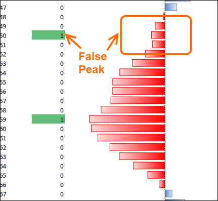
In Basketball This is Called This a “Pump Fake”
(In American Football, a “Juke,” in Hockey, a “Deke…”)
So I added another calculated column:
[MinOverInterval]
=CALCULATE(MIN(Data[value]),
ALL(Data),
FILTER(ALL(Data),
Data[Rat]=EARLIER(Data[Rat])
),
FILTER(ALL(Data),
Data[TimeID] <= EARLIER(Data[TimeID]) +5 &&
Data[TimeID] >= EARLIER(Data[TimeID]) –5
)
)
For each row in my data that calculates what is the minimum value over an 11-row interval – five rows before, five rows after, and the row itself:
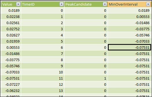
MinOverInterval: The Smallest Value in the 11-Row Window
One Last Column!
Then, tying it all together, the last calc column is this:
[IsRealPeak]
=IF(
AND(
Data[PeakCandidate]=1,
Data[MinOverInterval]=Data[Value]
)
,1,0
)
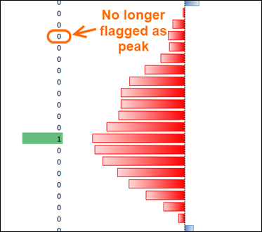
This column says “if this row was flagged as a peak candidate already, AND it is the most negative row in its 11-row interval, then we bless it as a REAL peak row.”
And if I use that column instead, that fixes the false peaks:
Some Final Notes
First, I suspect that I can simplify my calc columns a bit. There was some exploratory trial and error in this process and it might be that the “MinOverInterval” test is ALL I need, since there’s no way a row can be its minimum in the interval and NOT be more negative than its immediate neighbors.
But hey, I wanted to get this post out ok?
Second, yes, these calc columns are something I’d ideally want to have done in a database. But since I want to give Dan a completely self-contained toolset, I had to do it in calc columns.
Lastly, this “peak detection” is NOT the end of the road! Far from it. It’s just the beginning. Now that we have a reliable “peak flag” column in our data, we can start doing the normal PowerPivot thing – measures of frequency, slicing by properties of the rat itself (age, sex, etc.), properties of the trial…
So I expect Pivotstream will be doing some real work for Dan’s lab, helping support his Alzheimer’s research. All starting from a quick conversation in Dan’s backyard over the weekend. How cool is that?
Get in touch with a P3 team member