
Do YOU Want To Be A Report Superstar?
Hello again P3 Adaptive nation, today I’d like to drop some reporting knowledge. I’m going to share some of my best practices for Power BI Reporting I’ve developed over the years. As many of you are aware, a large part of the BI developer’s / analyst’s job is to not only create the report, but also to make sure it looks good, tells a story, pops, or my personal favorite “is aesthetically pleasing”.
I decided to sit down and come up with a list of techniques that I use in EVERY Power BI report I create. I want to share this list back with you, our community. While obviously subjective, I think…(hell, I KNOW) you’ll find some of these these useful in adding some finishing touches to help bridge the gap between a good report…and a GREAT report.
 Can You Spot ALL The Differences?
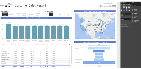
I’m going to use this opportunity to shamelessly direct you to a previous post of mine (and Rob’s), DAX “Reanimator” Series, Episode 1: Dynamic TopN… I’ll be using the report from that post to showcase the best practices I like to apply to ALL my reports.
That previous post talks about some pretty cool techniques on how to utilize disconnected slicers. Specifically how to create Dynamic Top N slicers for tables, and how to select a value by which to filter with. If you haven’t already I’d recommend checking it out.
I’ve captured the report in two screenshots below, a before and after if you will (if Power BI Makeover could be a reality show, this would be it). Anyone remember those Spot The Difference sections in the back of the Magazines growing up? Well this is like that, except way cooler! I’ll go ahead and say that you’ll be able to spot the first four differences fairly easily. If you can find all FIVE differences however you’ll get…well nothing really. But hey, you can feel accomplished because that last one is hard to spot!
Customer Sales Report BEFORE Applied Changes:
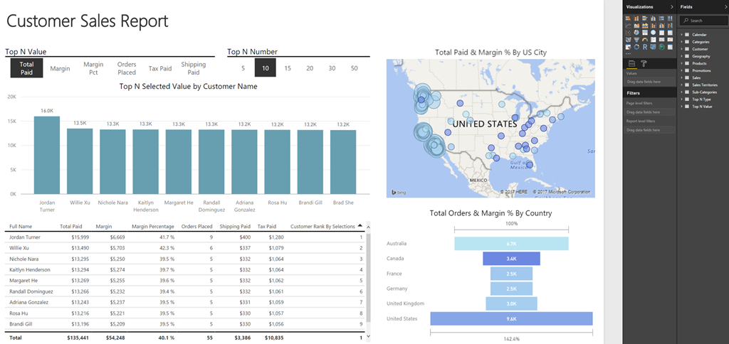
Customer Sales Report AFTER Applied Changes:
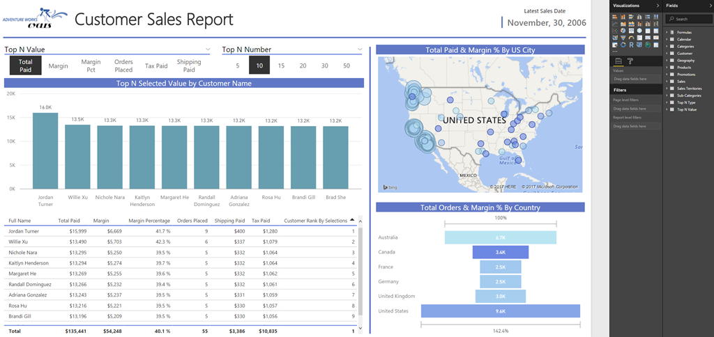
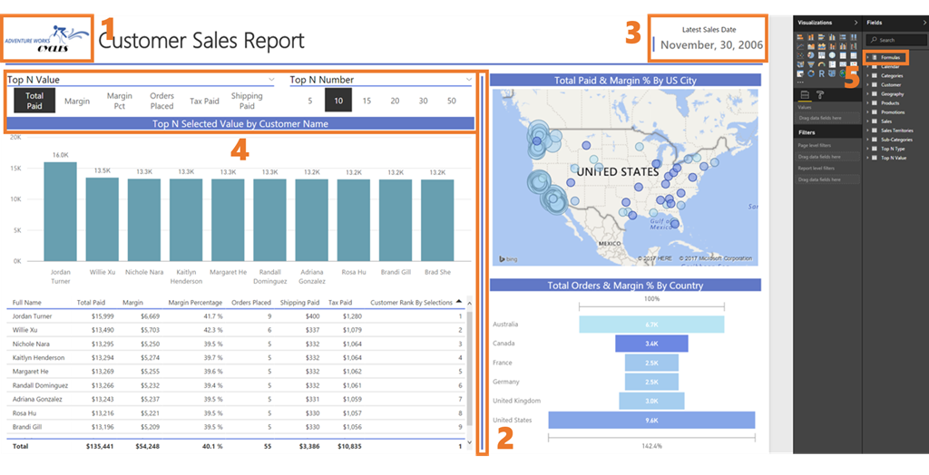
Did you get all five? Ok ok review time, I know most of you didn’t come here to play iSpy for adults. The five best practices I implement in every report are as follows:
- Company logo
- Lines to help divide sections of the report
- Data timestamp to show how recent the refresh was
- Report formatting
- Dedicated DAX measures table (BONUS POINTS if you found this one!)
Let’s take a look at the highlighted examples below and see what changes I implemented between the before and after photos:
A Little Design Magic Goes A Long Ways
These are all changes that (individually) only add minor improvements to a report, but add them together and it makes a noticeable difference! At the end of the day the customer will notice, and I look for any opportunity to make my reports stand out among the crowd. So let me run you through how I did each in step.
Power BI Design Practice #1) Company Logo

This one is a quick addition to your report and also helps you set the color tone for other objects. Under the Home tab in Power BI Desktop you’ll find an image icon that will let you add an image from a file on your computer. My personal preference is to add it to the upper left corner of the screen next to the report title.
Power BI Design Practice #2) Divider Lines

I’m ashamed to say I found ZERO use for the shape button the first year I was developing Power BI reports… One day however, I came across a report that utilized this line shape to create clear separation markers for various parts of the report.
After I saw the line in use I was sold on the concept, I had seen the light and have been using it ever since! I also go the extra mile and typically color it something that’s complimentary to the colors in the company logo. The button to add this is located right next to the image button (previous example).
Power BI Design Practice 3) Data Timestamp
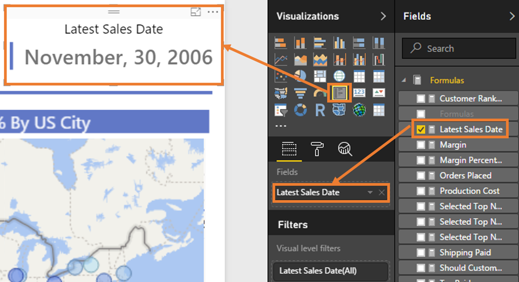
I started adding this into all my reports because I noticed a pattern of report users who kept asking me if or when the report was refreshed. So I eventually figured I should have a way of providing some sort of indicator that told the end user how recent the data was. There’s a few variations to this depending on which DATE field they want you to use, but they basically all use the same simple DAX measure, and then I place the measure into the multi-row card visualization.
Don’t worry, I’ll provide the measure below. I’ll also run though a few formatting tricks I like to apply to this card. My personal preference is to set the bar color to something complimentary to the logo (noticing a theme yet?), center the title (did I just assume it’s alignment?), and change the font color from the default grey (it’s hard to read!) to black.
DAX Formula (see I told you it was simple):

Applying a little bit of formatting polish:
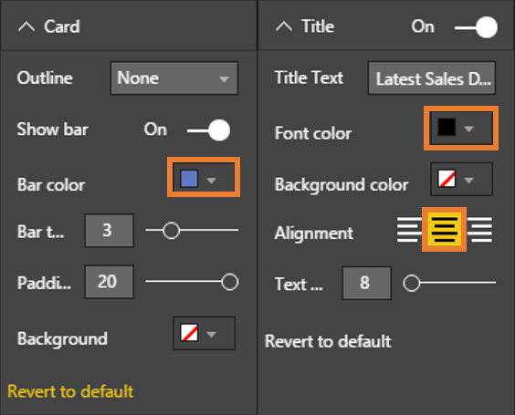
Power BI Design Practice 4) Report Formatting

This is less of a single applied step as it is multiple formatting practices applied throughout the report. I’ve already hit on this subject a little bit in the two previous Power BI visual design practices in regards to using complimentary colors. The two key takeaways in this section are object formatting and color coordination.
Of all my best practices I’m showcasing here I’d say this one is the most subjective. However I think that maintaining complimentary colors goes a long ways to creating a professional looking report. I also have a strong dislike for the default title design for visualizations in Power BI. By default it is left aligned and a grey color (AGAIN…hard to read!). I center that sucker and color the background. An added benefit to coloring the title background is it actually forces me to make sure my objects are aligned, otherwise it is VERY noticeable now if they aren’t.
Last But Certainly Not Least!
Power BI Design Practice 5) Formulas Table

By far one of my favorite hidden techniques of Power BI (AND EXCEL) is to create a dedicated table(s) to store all of my DAX measures. This could be one (or multiple) tables depending on how many measures you have, and how you want to organize them. The ingenious thing too is if you have an empty table, hide the columns, and only have your DAX measures showing in the report view…then Power BI does something MAGICAL.
It will change the icon from a table to the DAX Calculator symbol and put that it at the TOP of your fields list on the right side (regardless of alphabetical order). HOW COOL IS THAT?? Well I geeked out when I discovered this… In case you’re worried that this is complicated to create, it’s not.
Power BI makes the first step INCREDIBLY easy. Unlike Power Query in Excel, Power BI Desktop has a button that lets you create manual tables in your model with a couple clicks and a few keystrokes.
- Simply click the Enter Data button on the home tab, name your column & table, hit load, and boom…it’s in your data model.
- When you first add this to your model it’ll have the normal table icon.
- Assign all your DAX formulas from other tables to this one. Do this by using the Home Table button found under the modeling tab.
- Move all all your DAX measures to your new formulas table.
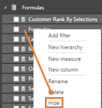
- Once you’ve finished re-assigning all your DAX measures to this table, simply right click on the original formula column from that table, select Hide, then save and close your workbook. This last step is required to see the the table icon change, and for the table to move to the top of the field list. Don’t ask me why closing/re-opening is needed, I wish I knew.
Step 1 – Create The Formula Table:

Step 2 – Newly created formula table:
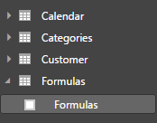
Step 3 – Assigning DAX formulas to the table:

Step 4 – Assign DAX formulas to the table:

Step 5 – Hide the table column:
Before I go though, let me tell you why having a formulas table is so AMAZING.
First off it puts your DAX measures front and center (technically the top?), without needing to dig through all the various tables to find them.
Secondly it forces you to use correct procedure when writing DAX measures. Since keeping measures in this table will require you to reference both the table and column name whenever providing a column reference in a measure. This should be a practice you’re already in the habit of, but if it isn’t then this will force you into it! There’s more details on why this is an important practice in Rob’s post on Five Common Mistakes Made By Self-Taught DAX Students.
Lastly, if for any reason you end up needing to delete a table from your model, the DAX measures won’t get deleted with it since they aren’t attached to the source tables anymore.
There you have it folks, my best Power BI visual design practices. I hope these add as much value to your reports as they have for mine. As always, until next time readers!
EDIT:
So Marco Russo has eloquently mentioned in the comments that there are two issues (currently as of June 2017) when creating a measures table.
First issue is that Q&A does not recognize relationships between measures and attributes in unrelated tables.
Second issue relates to using Analyze in Excel for Power BI. The drill through feature in Excel produces a blank table, instead of the expected data as a result.
If NEITHER of these features are important in your model, then I still stand by the above benefits of a Measures table. Hopefully the Power BI team will continue to make improvements and eventually these issues will go away with a future update.
Get in touch with a P3 team member