By Avi Singh [Twitter]
Folks, May 21st is being celebrated as Red Nose Day across USA. Goal is to have some fun and raise money for children living in poverty. We at P3 Adaptive mix a bit of black humor in today’s post and promise to donate a portion of the proceeds from our upcoming PowerPivot Online Class (Jun 8-9) to Red Nose Day.
For today’s special, we were inspired by the CDC released graph showing distinctive causes of death by state. Not content to stare at a picture, we rebuilt the model from scratch using Power Query, Power Pivot and Power Map. Which lets us slice and dice and visualize the data various ways to our heart’s content.
Our results match closely with that of CDC, slight differences may exist since we use 10 year span from 2004-2013, whereas CDC researchers reportedly used 2001-2010.
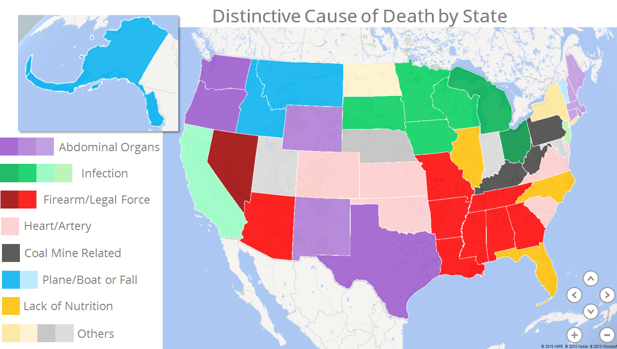
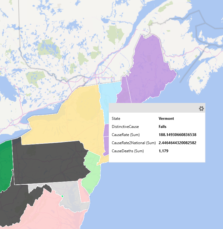
Power Map Rendering of Distinctive Cause of Death by State
Distinctive cause of death
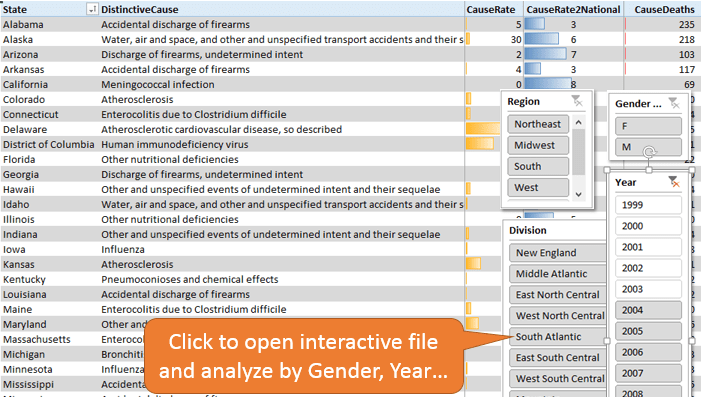
Distinctive Cause of Death by State (Click to see full list)
In the state of Alaska, there were 218 deaths (2004-2013) due to ‘Plane or Boat Accident’ (Listed officially as ‘Water, air and space, and other and unspecified transport accidents and their sequelae’).
Alaska’s 2013 population is listed as 735,132. Thus a crude rate of mortality due to plane or boat accidents, per 100,000 of population is
( 218 / 735,132 ) * 100,000 = 29.7
The national rate for the same happens to be just 4.9. Thus Alaska’s rate is about 6 times higher! In fact, if we look at all the listed causes, ‘Plane or Boat Accidents’ has the largest ratio when compared to the national rate. Thus for Alaska we flag, plane or boat accidents as a distinctive cause of death.
If we do the same for each of the 50 states, there are 24 distinctive causes of death (some apply to more than one state).
Data Journey: Power Query > Power Pivot > Visualization
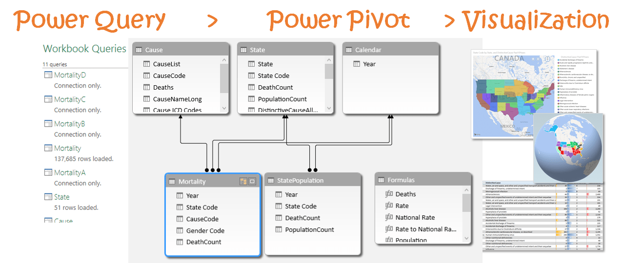
In today’s post, I will give you a tour of the end results and make available, the underlying file. I reserve the right, to come back in a later post to actually explain the steps that I took. Hopefully on a day when I’m not working so late in the night (it’s 2:41 AM and I am still writing…sigh!).
Rough overall steps were:-
– Download data from the CDC website and parse using Power Query
– Model data using Power Pivot, creating relationships and measures
– Visualize the data in Excel, Power View, PowerBI.com, and Power Map
Yes, why not. Once you build the model correctly, building visualizations is nearly free. What an amazing state of things…I feel spoiled rotten.
“Imagine a world where cost of creating new visualizations is near zero!”

Power Pivot data model can drive any visualization tool
I went one step further, than the CDC released graph and attempted to group together the distinctive causes identified for each state. You have seen the high level image above, let me provide a few breakdowns.
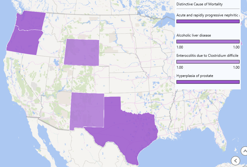
Is Texas really the Tequila state?
Nephrotic Syndrome (Kidney Related) is the distinctive cause in Texas, and it is Alcoholic Liver Disease for neighboring New Mexico.
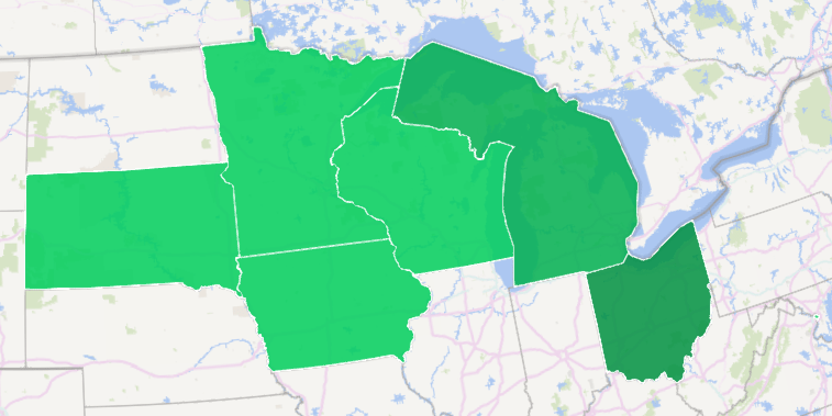
Achoo! Bless you Midwest
Influenza is the distinctive cause across Midwest states of South Dakota, Minnesota, Iowa and Wisconsin. For neighboring Michigan and Ohio it is Bronchitis and Respiratory Infection.
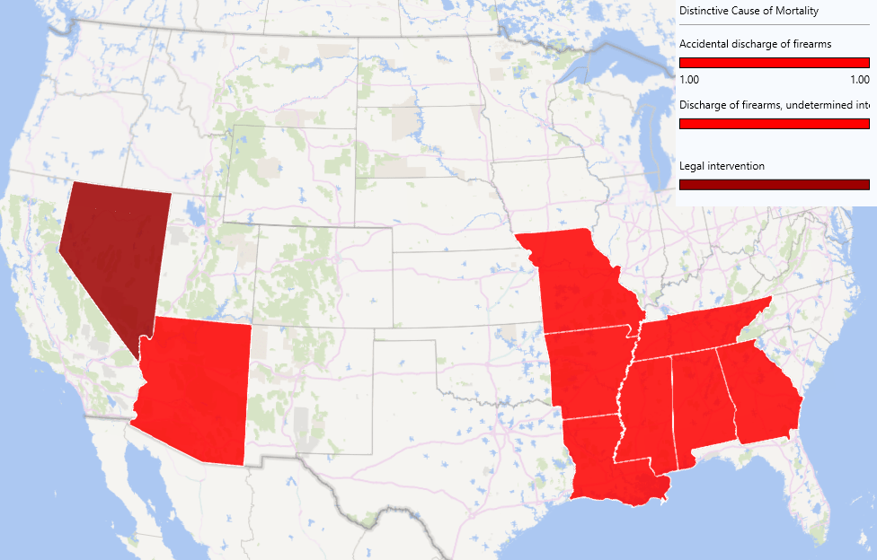
Should South Lock Away Their Guns?
Discharge of Firearms (accidental or otherwise) is the distinctive cause across many southern states and New Mexico. For Nevada, it is Legal Intervention.
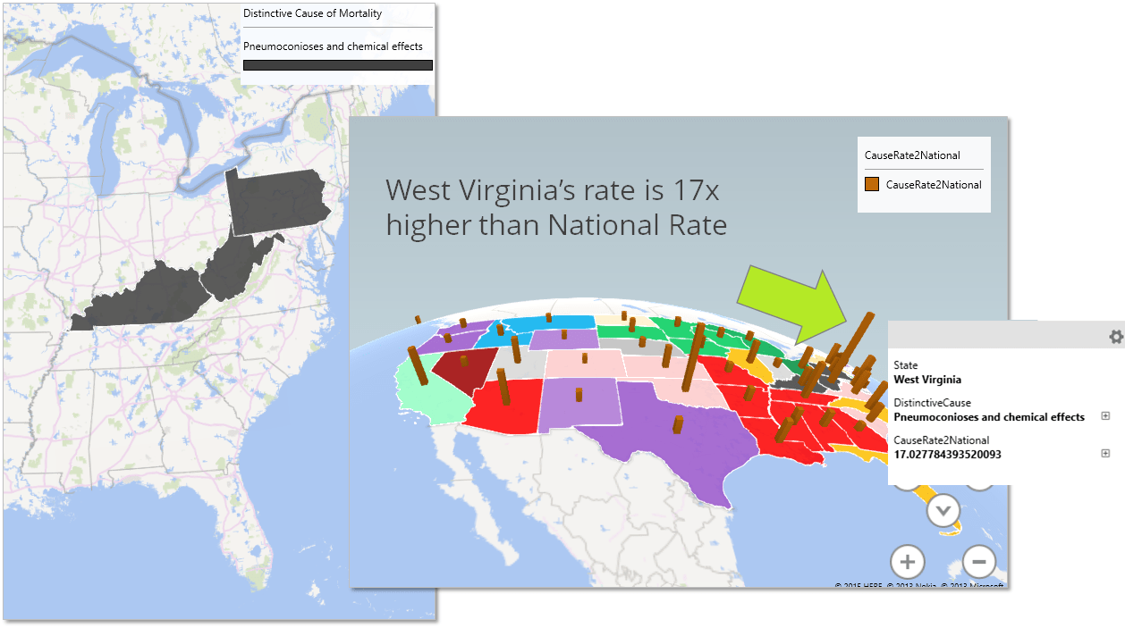
America’s Black Eye: Coal Mining States
For the coal mining states: Kentucky, West Virginia and Pennsylvania, Pneumoconioses is the distinctive cause, a lung disease caused often by inhalation of dust in mines. In fact for West Virginia mortality rate for Pneumoconioses is 17x higher than the national rate!
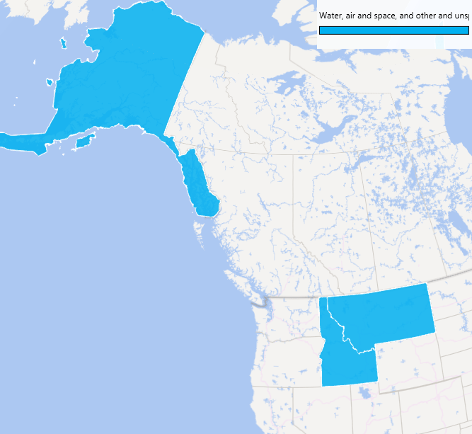
Alaska: The price of beauty
Alaska, Idaho and Montana have Plane and Boat Accidents as the top distinctive cause.
Vermont: Falling for the Fall Foliage
I have been to Vermont for it’s awesome fall foliage. Speaking of fall, turns out Falls are also the distinctive cause for Vermont with about 2.5 times higher mortality rate than the nation. Is it the distracted tourists?
Happy Red Nose Day to all! Signup for our class and we’ll donate to the Red Nose cause.
Power On!
-Avi
Get in touch with a P3 team member