
In Power BI, you can create insightful reports and dashboards to meet your data visualization needs. While dashboards allow you to see important metrics at a glance, reports provide more detailed information to help you analyze data. Reports and dashboards are two separate entities. However, you might find people referring to dashboards when they mean reports or the other way around. This is because dashboards are created by using elements from their underlying reports.
As a Power BI dashboard consulting service, we’ve been rolling up our sleeves and constructing data masterpieces for clients across industries. We’ve been working with our clients, transforming their complex data into visually striking narratives that drive decision-making and inspire action.
In this article, we will share our data analysis experience with you. We’ll guide you along the path to mastering report creation in Power BI and show you some handy Power BI templates to download.

Where Can I Find Examples of (Free) Power BI Reports?
Mastering data visualization in Power BI doesn’t have to cost a penny. You can find free tutorials and Power BI report samples on Microsoft Power BI’s official learning and documentation site. Moreover, platforms like Udemy and YouTube have an abundance of free resources on Power BI.
Some helpful free resources:
- Microsoft’s guide on Visualization Types in Power BI provides a comprehensive overview of different data presentation formats.
- Microsoft’s training on How to Use Visuals in Power BI offers guided learning to enhance your skills.
- The free tutorial Data Visualizations with Power BI on Udemy teaches you how to build impactful data visualizations and uncover insights effortlessly.
- Data Visualization with Power BI from Basics on MyGreatLearning is a free course that comes with a certificate upon completion.
- Popular Visualizations in Power BI on YouTube walks you through some of the most commonly used visualizations in Power BI.
Where Can I Find Data To Practice in Power BI?
As you learn, you may find yourself seeking a data source with specific types or for personalized practice (like customer, sales, or human resources data). Fortunately, there are many sample data sources for Power BI dashboard examples available to download and use for free:
- Sample SQL Databases:
- Microsoft’s learning center offers Power BI sample reports to download, which include datasets.
- Microsoft’s sample Excel datasets on GitHub. Find out more about Power Bi vs Excel.
- The Data Stories Gallery is a community where you can find many examples of Power BI reports created by experienced users. Many creators share their .pbix files, which come with the datasets. For the best free Power BI reports examples, you can sort the reports based on top kudos, providing a curated selection of the most liked reports.
- Kaggle datasets: Kaggle is known for having a vast array of datasets across numerous categories and file types (CSV, JSON, SQLite, and BigQuery).
- Data World: You can find open data contributed by users and organizations worldwide.
- Data.gov: The US government’s open data website.
- Google Dataset Search: A search engine designed to help you discover free datasets available on the internet.
How Do You Practice Power BI Skills?
If you are a beginner and want to learn quickly, we suggest you learn from existing Power BI projects. Microsoft offers Power BI dashboard and report examples to download and complete with datasets and easy step-by-step instructions to follow. You can pick a few samples to explore, then try editing some charts. Once you’re comfortable, try creating a Power BI report example on your own.
For example, take a look at the following Opportunity Analysis for Power BI. You can download the .pbix file and open it with Power BI Desktop or get the built-in samples in Power BI Service (on the Learning Center page, under Sample reports).
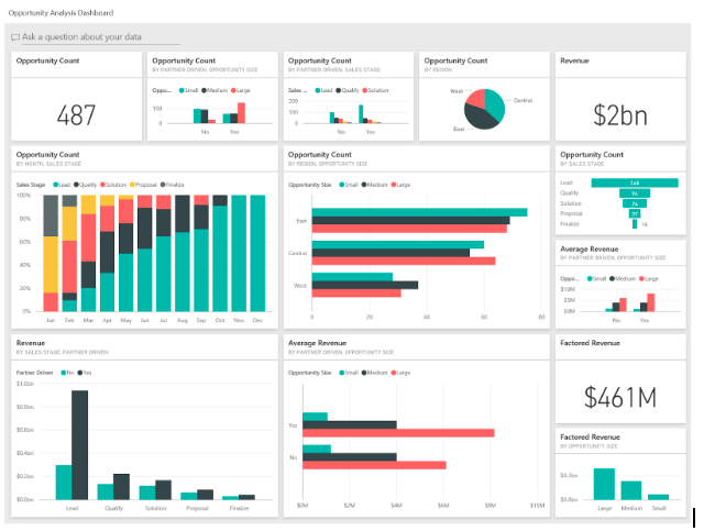
Figure 1. A Power BI sample dashboard to download
How Do I Get Power BI Projects for Practice?
Other than Microsoft’s samples, there are other handy resources to get Power BI projects for practice.
For example, DataCamp has a list of eight projects designed to develop skills for beginners and intermediate learners. But that’s not all. The internet is filled with tutorials to guide you through your Power BI journey. One example is the comprehensive Full Power BI Guided Project available on YouTube, which is tailored to provide beginners with a solid foundation.
Does Power BI Have Dashboard Templates?
Absolutely. Microsoft offers built-in Power BI dashboard examples to download. You can also easily locate them on the Power BI Service’s learning center page:
Figure 2. Power BI dashboard templates
The Data Stories Gallery is also a place where you can download Power BI dashboards created by experienced users.
Another great place to find Power BI dashboards is the Data Stories Gallery, where experienced users share their creations.
It’s important to understand that templates in Power BI can be in .pbix or .pbit files. A template in .pbix format includes data, making it an excellent option for those who prefer ready-to-use dashboards with sample data. On the other hand, a .pbit file contains only meta-data and has a much smaller size than a .pbix template.
Power BI Dashboard Examples You Can Learn From
Sample dashboards are one of the fastest ways to level up your Power BI skills. Instead of starting with a blank canvas, you can open a finished dashboard, see how the visuals connect to the data model, and reverse-engineer the design decisions a more experienced builder made. Below we’ve grouped the most useful Power BI dashboard examples by use case so you can jump straight to the type of dashboard you actually need to build.
Sales & Revenue Dashboards
Sales is where most companies start with Power BI, which makes it the richest category for sample Power BI dashboards. Microsoft’s built-in Sales & Returns sample (available inside Power BI Service under Learning Center) is the cleanest place to begin. It shows revenue by region, product category, and time period, and it’s a strong reference for anyone building executive sales reports.
What to study: how the dashboard uses slicers for date ranges, how KPI cards are paired with trend lines, and how drill-through pages let executives move from a summary view into transaction-level detail without cluttering the main canvas.
Financial & Executive Dashboards
Finance dashboards demand precision, clean formatting, and tight control over how numbers are presented. The Microsoft Power BI dashboard examples in the Profit & Loss and Financial Performance categories are the ones to study here, along with community-built P&L dashboards in the Data Stories Gallery.
What to study: variance calculations (actual vs. budget vs. forecast), conditional formatting that highlights underperforming line items, and the use of small multiples to show year-over-year comparisons across multiple business units in a single view.
Marketing & Customer Dashboards
Marketing dashboards focus on attribution, channel performance, and customer behavior. Useful sample Power BI reports in this category include Microsoft’s Customer Profitability sample and the marketing-focused dashboards available through platforms like Windsor.ai, which often connect directly to ad platforms (Google Ads, Meta, LinkedIn).
What to study: how funnel visualizations are constructed, how cohort analysis is presented, and how dashboards balance acquisition metrics (CAC, conversion rate) with retention metrics (LTV, churn) on the same page without overwhelming the reader.
Operations & Supply Chain Dashboards
Operational dashboards are designed for daily monitoring rather than strategic review, so they prioritize real-time refresh, clear status indicators, and exception-based design. Microsoft’s Supplier Quality Analysis sample is a strong starting point, alongside community dashboards in the Microsoft Fabric Community that track inventory, fulfillment, and logistics KPIs.
What to study: how status indicators (red, yellow, green) are applied consistently, how alerts are surfaced for items that fall outside acceptable thresholds, and how dashboards handle large data volumes without sacrificing performance.
HR & People Analytics Dashboards
HR dashboards are growing fast as more companies treat workforce data as a strategic asset. Microsoft’s Human Resources sample is the standard reference, and the Data Stories Gallery includes several community-built BI dashboards examples covering attrition, headcount planning, and diversity reporting.
What to study: how sensitive metrics are anonymized or aggregated, how row-level security protects access for HR business partners, and how dashboards combine lagging indicators (turnover) with leading indicators (engagement scores, internal mobility).
How To Get the Most Out of a Sample Dashboard
Downloading a Power BI dashboard sample is the easy part. The real value comes from how you study it. We recommend a three-step approach: first, open the .pbix file and use the dashboard the way an end user would, noting which questions it answers well and which ones it doesn’t. Second, switch to the data model view and trace how tables relate to each other, paying attention to fact tables, dimension tables, and any DAX measures that drive the key visuals. Third, try to rebuild one page from scratch using the same dataset, which forces you to understand every design decision rather than just admire the finished product.
The fastest learners treat sample dashboards as case studies, not just templates. Each one teaches you something about modeling, DAX, or visual design that’s hard to pick up from documentation alone.
Power BI Report Templates Are Just The Beginning. What’s Next for Your Data Visualization Needs?
You’ve explored some great resources and templates for learning and practicing Power BI. However, do you still need a bit more guidance? Have you checked out the Power BI Implementation guide? Are your reports running slower than you’d like? Is there untapped potential in your sales data?
We’re ready to step in, tidy up, and set your project back on the right track. Whether you need assistance creating Power BI models and reports from scratch or require an audit of your existing Power BI efforts, we are here to support you and your Power BI data visualization needs.
Our lean and efficient approach focuses on delivering value without wasted effort. So, why wait? Contact us today, and let us help you transform your data into meaningful insights that drive your business and financial performance forward.
Get in touch with a P3 team member