
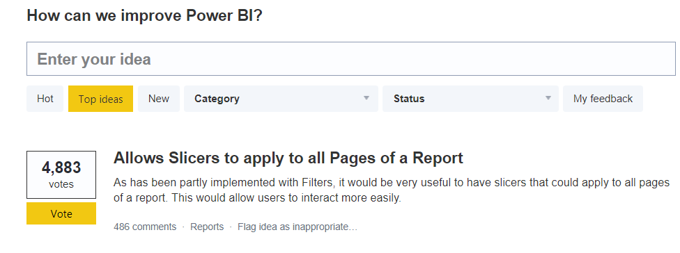
And another one bites the dust… this month the Power BI team have only delivered the #1 most requested feature on the Power BI Ideas forum. Synced slicers have arrived! Now you can apply a user’s selected filter criteria throughout the entire report.
Another new feature added was cross-filtering across multiple visuals. Ever found yourself in that situation when on a minute’s notice, you suddenly have the attention of the CEO. You have thirty seconds MAX to engage in a little data exploration.
They feed you a chain of 5 or 6 questions that only occur to them as you slice & segment your way through the first few layers of questions. Then suddenly you try to control + click that pie chart the CEO is pointing at and had to turn and say “uh I can’t click that, if I do we’ll lose our filters.” It wasn’t a deal breaker, but it was a buzzkill. Well, that’s been fixed too. Control + click pretty much does what you want it to now!
Between these two features, I’m sure you figured it was going to be great for preserving screen real estate. With no need to have duplicated slicers on every single page, we can free up 10-20% of the canvas on most of the reports for larger and more engaging visuals, right? I figured I would set up a home page with all the slicers there and I’d have MORE CANVAS! Well yes, I certainly did all of that and you will too, but it quickly becomes apparent that it’s not quite as simple as that.
If you tuned in last week, you’d have caught Reid’s post on SELECTEDVALUES that began with the ominous headline
Data Ambiguity…The Silent Report Killer.
With our newfound powers to minimize slicers, these are words worth tattooing across your forearm (right next to that P3 Adaptive one). The techniques covered Reid’s post are going to be fundamental to report building going forward as we’ll discover today (this one and this one too). Go back and read it now…well not now, but in three minutes.
How to Use the Sync Slicers Functionality
Please click here to download the workbook to follow along.
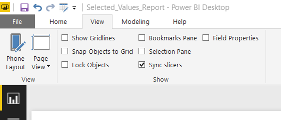
First of all, how does it work? To work with Slicer syncing, you’ll first need to expose the Sync Slicers pane. To do this, go to the View menu and check the Sync Slicers box.
Slicer sync is only going to work with the actual built-in Slicer visualization. Syncing across pages does not yet work with any of the custom visual slicers like the Chiclet Slicer or the other visualizations like the column or pie visualizations.
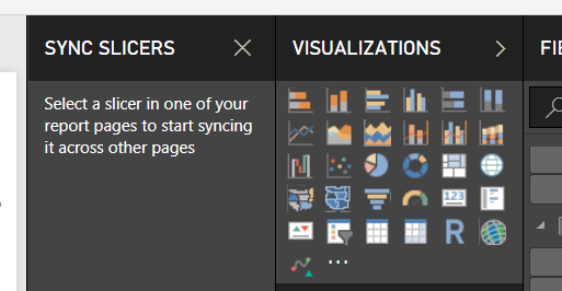
Once you activate a slicer, you may see something like this if you had common slicers already existing on each page.
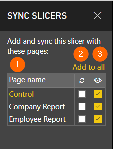
The first column is the list of pages in my workbook.
The second column is the ‘sync’ column, and as none of these are checked, the slicers will continue to function independently of each other. If I check this, the slicers are essentially linked, and a change on one page occurs on the other.
The third column indicates whether the slicer is being displayed. As this was an existing report where I had a report category slicer on each page, it makes sense that all three are check. But I no longer need to keep these visible to the end user. So I can uncheck these. The slicer does need to physically exist on that page; it just doesn’t need to be visible.
As my first test, I went through and checked all of the sync checkboxes and sure enough, if I selected a product category on one page, that selection ‘stayed’ when I moved on to the next page. Four simple clicks!
Want to learn how to unlock even more potential with Power BI? Sign up for one our Power BI training courses to learn even more tips and tricks that will help you take your skills to the next level. Our courses cover everything from the basics to advanced techniques, including how to create dynamic reports with a single slicer. Don’t miss out on this opportunity to take your Power BI skills to the next level – sign up here!
One Page To Rule Them All
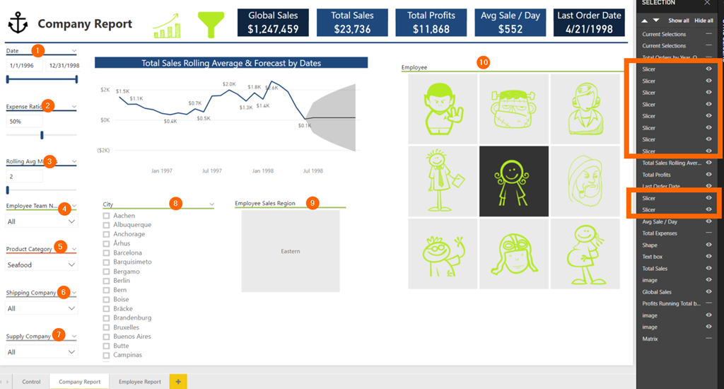
Buoyed with confidence, I jumped right into setting up a Home page where I just copied, pasted and reformatted all of the existing slicers. I have traditionally used the drop-down slicer a lot, usually, because it is efficient regarding preserving screen real estate when inactive, but with all this space, I went all out with lists, sliders, image slicers! If we wanted to get crazy, we might even want to increase the font size! Too crazy?
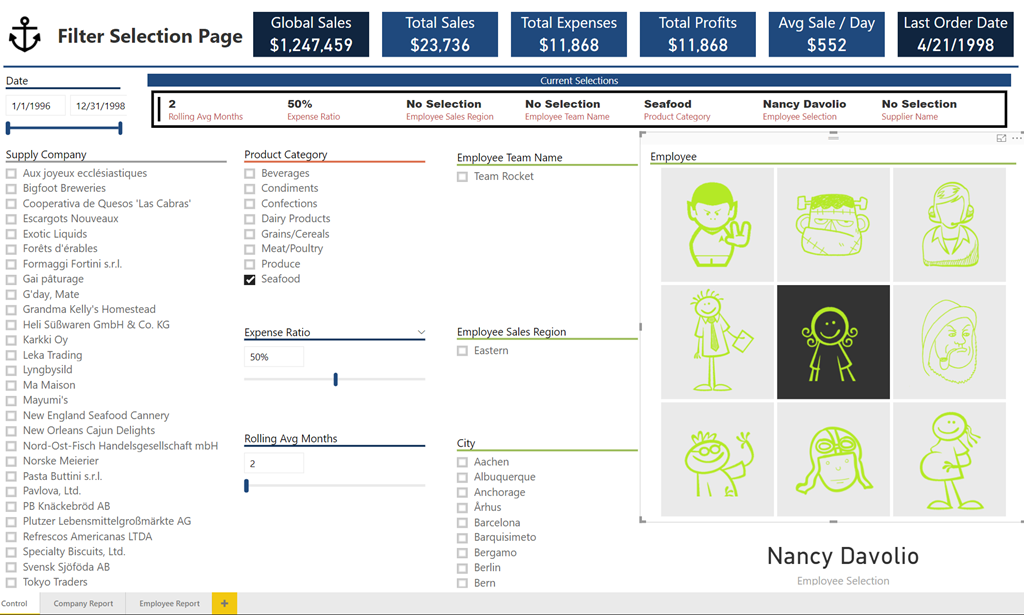
See that large image slicer on the right-hand side? Those are our nine employees. This was a completely new slicer, however, and so when I selected this slicer and went to the Sync Slicers pane, it looked like this.
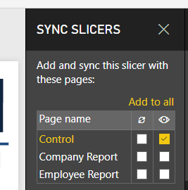
While the Employee Name field had been used in Matrix visualizations on other pages, it had not been used in any Slicers. I wondered why then those other pages displayed the option to sync at all and weren’t grayed out. How could the slicer on my Control page sync with the other two pages, when I knew that no slicer for that field existed for those fields?
So I just went ahead and checked all three, then selected an Employee from the slicer.
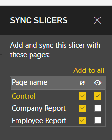
And sure enough, the Company Report is showing the same sales figures as my control page!
Great – so it just works? Well yes and no. When I selected the sync button, it added a new slicer to the other two reports but left them hidden.

If we make the new slicer visible either by clicking the eye icon in the Selection Pane or by going back to the Sync Slicers pane and checking the boxes in the last column, then we can see that Power BI has duplicated the original slicer onto the new page, formatting, position and all. I think you’ll agree that it is probably best left hidden in this case.
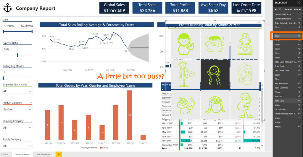
So now all that is left is to go through each one of the slicers on my home page and ensure all of the sync checkboxes are checked for all of the pages. Then I have universals slicers regardless of where I choose to display them.

Surely now with everything synced and a complete slicer page, I can get rid of those slicers on the report pages? Let’s hide those and make the most of all this extra space…
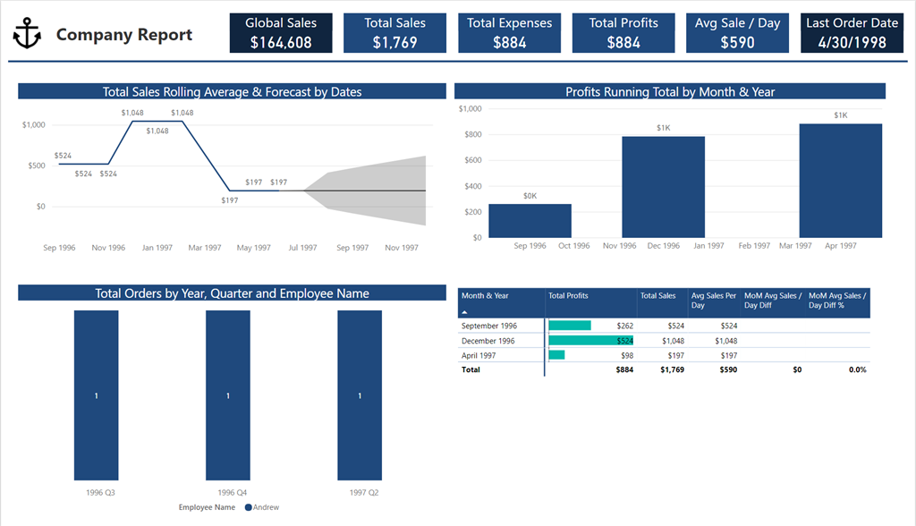
Goodbye slicers – hello ambiguity! The above chart looks crisp, but what am I looking at? The numbers changed… did another slicer sneak in somehow?
With slicers now absent from the report pages likely to become a more common occurrence, we should now always be asking – will it be clear to a user what they are looking at? If they get interrupted and have to come back to their data deep dive, how will they recalibrate?
It seems no coincidence that SELECTEDVALUE was introduced only a few months before all of the storytelling features began rolling out. DAX is still a huge part of using these features.
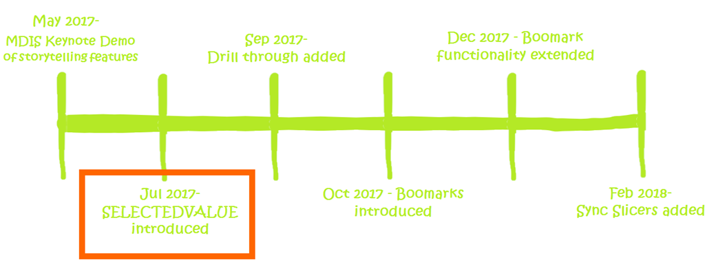
Every model using Slicer Sync should be using multiple SELECTEDVALUES or CONCATENATEX measures. So get comfortable with these DAX functions before implementing slicer sync….. or at least get used to using the Concatenated List of Values Quick Measure.
In the absence of visible slicers on every page, these slicer selections will need to be displayed somewhere on the page as Reid outlined last week. I’ve added mine down the left-hand side where the slicers used to be.

So this doesn’t seem like a huge enough win – I’ve only replaced the slicers themselves with a list of filter selections. But… I have centralized the slicer selections (sort of), so that is absolutely a real benefit regarding user experience. At least a user can be confident that they can make their selections and move on.

Not satisfied with this and a little weirded out by all these hidden slicers necessarily lurking beneath the surface of my report, I turned to Bookmark Bill for some advice.
He suggested that an alternative to creating a landing page would be just to simulate that landing page within every page, allowing the user to flip between a chart view and a filter selection view while remaining on the same sheet….. using, you guessed it bookmarks!
The slicers are already there on every page, albeit hidden, why not at least provide the option to use them?
1. Add two icons to which we will bind the bookmarks – one for a charts view and one for slicer selection view.
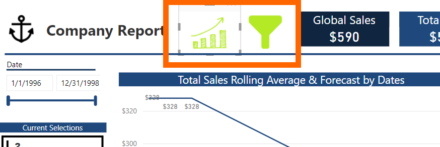
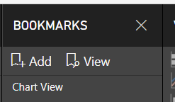
2. Go to View, and check the Bookmarks Pane checkbox if it is not already checked. Then add a bookmark and name it Chart View.
3. Go to View, and check the Selection Pane checkbox if it is not already checked. Turn off all of the elements that you do not want to display in Slicer View.
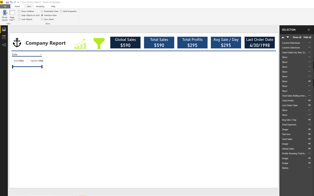
4. Now make all the slicers visible, format and lay them out as you would want the Slicer View to appear. Now add another bookmark and call it Slicer View. With the excess space, I have available I’ve even left a line chart on the to give the user the high-level overview of the results of what they are selecting.
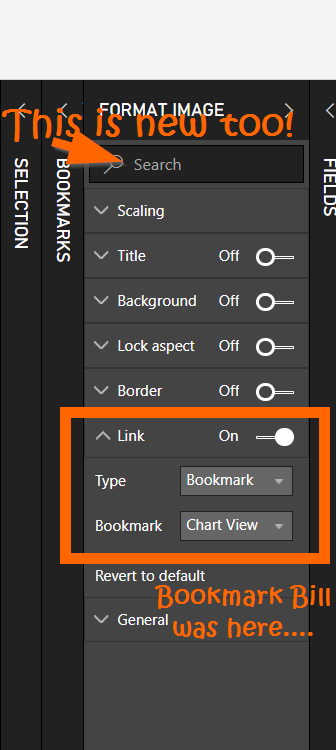
5. Now we have two bookmarked views that we need to bind to our two images. Select the chart image, go to the Formatting pane on the right, then to the Link submenu and change the Link Type to Bookmark and the Bookmark to bind to the Chart View. Repeat the same process for the Slicer image and the Slicer View, and there’s only one more thing to address.
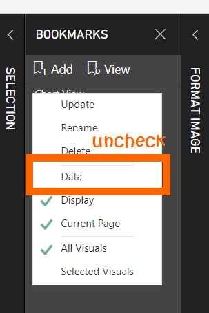
6. By default bookmarks are tied to a set of filter criteria, however, as of the December update, this can be turned off so that the universal slicer selections made by the user will remain. On the Bookmarks pane, click the ellipsis next to each of the two bookmarks and uncheck Data.
Now you have given the user base options. They can return to the Home page to change filter selections or just stay on the page they are on. Regardless of where they are making their selections in the report, their slicer selections should permeate uniformly.
I’m looking forward to seeing what our team and the Power BI community come up with to take advantage of these features while creatively tackling the challenge of potential data ambiguity.
There are obvious benefits to these latest changes, so, by all means, consolidate your slicers, but always beware the silent report killer…
Forget bending spoons with your mind – there’s no money in it.
It takes a special kind of mindset to “bend” data (and software!) to the human will. As this article demonstrates, we at P3 Adaptive can twist Power BI into a pretzel if that’s what an organization needs. (A robust, trustworthy, industrial-strength pretzel of course).
The data-oriented challenges facing your business require BOTH a nimble toolset like Power BI AND a nimble mindset to go with it. And as Val Kilmer / Doc Holladay once said, we’re your huckleberry.
Get in touch with a P3 team member