What if I told you, there was one key skill, that has set me head and shoulders above the Excel crowd when working with Power Pivot and Power BI? Would you be interested in learning that skill? Great, because I was about to teach it to you anyway.
Pay It Forward
But first a story. I had discovered Power Pivot (code-named Gemini back then), while working in the Microsoft Commerce group. But really came in to my element at my next gig, the Microsoft Learning team (read about my Power Pivot Journey). There I met my colleague Gregory Weber (known as Greg). It’s hard not to be impressed by Greg. He was a Microsoft certified instructor and taught courses for many years, both within US and internationally. He has got the trainers voice, and fluidity with words. Along with the ability to deconstruct complex topics and make them easy to understand. He can talk about pretty much any topic under the sun, technical or otherwise. Once you get to know him better, you’ll find out that he enjoys building and programming robots in his spare time (How’s that for a hobby?). Lately he has been pursuing a degree at Georgia Tech, while also helping to teach some of the courses there. Besides all of this, he is a genuinely nice guy.
It was Greg, who suggested that we form a book reading club. Our first book was one I had heard about, but never read – The Data Warehouse Toolkit: The Definitive Guide to Dimensional Modeling By Ralph Kimball. As a business analyst, I had leaned heavily on Excel, along with a mishmash of other technologies. Data warehouse and data modeling didn’t seem like topics that would be relevant to me; more for an IT/BI team perhaps. But I figured, it couldn’t hurt to learn something new.
Our book club meetings looked more as if, class was in session. We brought in our questions, and Greg patiently answered them, helping us realize the importance of the topics, and trade-offs involved in various choices. As things go, our reading club was disbanded before we were even halfway through the book. But the knowledge that I had gained, helped me grow by leaps and bounds in my Power Pivot and Power BI journey.
Now the truth is, I would never have picked up this book and read it myself (much less understand it). It was only due to a teacher like Greg, that I was able to internalize some of the concepts. So this article, is my humble attempt to pass on the knowledge (hopefully without mangling it). I’m just paying it forward.
Lost Chapter From Our New Book: Power Pivot and Power BI
The article below, was actually submitted, as a chapter in our new book. However under Rob’s keen eye, we realized that most of these topics were weaved in as best practices in the rest of the chapters anyway. While it didn’t make it in the book, we still feel it would be of value to our readers – hence this article.
If you were reading the book, this article would perhaps fit in best as Chapter 19A. (After Chapters 17/18/19 have covered Multiple Data Tables and Performance). You can get our book at Amazon or MrExcel.
Data Modeling – for Scalability and Usability
Scaling to Millions of Rows
Scaling to Multiple Data Sets
Lookup Tables – the Who, What, Where, When, How
Matrix of Lookup and Data Tables
Crazy Lookups and Snowflake: Too Much of a Good Thing
Usability
Data Modeling – for Scalability and Usability
Scaling to Millions of Rows
So you’ve read our advice that
• Wide Flat Tables = Poor Performance
• Narrow Data Tables with separate Lookup Tables (Star Schema) = Improved Performance
But you say to yourself, the performance of my model is just fine. Thank you, thank you very much. (You did say that the Elvis way, right?). That is the case for most new users adopting Power Pivot. They are working with relatively small models and no matter how they are structured, your performance is reasonably good. Especially, when compared to all the effort you had to put in earlier (before Power Pivot), to build similar reports.
However this honeymoon period is not going to last forever. Sooner or later you would end up working on a data model, large enough, that all these lessons would be important. It is easier to start off, following the best practices, than later on having to undo your work and unlearn the bad habits.
I would not elaborate too much on this here, we’ve covered this ground already in the Performance chapter(Ch 19). Instead I want to speak about other reasons, why a good Data Model is critical to your success.
Scaling to Multiple Data Sets
So you are a new Power Pivot user and start your journey with a small dataset. Say the Sales data, that we started with or something similar. At this point, for a small dataset, it doesn’t matter much, whether you keep separate Data and Lookup tables (Star-Schema) or a single flat-and-wide table. Since it is a small dataset, the performance would not vary noticeably and you can pretty much write any measure you need, in either design.
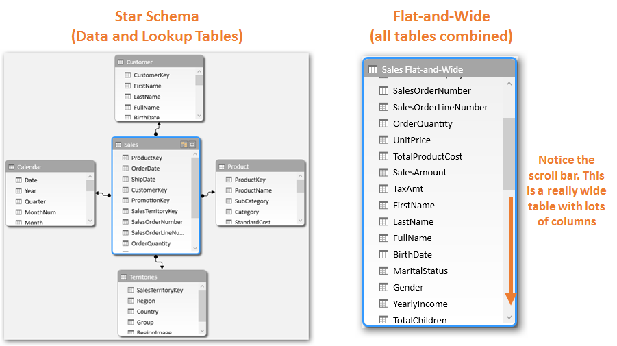
With a single small dataset, there is not much difference, performance wise,
between the two designs –Star Schema and Flat-and-Widе (click to enlarge any image in this article)
| ⓘ It is always best to organize your lookup tables near the top and the data table near the bottom. Consider the above Star-Schema screenshot for illustration only. |
Now think about, what happens when you bring in another dataset. If we are using flat design, we end up with two flat data tables – Sales and Service Calls in our case. That works as long as you analyze these two datasets separately.

Two Flat-and-Wide tables: Sales and Service Calls

Can create separate pivots to analyze the datasets separately…
However, often the magic happens when you can show measures from two different data sets side by side in the same pivot, and slice and dice them together. Or even better – write hybrid measures across the two datasets.

Analyzing disparate datasets together is the holy grail for analysts
But if you have two flat tables how would you ever be able to accomplish this? This is a big moment, so I want you to pause and think about it.
<<This page intentionally left blank to give you a moment of cogitation>>
The answer is obvious, and we have already implemented this design in our model, and exercises earlier. We need a common lookup table.
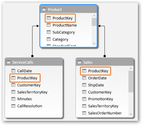
Common Lookup table would let us connect and analyze the datasets together
Lookup Tables – the Who, What, Where, When, How
And not just one, you need a few. Often when I am working with a dataset and need to think about the lookup tables I might need, I think of the – Who, What, Where, When, How. For example for our Sales data, I might answer that, as below and attempt to create the Lookup tables accordingly.

Who, What, Where, When, How – would become our Lookup Tables

Both data tables connected to all relevant lookup tables – ready for action!
| ⓘ Diagram View with Multiple Data/Lookup Tables: If you do end up with multiple data and lookup tables, your Diagram View might start to look like a spaghetti chart or a complicated Integrated Circuit diagram. We would still recommend that you keep your Lookup tables near the top and Data tables down below – to relate to our analogy of “relationships flow downhill”. Some people complain that they cannot see the related tables easily this way. However understanding your data and lookup tables and improving your discipline in using them that way should override that.If you do end up with more tables than you can keep track of, consider creating Perspectives to keep them organized for yourself and for your users. Learn more at https://ppvt.pro/groupTables |
Note that, you can have multiple “Who”s and multiple “When”s etc.
For example, for our sales transaction, we can have
Who: Who placed the order? Whose credit card was used to pay for the transaction? Who was it shipped to?
When: When was the order placed? When was it shipped? When did it arrive? When was the customer invoiced? When did the customer finally pay?
You can read about how to handle such cases, where potentially there could be multiple relationship between two tables, in our chapter on “Complicated” Relationships (Ch 22).
Matrix of Lookup and Data Tables
As your model evolves and you pull in additional datasets, these should get plugged into Lookup tables in a matrix like fashion (the rectangular array, not the movie; well maybe a bit like the movie ).
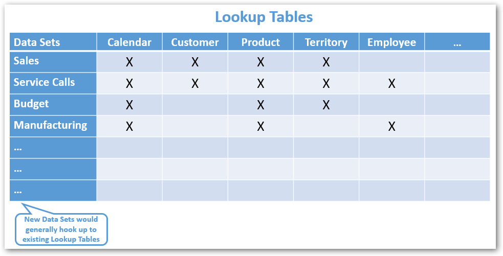
Data sets should connect to a common set of Lookup tables
(click to enlarge any image in this article)
Even if the number of data tables in your model grow at a prolific rate, the lookup tables should remain a fairly stable set. Your lookup tables typically represent the core entities in your business – like Customer, Product etc. – to which many data sets would hook up to. On occasion as you bring in new datasets (which typically represent business processes), you may need to add new lookup tables as well. But that exercise should be fairly infrequent.
| ⓘ Not all data tables would connect to all lookup tables, only the ones that apply to the specific dataset. That is perfectly all right, in fact to be expected. For instance in the example above, Budget does not connect to Customer or Employee, since Budget is not set at Customer or Employee level (at least for this example scenario).When using measures across two (or more) datasets in the same pivot (or when using hybrid measures) just be aware that only the common lookup tables would provide filtering on both datasets. You may get invalid results if you use a lookup table which is only connected to one of the two data tables. See example below, but also covered in detail in Chapter 17 Multiple Data Tables, Section ‘Multiple Data Table Gotchas’. |
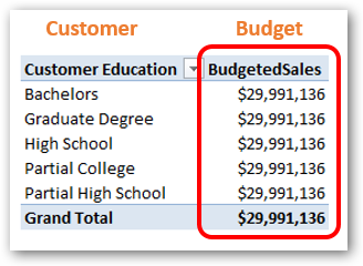
Budget data table is not connected to Customer Lookup Table,
thus you would get invalid results if you try to use them together
Crazy Lookups and Snowflake: Too Much of a Good Thing
Whereas Lookup tables are good, there can be too much of a good thing. I have seen client models where everything is a lookup table and the diagram view looks like a mutant octopus.

Making every little thing into a lookup table is not good data modeling
(click to enlarge any image in this article)
Or where we have cascading Lookup tables (also called Snowflake).

Lookup Tables have Lookup Tables? That may not be ideal
(click to enlarge any image in this article)
None of these are considered good design for performance, scalability and usability reasons (discussed next). Your lookup table should represent something tangible and easily understood – e.g. Product, Purchase Order.
| ⓘ Consider all of this as guideline, a best practice. We’re not too squeamish about breaking these rules. Just be aware when you are not following the guidelines, understand why you are not doing so and account for possible implications. |
Usability
Star schema (separate Data and Lookup tables) would typically offer you the best performance and allow you to scale to millions of rows and multiple data sets. But another important implication is usability. Even for the simplest scenario where we have only one dataset – which of the field lists below would you like to use, day-to-day to build new reports and analysis?

Star Schema would be much more user friendly once you start building reports
More importantly, which field list would you want other users to be using who connect to your data model? Star Schema groups items into logical entities which are easier to understand; not just by you but for all the users who would end up connecting to your data model and creating reports/analysis against it.
Think you are just creating a quick analysis model for yourself? Power Pivot is so powerful that you would often create models that last longer than you ever expect, be used by more people than you ever imagined. The model that I built at Microsoft, started as a simple model for my own use, but grew over time and went on to be used by hundreds of users and is still in operation long after I left Microsoft.
| ⓘ When we parachute into an organization for our typical 2-3 day consulting engagement, I still create each data model like it’s going to be the next best thing since sliced bread for them. Dare I say, it often is |
So dream big and aim high. Put some thought into designing your data model. It only takes a little more work and pays huge dividends in the long run.
Get in touch with a P3 team member
