“Dr. A. Heller. Weapons designer.
Innovator. Inventor. World changer.”
“…why does he live in a deserted amusement park?”
Building an Arsenal of PowerPivot Components and Tools
In the past six months assembling the core PowerPivot-fueled platform at Pivotstream, we’ve been developing some components and tools to supplement the core PowerPivot v1 product, both in terms of what our customers see as well as “behind the scenes” tools for us.
You might expect this from an ex-Microsoftie whose prior job was designing software – I really can’t stay out of that game completely. (Doubly so given my background on the PowerPivot and Excel teams). I’m always starting sentences out like “You know, I bet we could…”
One small example of this that I shared last week: VBA macros that we’ve been using and modifying to make workbook creation/editing go faster. That’s just the tip of the iceberg though really, so let’s take a look at the first in a series of larger components.
First Example: Cleaner SharePoint Pages
First, consider what the top of the default SharePoint page looks like:

Default SharePoint Home Page Etc.
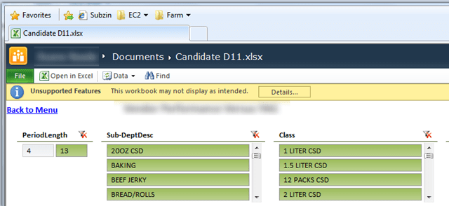
And what the default Excel Services report page looks like:

Default Excel Services Report Page
Not bad for out of the box, but there is definitely room for improvement. Let’s look at those again with some elements highlighted:

Extraneous Elements Highlighted
Things that many BI sites would rather NOT have:
- Site Actions Menu – This is fine for a standard SharePoint experience, where users are often pseudo-admins of the site. But for a BI site, where you want as little noise as possible, and don’t want users to have anything resembling admin control, this is a liability.
- SharePoint Ribbon – Don’t get me wrong, I actually am LOVING the SharePoint Ribbon. Way more than I expected. But again, on a BI site, the user’s task is to navigate as quickly as possible to actionable information. And you will be surprised how often someone will call you and say that they can’t find the option they are looking for on the Page ribbon tab, when the button they want is right there in the report. Again, it’s just noise in the BI scenario.
Now let’s take a look at the Excel Services page again, with the same level of focus:

Extraneous Elements Highlighted Again
Things that many BI sites would rather NOT have:
- Excel File Tab and Toolbar – Just like above, this is a great element for many scenarios. If you view Excel Services as “Excel in the browser,” which is precisely its mission in most cases, then yes, you need a File menu for Saving, Downloading, Checking Out, etc. But in a BI site, again, it’s noise, it’s confusing because it’s read only, etc… plus it distracts from the well crafted perception that this is NOT Excel but a Web Application. Most people just feel GOOD about web apps, and they feel kinda icky about Excel. People are more likely to use something that they feel good about.
- File Name – Same thing. The feel-good vibe of the app is disrupted by the presence of an Excel file name. “Are you saying that’s a file on my desktop? Where is it?” Subtle little things like this are easy for techies like us to dismiss, but ignore them at your own peril.
- Unsupported Features Bar – This one requires little explanation, it looks horrible. And it suggests to the user that something is broken, when really, it’s just those slicer parent controls. In the VBA post I gave you a macro for removing all of those right before you save, but in practice that isn’t a viable solution.
The Simplified/Modified Versions
None of those problems was going to fly for us at Pivotstream, so we developed our own modified set of page templates.
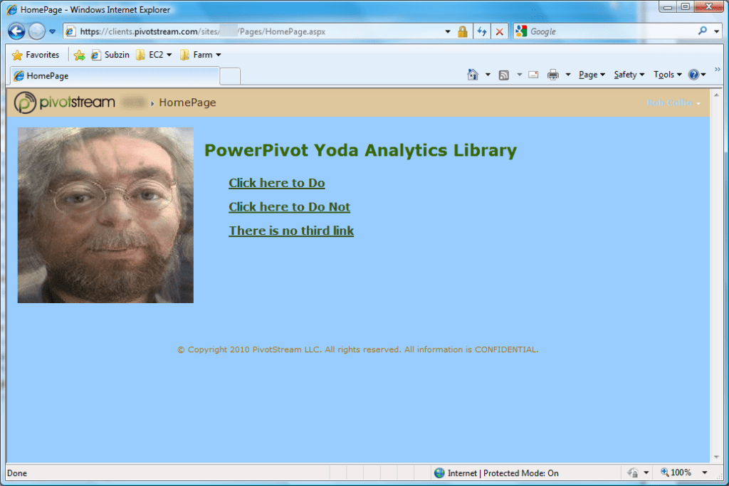
First, a really simple, sample home page as a customer would see it:

Note also the little copyright notice at the bottom, that’s built into all of our pages now as a result of the template.
These templates are also themeable, so we can change the color scheme, page content, and images from within SharePoint itself with a few clicks:

(No one has ever accused me of being an artist, so at time I choose intentionally ugly colors – you can do much better I am sure. Bet you can’t whip up a PowerPivotYoda like I can though).
Improvements to Note:
- No SharePoint ribbon to distract
- No Site Action menu (ditto)
- No Search box (we can turn that back on once we have it hooked up to work properly)
- No QuickLaunch menu telling me about all those doclibs and such on this site that I don’t want the users to concern themselves with.
- Lots of real estate for adding content and links.
Customized Report Page Templates
Next, here’s a report page we have in production, with a very minimalist style:

Zooming in on the top, we see:

Improvements to Note:
- Still no SharePoint Ribbon or Site Actions menu
- No Excel “File” ribbon
- No “Unsupported Features” warning
- “Download Snapshot” appears as a link in the header, separate from the File ribbon
- No Excel Icon on the browser tab – actually it is usually our Pivotstream logo, but IE forgets those icons all the time and puts the little IE logo in instead. Sigh. Firefox is much better about that I’m told, but I’m still running IE.
- No Excel filename in the title bar
- “Breadcrumbs” nav bar in the header, for nav back to the site home
In other words, everything extraneous removed, and only functionality remains.
Fear not, admins still see the suppressed controls!
Of course, when *I* log in to these sites, I often need to make changes, like add a new page, update a setting, etc.
So, I need a lot of the things that are suppressed in the screens above, like the Site Actions menu, and the SharePoint ribbon.
The screenshots above were all taken when I was logged in under my User account. Here’s what I see when I sign in as my Admin account:

Neat huh? It detects I am an admin, and gives me back all the stuff like the SharePoint ribbon, Site Actions, the notification I have the page checked out, etc.
Under the hood
OK, so what all is going on here, in order to make this work? Here’s a rough list:
- A new SharePoint Master Page, from which all user-facing pages are derived
- Admin vs. User detection logic in that Master Page, and subsequent suppression of certain page components when User
- A new Layout for the report page, that includes the Excel Services web part with default settings already applied
- A new Control (part server-side and part Javascript) that implements Download Snapshot functionality without having to expose the Excel toolbar (whose options are confusing in a pure BI environment).
That’s about all I am qualified to convey – I supervised the creation of all of this, but I did not code it. (Similarly, I can tell you about how Excel’s calc chain involves a separate linked list per processor, but I couldn’t tell you how to write something similar now could I?).
That Excel Services Toolbar – Isn’t that part (hiding it) simple?
Yes and no, and then no again 🙂 On one hand, it IS easy to create a new web part page, slap an Excel Services web part on there, and then customize its settings to your liking.
What I did NOT find easy, was repeating that process every time I wanted to publish a new report.
With this new system, I just instantiate the right template, and change one setting to point the template at the right workbook. Done.
Also, the Download Snapshot feature turns out to be pretty important. For us, and most locked-down BI deployments of PowerPivot, the snapshot feature is the ONLY way to print something that looks decent. And it’s the only way to take a fixed view of the entire workbook offline. So, we didn’t want the File menu, but we needed that feature to stay.
So we re-implemented it 🙂
What about the Sharing thing you mentioned?
It cost us well over $20,000 in billable time to build all of this, in addition to my time designing and supervising it. In my opinion, there is no sense in others having to sink the same cost (and their own time) rebuilding the wheel.
If you are interested in learning more about this, drop me a note/
Unlike the VBA Macros and other small stuff, I can’t give away modules like this that the company paid for. But I am free to explore the idea of sharing with the community at a fraction of what it cost us, as a means of recouping some of our development budget.
And if I can make this sort of project pay for itself, that just means I can spin up other such projects 🙂 This is very much an experiment at this point.
Anyway, drop us a note if you’re interested, and we’ll see if we can figure something out.
Get in touch with a P3 team member