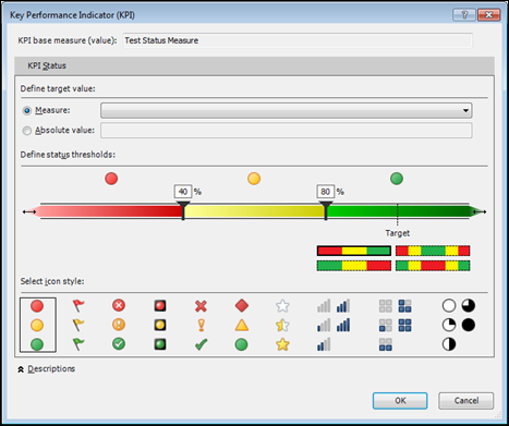
A Shiny New Dialog to Play With!
Better Late Than Never!
On Tuesday, in my intro to David Hager’s post, I promised to circle back “later today” and add some follow-on thoughts. Well, ONE of those words ended up being truthful
But I’m back today! Let’s not dwell on the past shall we?
In David’s post, he ended up with a “TestStatus” column set to Pass/Fail/Warning depending on a) what the test value reported and b) the specific acceptable ranges established for that particular kind of test.
He was then able to use that as a slicer. But what about conditional formatting? His original example, a regular (non-pivot) table, DID include conditional formatting.
This is where I thought it would be good to finally check out the new KPI feature in PowerPivot V2.
What is a KPI?
It stands for Key Performance Indicator. Essentially though, what it means in practice is “a measure that has conditional formatting built into it.”
Pretty cool concept really – imagine being able to define your conditional formatting rule once and then use it any pivot with a single click!
Amir and Me: my own twisted history with this feature
Back around 2005/2006, when I was working on the Excel team at MS, I essentially conspired with Amir Netz to “sneak” this feature into Excel. (What this meant, specifically, was that Excel learned to recognize when a measure carried built-in conditional formatting, and then translated that into a conditional formatting rule in the pivot). At the time, that feature only benefited organizations that used the traditional Analysis Services server product, and had zero impact on the average Excel Pro.
Ironically, a few years later when I was working on PowerPivot V1 (still at MS), I then opposed Amir’s desire to add KPI’s to PowerPivot. My reasoning was basically “I can’t use a KPI to apply data bars or color scales, which are by far the two most useful types of conditional formatting, so let’s not burn valuable development time on a feature of limited value to Excel pros.”
Partly because of my resistance, KPI’s didn’t make it into V1. But here we are in V2, I’m not at MS anymore, and we have the feature. So let’s see what we can do with it!
Convert From Pass/Fail/Warning to –1/0/1
Conditional formatting doesn’t work well against text values, and neither do KPI’s. So first I added a new calc column to David’s workbook:
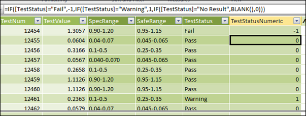
Why –1/0/1?
Because that’s what KPI’s expect you to use. It’s weird that apparently 0= Good (Green) and 1 = Warning (Yellow), weird enough that I had to find that out using trial and error, but no big deal once you are aware of it. I also may be missing some underlying principle here – it’s been a long time since 2005/2006.
Create a –1/0/1 Measure
Next, you need a measure that returns the same –1/0/1 values. So I created:
[Test Status Value]
=MIN(TestResultTable[TestStatusNumeric])
Why MIN and not AVERAGE? Because the measure really does need to return one of those three values and nothing in between (I think). Averaging them may have unpredictable results. Let me know if you have tried this and found something different.
Creating the KPI
OK, now I have two measures in my field list: the original test result value and this new –1/0/1 measure:
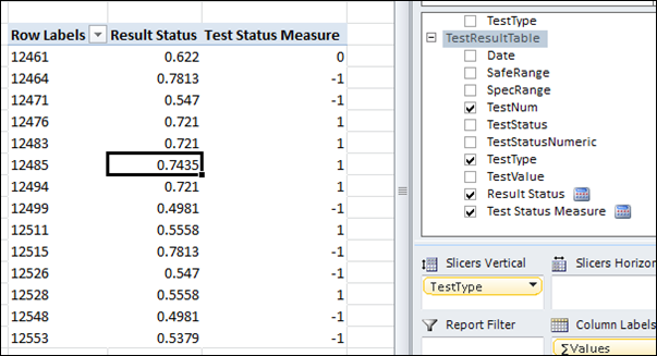
I Now Have Two Measures. Ready for KPI!
OK, so then you right click the original measure and choose create KPI:
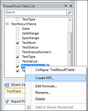
Right Click Original Measure (NOT the –1/0/1 Measure) to Create KPI
The Dialog
This is what you see next. I scratched my head a bit before I figured it out. Actually I still don’t have it completely figured out but I haven’t circled back to spend time on it yet.
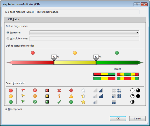
Change the measure dropdown to be your –1/0/1 measure:

Pick the conditional format type that you want (note that it’s ONLY the icon types):

I Haven’t Had Success With These Parts of the Dialog Yet
Ignore this part of the dialog for now – this is the part that I need to research further, I assume it’s something you’d use if you had a measure that returned more than –1/0/1. If you’ve got this figured out please let me know, otherwise I’ll get around to it.

I Don’t Know What to Do With This Part Yet
I also didn’t see much point in moving the little threshold sliders:

I Left These Sliders at 40 and 80
It may be that those two parts of the dialog make more sense when you choose “Absolute Value” at the top of the dialog as opposed to “Measure.”
The Results
You now get a new KPI “node” in your field list:
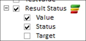
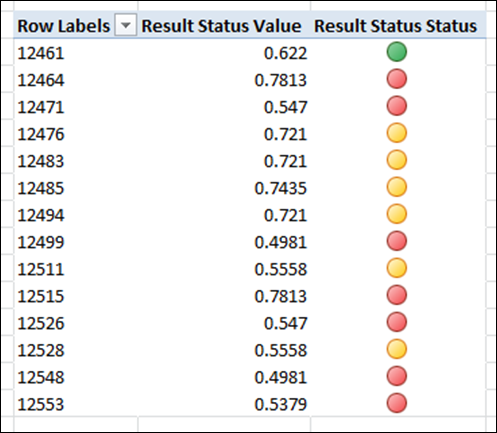
See how Value and Status are both checked? Well here’s what you see in the pivot:
Rob blames Rob!
My first response was, “WHAT??? The conditional formatting gets applied to the –1/0/1 measure and NOT the original value measure? What the heck kind of decision was THAT? This eats way more space, an entire extra column in the pivot!”
And then I realized… if only I had caught that back in 2005/2006, because that is the way the feature got implemented in Excel. Seriously folks, it’s never all that satisfying to get all morally outraged and then in the next instant realize that it’s your own dumb mistake
It’s also a statement on “don’t rush features into the product at the last minute, because you don’t have time to properly consider how they should be used.”
And even more than that, my past sin is a reflection of how little I had personally used conditional formatting at that time in my career. But remember, the fancy new conditional formatting features didn’t even exist until Excel 2007, which was the release we were working on. I only became a conditional formatting “fiend” once it became as useful and accessible as what 2007 made it.
Anyway, more history and reflection than perhaps you are looking for, but I find it personally fascinating, the evolution of my relationship with all of this stuff.
Final Analysis
Honestly I don’t expect to use the feature that much. The lack of color scale and data bar is just as critical to me today as it was in 2008 when I was arguing with Amir. And the (re-) discovery that it requires an additional measure column in the pivot makes it even more awkward for me.
On net my opinion remains the same as it was a few years ago: this is a feature that was added because the traditional BI crowd expects to see it. And it demos well to a BI audience because BI audiences tend to think of the field list itself as the way people consume BI (which in my experience is short-sighted – the masses only want to consume finished reports).
But Excel pros can get much better conditional formatting results if we skip it and apply conditional formatting the “old fashioned way.” So that, I think, is what we will keep doing.
A shame really – I hope the PowerPivot and Excel teams revisit this KPI feature and correct the shortcomings. Including the mistakes of one Rob Collie
If you think I have missed something here please let me know, happy to reconsider and learn.
Get in touch with a P3 team member