
Every month Power BI gets an update that adds a nice handful of new features. Here at P3 Adaptive we ALL get excited for this! We often stand around the water cooler talking about all the new features. When a REALLY exciting feature comes out we get as gleeful as school children! Well starting this month we want to share our excitement with you. We will showcase our favorite features (typically one to two) with you, with the aim to give you a few more ways to use the new features.
Our aim will be to keep these posts bite sized and easily digestible. We’ll also aim to get these posts out at the beginning of the week, shortly after the monthly Power BI update release. With that being said I want to get into this month’s awesome feature…Report Drill Through.
Report Pages Are No Longer Islands
Report Drill Through enables users to create a report page, filtered to a single entity (E.g. Customer, Employee, Store, Product).

Reports often have a summary landing page where there might be a lot of information, but not much detail about a specific item. Traditionally in Power BI we’d create a separate reporting page for further detail breakouts on an entity. However, that would require it’s own set of SLICERS that you would have to re-select if you wanted it to mirror the reporting page you were coming from…that’s too many clicks!
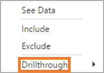
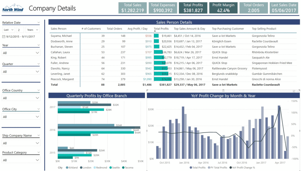
Selecting an item in Drill Through in a table from one reporting page will take you to another page, FILTERED to the entity you selected! This feature essentially let’s us create detail sub-pages that are linked to whatever primary reporting page the report uses. Features like this have been available for YEARS in Excel using linked cells, I’m super happy we finally have this as a feature in Power BI Desktop. It only takes a few steps to setup, but I’ll leave the instructions for that over at the Power BI September release page. With that said, let me run you quickly through how this looks like in a sample report.
Animated GIF showing Drill Through functionality from the Company Page TO the Employee Page

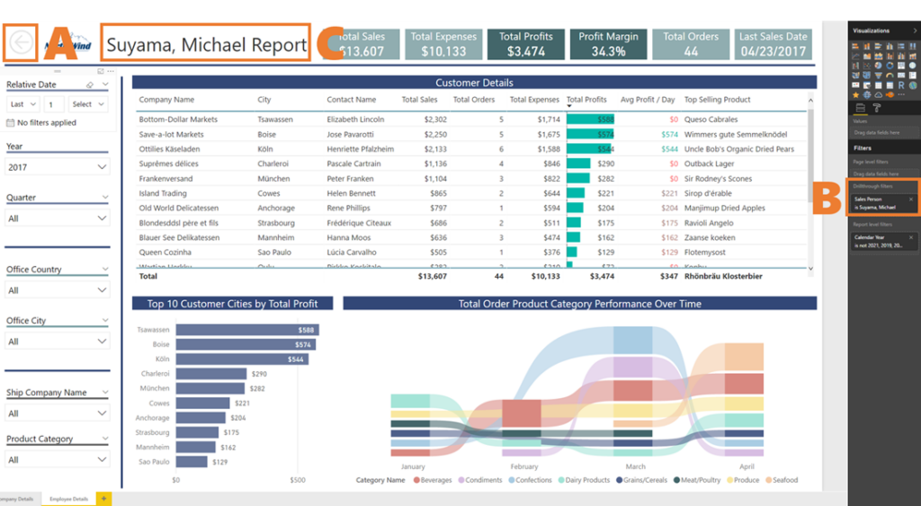
One HANDY feature included in Drill Through is the addition of a back button on the page you drilled into. The back button allows you to quickly and easily return to the page you came from, especially useful if you’re working in a report with MANY report pages! You can see where I’ve placed the back button next to the (A) in the image below. You’ll also notice the addition of an additional filter field on the right side of the page (B). This release added a Drill Through filter here, and it is where you put the item you want to Drill Through into this page. In our example that item is the Sales Person column.

What If I Wanted To See My Drill Through Filter?
I also took it one step further, and created a handy DAX Measure to DYNAMICALLY display the text of the Drill Through filter. If you look at the top of the report in the image above (C) you’ll see that my report title shows the name of the Sales Person I filtered to. I came up with this solution because I really wanted an obvious callout to the filter that was being supplied from the Drill Through feature. All we need is a DAX measure and a card visual!
Employee Name =
CONCATENATE ( SELECTEDVALUE ( ‘DIM Sales Person'[Sales Person], “Employee” ), ” Report” )
This DAX Measure will return “Employee Name” & “Report” if filtered, and “Employee” & “Report” if unfiltered. Placing it on a card visual and removing the category label makes it look just like a regular textbox too! Now we essentially have a dynamic report title on our page, calling out the exact filter being applied from our Company Page. Whenever I implement the Drill Through feature I will use a DAX measure like this as a best practice. Mainly because it will help avoid any confusion to the client about what was (or wasn’t) filtered.
The Honorable Mention Goes To…
Just because of how much I like their new Ribbon chart, I wanted to include that in this post as well. They also added this chart type in the September release, and it’s super powerful to show the performance of a category over time. In the image above you can see how easy it is to trace performance trends for Product Category over time. Using DAX it is possible to retrieve a Top Performing “thing”, Rob even wrote a post about that years back. I got excited when I realized I could now observe the performance of all PRODUCTS over TIME! Again, you can read more about this feature on the Power BI September release post. That’s it for today P3 Adaptive Nation! I’ve included the embedded report below as well as download link to the pbix file, until next time.
Power BI Embedded Report
Get Your Files
Get in touch with a P3 team member