
A Lasting Metaphor
Many years ago, I was designing a feature for Excel 2003. And the VP of our division of Office, a man named Richard McAniff, didn’t like the feature. At one point, he told me:
“Rob, it’s like you live in a world where everyone wants really tasty daiquiris. And what you are building is a blender. A blender that, when assembled and used properly, can make great daiquiris. But the problem is, no one wants the blender. They don’t want to mess with it, they’re too busy for that. What they want… is just the tasty daiquiri.”
Now actually, when Richard said that, he used the metaphor of “ovens and steaks” rather than “blenders and daiquiris.” Which always seemed a bit “off” to me – I mean, who cooks steaks in the oven? For a middle class guy like me, steaks are cooked on a grill. But the funny truth is that the most expensive steaks DO get cooked in ovens. His wise metaphor was diluted by too many years spent at his payscale. (Richard, I love you man, and someday hope to have enough money that I will no longer detect such idiosyncrasies, heh heh). So… I am “translating” the metaphor, which I have used for many years now.
Blenders ARE necessary, but they shouldn’t become the GOAL
This has tremendous relevance to the way in which PowerPivot is turning the BI industry on its head.
The genesis of any BI initiative is the desire to know more about your business. The goal is Better Insight. But what happens next? You immediately get sidetracked/hijacked into Building an Infrastructure. Massive investments in Data Warehousing. Master Data Management. Extract, Transform, and Load. Heavy, heavy stuff.
Now, is that stuff necessary? Yes, but only to an extent. The problem is with the sequence – first you build out tons of infrastructure. And then you start delivering insights.
Well guess what? It takes about five minutes for the desired Insights to fade into the background, and for the Infrastructure to become a goal in itself.
That’s really, REALLY dangerous stuff. As I’ve pointed out before, you often don’t even know that your requirements are flawed until you see your first visualization. Months of infrastructure work could deliver something that falls dramatically short in critical areas. And at the same time, the infrastructure might vastly over-deliver on certain aspects that turn out not to be all that needed.

The Entire Industry is Built This Way
As flawed as that approach may be, in many ways, technology wasn’t ready to support doing it a different way until recently.
Now that a better way is available, though, we’re still very early in the transition. Nearly everything about the BI industry is still geared around the old way, to the extent that today’s tools and processes actually require those huge infrastructure investments. They are so tuned to the painstaking way that you can’t just start speeding things up.
It reminds me of the sensitivity of US modern fighter jets. Every morning, the crews have to walk the entire length of the runway, in a line spanning its width, looking for little pebbles and other debris that could seriously damage the aircraft. These are machines built for WAR, but they can’t handle pebbles.

A Better Way: Just Get Started
Don’t have the perfect infrastructure/blender built yet? Great – that means you have wasted no time to date! Just get started. Load some data into PowerPivot. You can even load it from multiple sources, all into one model. Experiment. See what you can learn from the data in its current form.
Nothing exposes the flaws in your data sources quite like this process. You WILL find problems in your source data that need to be fixed. But then you can go focus on fixing JUST those, and you will know precisely what the fix needs to look like. You can be very prescriptive about it, and limit the scope of the work. Often, the fix takes less than five minutes. (And yes, other times, it’s an overhaul).
Inverting the Traditional Sequence: Keeping the Desired Result in Focus
Traditional BI’s sequence:
- Develop a broad plan that encompasses all or most of the important data sources in your organization.
- Embark on an often-lengthy process of developing shared standards across all of those data sources.
- Write endless amounts of logic to load and transform data into a Data Warehouse.
- Embark on the process of building cubes over the top of the DW, encoding complex business rules (explained to the techies by the business users) into measure calculations.
- Produce the first visualizations and reports.
- Collect feedback from all of the unsatisfied consumers, and use that as feedback to start over at step 1.
The Sequence that PowerPivot Enables:
- Pick a business question or need that is currently unaddressed. Set your goal as “let’s answer that, right now.”
- If you have an existing DW, use it. If not, start from existing data sources. A good middle ground is to shape your sources into Star Schemas, which is relatively simple compared to building a full-fledged DW.
- Load data into PowerPivot.
- Build charts and reports. Write measures as needed. See how far you get.
- If you discover that you need data source changes, go and get those done. May take a few iterations but it will still be light years faster than the traditional process.
- Pick another business question. Dive in. Repeat.
You’ll be stunned at how far you get, and how fast.
Another Example of the Metaphor in Action
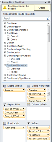
The trigger for this blog post was a conversation I had yesterday about field lists. Field lists are very much a necessary tool for building reports and visualizations.
Of course, 99% of the world never wants to see a field list. And I can’t blame them. Field lists are blenders. The reports/visualizations themselves are the daiquiris.
The message I tried to convey in that chat (and poorly, I might add) is that field lists are a difficult thing to sell to most people, as compared to the finished product they produce.
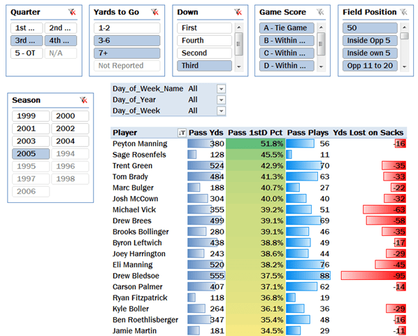
That’s why I try to start every presentation on PowerPivot with a demo of a finished, published, interactive report, before trying to show anyone the addin. And it’s also one reason why Pivotstream’s subscription BI business goes over so well – no field lists, no infrastructure. No blenders. Just insights and daiquiris.
Parting thought
As someone who makes his living off of software, I obviously make blenders whether I like it or not. If you are reading this, chances are that you do too.
The key is to remember that blenders don’t sell, because your customers rightfully aren’t interested in buying more infrastructure. Their eyes are on the prize. So the more you can think like them, and focus on the same goals that they have, the better you will do.
And I’m not just talking about marketing spin. I firmly believe that daiquiri-focused engineers build much better blenders than blender-focused engineers.
OK, back to DAX tricks in the next post.
Get in touch with a P3 team member