
“We sure sold a lot of toilet paper around Halloween this year. That promotion we were running must’ve been REALLY effective!”
-Retail Manager Extraordinaire
Halloween Mischief Has Nothing to Do With It!
A Common Question: What Caused the Change?
Thought I’d take a break from the “Refresh on SharePoint” series and talk about an age-old problem… and how easy it is to address with PowerPivot. There isn’t much complexity behind it, and yet it’s still much more useful and re-useable than anything you can do with Excel alone.
Let’s say you work for the fictional AdventureWorks bicycle company. And for the past few weeks, you’ve been running a special promotion: “Buy a Bike, Get a Free Water Bottle.” And so far, it’s looking pretty good, as evidenced by the highlighted region on this chart:
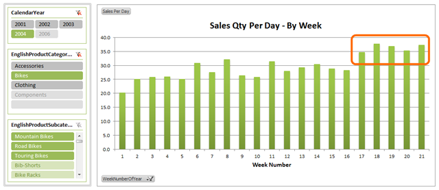
OK, great. But hey, those free water bottles are expensive and cut into your profits. So if you want to be truly responsible, you need to make sure there aren’t other variables driving this bump instead.
(Oh, and for readers outside the US – are we the only country where teenagers engage in “toilet papering” other teens’ houses on Halloween?)
Getting a Baseline From Prior Years
The most common source of “noise” in sales like this is just normal seasonal fluctuation. Weeks 17 thru 21 of the year – are those normally a hot week for bike sales every year, whether there are promotions running or not?
What I am going to show is just one technique for taking that into account. There are many others, but this should get you thinking.
Step One: Baseline PivotTable
In the chart above, I’m just looking at bike sales in 2004. To get a baseline, I’m going to look at the three prior years:
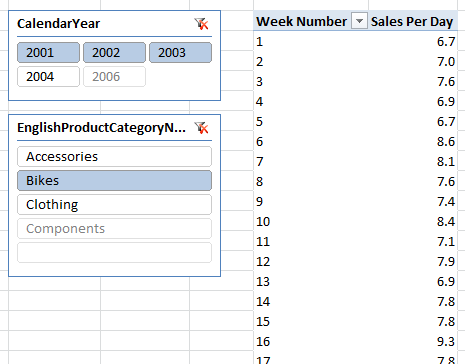
OK, yes, the numbers are smaller in prior years – these are the dangers of using a sample data set like AdventureWorks. The inspiration for this blog post, however, is a real project I’m working on at Pivotstream… and for client confidentiality reasons I obviously can’t use that data set. So bear with me – the technique here is the important thing, not whether my sample data set is realistic.
Step Two: Create a Weekly Adjustment Factor
At the bottom of that pivot, the grand total represents the average sales per day over the entire 2001-2003 period:
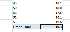
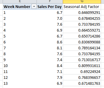
The ratio of a given week’s sales per day vs. that grand total is an excellent indicator of how active that week of the year is on an ongoing basis.
So, let’s calculate it. And since I only intend to calculate these ratios as one-time fixed values, I’m just going to use normal Excel formulas to do it (as opposed to creating a measure for it):

Calculating the Seasonal Adjustment Ratio for Each Week
($F$57 is a Fixed Reference to the Grand Total Cell)
Fill that formula down for all weeks and we get:
Side Note: Building the Right Reference Pivot
Before I move on, I think it’s worth mentioning that it pays to think about the makeup of your reference pivot. What measure should you use? For instance, if the price you charge for your products fluctuates a lot for random reasons (EX: if you sell farm produce, which is subject to worldwide random price changes), then a pure dollar figure measure may not be a clean baseline. So my Qty per Day measure would be better in that situation.
Similarly, if your company acquired another company in June of 2003, and its product line merged into yours in that month, effectively doubling your sales, that will also skew your baseline higher for the second half of the year – my Qty per Day measure would NOT be immune to that problem. So in that case you may prefer to slice the baseline pivot to ONLY include the original company’s product line.
Point is… it takes business-specific expertise to define your cleanest baseline.
Importing Those Factors Into the PowerPivot Model
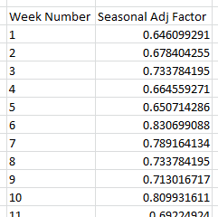
OK, now that I have those numbers, I want to get them into PowerPivot so I can apply them all over the place. A little Copy/Paste Values gets me this two column table in Excel:
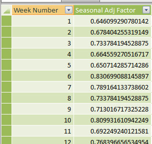
From there, I can copy/paste into the PowerPivot window as a brand new table:
Relating that Table into the Rest of the Model
Next step is to create a relationship. In this particular model, I need to connect this new table to the existing Date table, since that’s the only place where I have a Week Number column in the model:
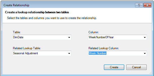
Now, I never intend to put fields from this new “Seasonal Adjustment” table on any of my pivots… which means that table will never get filtered by anything (slicers, row fields, etc.)
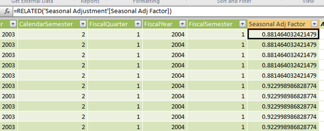
That’s a problem, because ultimately I will need filtering by week in order to make my measures work. So I need to get those values added into the Date table, because Date table fields WILL be on my pivots. A little =RELATED is in order:
Creating a “Seasonal Adjustment Divisor” Measure
Basically, we want a measure that, in the context of a specific week of the year, returns the corresponding Adjustment Factor from date table. Once we have the measure, we can then divide other measures by that measure to create “seasonally adjusted” versions.
Here’s the formula for the “divisor” measure:
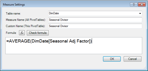
Were you expecting something more complex? Yeah, I was too 🙂 And to be fair, in my real-world example I am working on, it is a bit more complicated, but that has more to do with the data than basic approach.
To verify that it works, let’s compare it side by side with the original seasonal table I built in Excel:
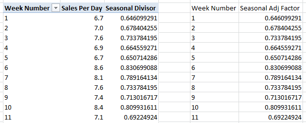
Bingo. Matches perfectly. Of course, given that we’re just looking at single week numbers here, I didn’t have to use AVERAGE() – I could have used MIN(), MAX(), or SUM() and gotten the same results.
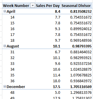
But AVERAGE() really does make a big difference at higher levels, like when I add Month to the pivot, here at right:
So the month of April, for instance, typically moves about 81% as much product as the average month. Neat.
And December, unsurprisingly, clocks in at 170% as much volume as the average month (hey, AdventureWorks sample db DID get that one right).
OK, that’s the last prep step. Now we get to the payoff – the creation of seasonally adjusted versions of our core measures.
Seasonally Adjusted Sales Measures
All that work above may seem like an investment, but trust me, it has taken me a lot longer to write up this blog post than it did to actually just build the model. About 10 minutes, tops.
No matter what, though, the next step is as quick and as painless as it gets. Just start dividing existing measures by the divisor measure!
For instance, at the beginning of this post I was using the “Qty per Day” measure. Let’s make the seasonally adjusted version:
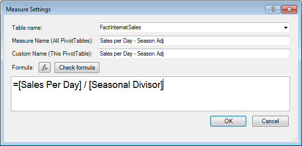
(Oh, and if you are wondering how I made the text in the measure dialog bigger, well, it’s as simple as holding down the CTRL key and rolling the mouse wheel. Thanks to Alberto Ferrari for this great tip.)
Time to test it out. Let’s go back to the original chart and add this measure side by side with the original measure:
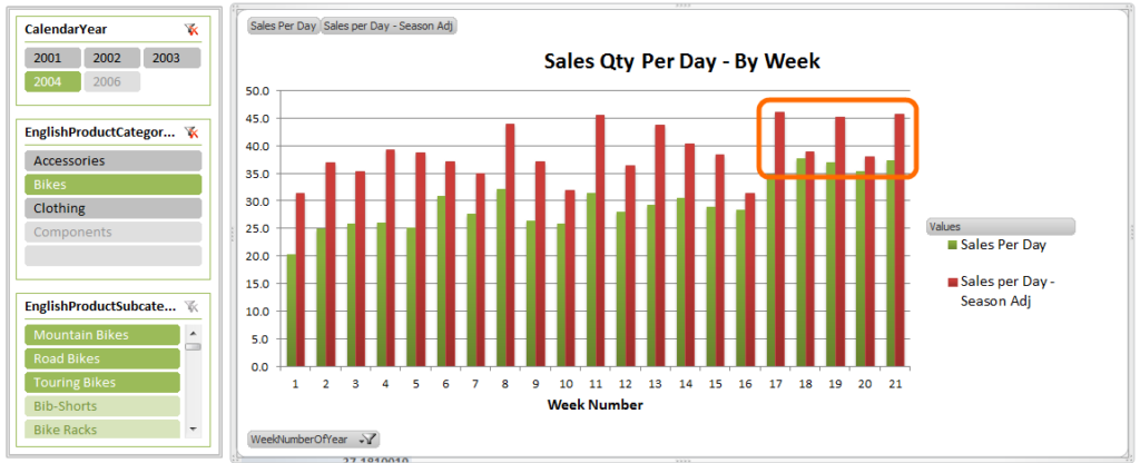
Original Measure Side by Side with Seasonally Adjusted Version
Hey, when adjusted for seasonal trends, our sales activity was actually even higher… but then again… so were all of the other weeks on the chart as well.
In fact, after adjusting for seasonality, the “bump” from the promo campaign doesn’t seem as large as it did before. Here’s the chart again, this time with just the seasonally adjusted measure:
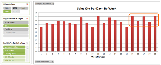
Seasonally Adjusted Measure by Itself – Where’s the Lift?
So yeah, maybe a small bump. But not much. Is it worth it? Well, my next step would likely be to create a seasonally-adjusted measure of profit, since that will factor in the cost of the free water bottles. Again, this all comes down to the particular of your business, which is why having the tools directly in the hands of the domain experts is so critical.
Use it Everywhere!
Just wanted to emphasize this one more time: now that I have the [Seasonal Divisor] measure, I can quickly create seasonal-adjusted versions of as many measures as I need. One quick division and I’m done.
Also – if you ever want to adjust your definition of seasonality, all you have to do is change the formula for that one divisor measure, or the table that underlies it, and ALL of your seasonal-adjusted measures respond accordingly. You don’t get that kind of “one touch update” in traditional Excel.
Lastly, because you are creating measures rather than calculations that are fixed to the layout of a given sheet, all of your work is easily re-useable in many different contexts – analyze by individual products or by entire categories. By city or by country, no problem. At a daily or monthly level. You get the idea.
Other Techniques to Consider
Two more possibilities just to get the imagination going:
- Define the Seasonal Adjustment table in SQL – why not move that whole process, and the underyling logic, into SQL? That way, you’ll get updated seasonality numbers over time, and you can probably get more sophisticated logic into the system. Sure, you’ll need help from your DBA, unless you ARE the DBA. But cooperation with your DBA team is a prime attribute of an optimal PowerPivot system.
- Differentiate by other fields – hey, maybe Accessories have a different seasonality pattern than Bikes. And the Southwest region of the country might not show as much dropoff in January as the Northeast does. You can absolutely factor that into your Divisor measure. You could even try to do it 100% dynamically, in the measure, without pre-calcing an adjustment table first.
OK, that’s enough for now. Back to SharePoint refresh shortly.
Get in touch with a P3 team member