The Request
Use a disconnected table in Power BI to show each month and total trailing twelve months (TTM), the total for prior TTM, AND the variance between the two in one matrix table. Why? I saw a request for this kind of report in the Power BI Community forums. The requester also wanted the totals row to show the average for each column and to have conditional formatting for each cell, based on being above or below average.
Please click here to download the .pbix and follow along.
Disconnected Table for Pre-Arranging the Data
My solution is to create a table in the data model to pre-arrange the data. Each row provides a date range for the data, an offset value, and a name for the range. In the final report these rows will provide the column headers. From the Modeling tab in Power BI, I use the Create New Table button to create a table:Report = GENERATESERIES(-11, 3, 1)
This GENERATESERIES() function creates a one-column table with values from -11 to +3. I then add some calculated columns to the table. I start with End Date and work from there.
End Date  =
VAR LastFullMonth = IF(TODAY()=EOMONTH(TODAY(),0),
TODAY(), EOMONTH(TODAY(), -1))
RETURN
IF (
Report[Value] < 1,
EOMONTH(LastFullMonth,Report[Value]),
IF (
Report[Value] = 1,
LastFullMonth,
IF ( Report[Value] = 2, EOMONTH ( LastFullMonth, -12),
LastFullMonth
)
EOMONTH() finds the last day of the month. The second argument tells the function how many months to go back. The LastFullMonth variable uses the last day of the previous month, or the current day if it’s the last day of the month. Each of the month rows uses the Report[Value] column as an offset. 0 is the current month (last full month). -1 is the prior month, and so forth. The positive values give us our last three columns. Report[Value] of 1 is the end of the twelve trailing months. Report[Value] of 2 is the end of the prior twelve trailing months. And Report[Value] of 3 is the Variance (so end date doesn’t really matter here).
The Second column is Start Date. Start Date uses the End Date to get the first day of the month for each month.
Start Date = IF(Report[Value] <1, DATE(YEAR(Report[End Date ]), MONTH(Report[End Date ]), 1),
EOMONTH(Report[End Date ], -12)+1)
For the last 3 columns, Start Date goes back 12 months + 1 day, to get the beginning of the 12 month period.
The third added column is Range, which is the column name. It’s the end date of the month, or TTM, TTM LY, or Variance.
Range = IF(Report[Value] < 1, FORMAT(Report[End Date ],””),
IF(Report[Value] = 1, “TTM”,
IF(Report[Value] = 2, “TTM LY”, “Variance”)
)
)
From the modeling tab, be sure to set the sort by column for Range to the Value column.
The table looks like this in Data View of Power BI:
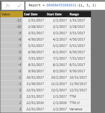
In Data View, it’s easy to verify that the date ranges are as expected. Report[Value]: 0 is the current last full month, which starts with 12/1 and ends with 12/31. TTM and TTM LY both have the expected start and end as well.
DAX Measures: Trailing Twelve Months (TTM) in Power BI
The data ranges of the Report table will feed the measures for our report. PdSales gets the Total Sales – Sum(Sales[Sales Amount]) for the dates between the Start Date and the End Date from the Report table. This measure works not only for the individual months, but also for TTM and TTM LY.
PdSales = CALCULATE (
[Total Sales],
DATESBETWEEN (
‘Calendar'[Date],
MIN ( Report[Start Date] ),
MAX ( Report[End Date ] )
)
)
The only thing that PdSales doesn’t account for is the Variance, because it doesn’t use a date range. Variance is the difference between TTM and TTM LY, or between Report[Value]=1 and Report[Value]=2.
Variance =
CALCULATE([PdSales],
ALL(Report),
Report[Value]=1)
–
CALCULATE ([PdSales],
ALL(Report),
Report[Value]=2
)
The CALCULATE statements get the difference between [PdSales] for TTM and TTM LY.
A measure called [Period Sales] brings these two measures together.
Period Sales =
IF(MAX(Report[Value]) < 3,
[PdSales],
[Variance]
)
The final measure gets the average of the Period Sales according to the Region.
Average Period Sales =
AVERAGEX(VALUES(Territories[Region]), [Period Sales])
This will return [Period Sales] for each region, but for the grand total it will find the average of [Period Sales] for the Regions.
Bring It All Together in a Matrix Visual in Power BI
Put Territory[Region] on Rows. Put Report[Range] on columns. And put [Average Period Sales] on values. Now, that’s an elegant solution. If the columns are in the wrong order, go to the modeling tab and set the sort by column for Report[Range] to Report[Value]. Sadly, there’s not a way to set conditional formatting for each column of a matrix based on the total row. But, that’s not going to stop us!
You can, however, add a measure to show the percentage of the total, and put conditional formatting on that. I then size the column to be too narrow to show the number, so that only the background color is visible.
Above or Below Average =
[Average Period Sales] / CALCULATE([Average Period Sales], ALL(Territories) )
[Above or Below Average] goes into values in the fields well of the matrix. Click on the field in the wells to set Conditional Formatting: Background color scales.
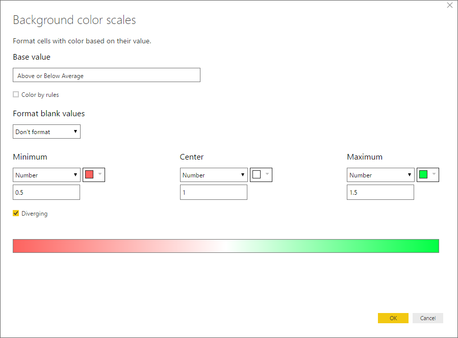
The values shown are what I prefer to keep the chart clean and highlight significant differences. What stands out are values that are 50% or less of the total shown or 150% or greater of the total. I also did not want the name of the Sales measure repeating for each column, so I renamed in to a single space in the field wells.
What Else? Slicers, a Ribbon Chart, and Bookmarks
I added slicers, true slicers, to the page. And as Rob has said, “it’s not a ‘legitimate’ post until a slicer shows up.” What do I mean by a true slicer? I mean buttons, and not dropdowns. To get these guys, you have to select General under the formatting options and choose Vertical. Once you do that an option shows up to make the slicer responsive. Then you can fiddle with the sizes until they look better. They may not be easy to work with, but people LOVE them.
A Ribbon Chart to Give Context to the Matrix
My report consumers ask for a lot of tabular visualizations. It’s because they can export it to Excel. But tables don’t always show patterns in the clearest way, so I added a ribbon chart to the page, to add context. I like to use the legend as a slicer, but I don’t like the default highlighting when clicking on the legend of a ribbon chart. It’s way too subdued for my taste. Instead, I prefer what it looks like when you click another chart and can see that one thread go all the way through the months (not just the data points but also the transitions between them). So, I added a bar chart below the ribbon chart and sized it so that the bar chart is not visible, but the legend for the bar chart is visible.
Bookmark: All Twelve Trailing Months
So, only 9 months are displayed on my matrix table. With the slicers and extra conditional formatting, I can only fit in 9 of the twelve trailing months. I use the filter pane in Power BI to filter the Report[Value] to -9 or greater. So, I bookmarked a second copy of the report (and a second copy of the ribbon chart). The report reader can click the Twelve Months button, see the tables widen, and slicers disappear. The Twelve Months button is actually a rectangle shape with no fill. Behind that shape is a text box with a white fill that has the text of Twelve Months (details at the end of the post).
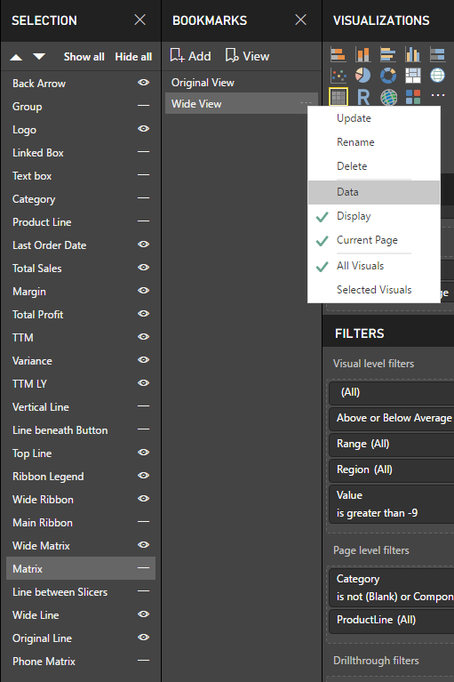
Above is my Bookmarks pane and Selection pane. Every item in my Selection Pane has a name. I get this result by adding a title to every element and in most cases turning that title off. This makes it much easier for me to decide what to show or hide in the bookmark. The Original View is the bookmark for the default, with slicers and limited months. Wide View is the bookmark for showing all twelve trailing months, with no slicers. Wide View has Data turned off, so that all of the slicers from the Original View will carry over when the user clicks the Twelve Months button.
So, how do bookmarks impact mobile versions of reports?
Mobile versions of reports are critical for supporting managers and executive officers to check on key metrics no matter where they are. And for that matter, they can be useful for outside sales reps. When I say mobile, I mean the portrait version, because landscape just looks like the report. There’s less screen space, so it forces you to think about what’s most important. In my case, I have decided that what’s most important are the slicers and the totals: the total for the twelve trailing months, the total for the previous twelve, and the variance.
Bookmarks don’t actually work in the mobile portrait view. The items visible are whatever items are visible in the default view of the page. If an element is not visible in the default view, it will be invisible when added to the mobile view. The bottom line is that if something needs to be visible on the mobile view, it has to be visible in the default view of the page. But I don’t really want to show both versions on my page. What to do? Make it visible, but make it tiny and hide it behind something else on the page. In my case, I sized it to be too small to read in the standard view of the report, and I put it in the same space as. On the mobile version, I add it to the canvas and resize it as I like.
My three-layered button
Back layer: Table for mobile report.

This table is small enough now to be hidden behind the button.
Middle layer: text for my button.
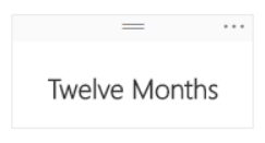
The text box is formatted with an opaque white background, to conceal the tiny table.
Top layer: a rectangle shape
This shape is transparent, so that the text from the text box shows in the middle of the rectangle. This link to the bookmark is anchored to this shape. To move elements forward or back, select the item by clicking on it, and select format in the ribbon and move forward or back.
Where It’s At: The Intersection of Biz, Human, and Tech*
We “give away” business-value-creating and escape-the-box-inspiring content like this article in part to show you that we’re not your average “tools” consulting firm. We’re sharp on the toolset for sure, but also on what makes businesses AND human beings “go.”
In three days’ time imagine what we can do for your bottom line. You should seriously consider finding out 🙂
* – unless, of course, you have two turntables and a microphone. We hear a lot of things are also located there.
Get in touch with a P3 team member