“The customer is always right”
-Anyone who knows their business
A business intelligence feud!
A few weeks back, a BI analyst posted a list of factors to consider when selecting a new BI tool. Shortly thereafter, a BI blogger posted a scathing critique of that article. The analyst, for his part, then blasted the blogger on Twitter (and curiously, re-linked the blogger’s offending post). By BI community standards, this is a feud of uncommon proportions.
I don’t really want to get in the middle of such an entertaining exchange, but I feel compelled to offer at least a short comment.
You see, the analyst had the audacity to suggest that the number of visualization types (charts, gauges, etc.) supported by a BI tool is an important factor for potential customers to consider. Perhaps he was unaware of the newly prevailing wisdom: fancy visualizations are bad for you. Simpler is better, 3d is a distraction, pie charts are passé, and gauges/stoplights are toys.
I think that point of view is at least partially misguided, and while rooted in scientific fact, it misses something fundamental about human psychology.
The prevailing wisdom of the chart police – three examples
1) Use Bar Charts Instead of Pie Charts
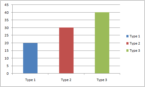
Simplest Visual Comparison
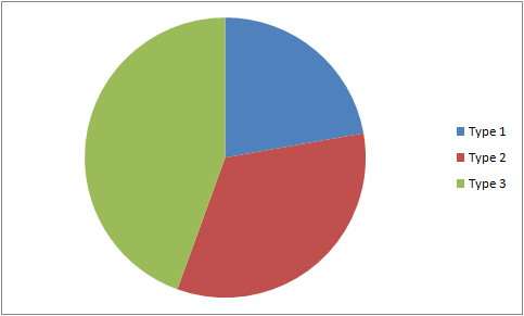
Same Numbers, Harder to Compare
There is research proving humans are good at judging the relative lengths of objects, but bad at comparing the relative sizes of areas. (Although I’d submit that, in college, my friends and I were masterful estimators of pizza subdivision, so perhaps the human race as a whole is just out of practice).
2) Avoid 3d and Other Effects
…because again, they just make visual comparisons tougher.
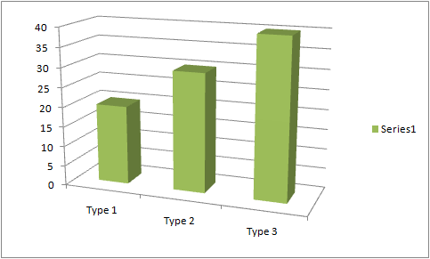
| Not Acceptable |
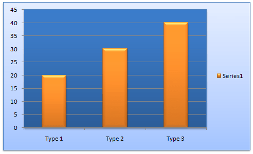
| Probably Earns You a Lecture |
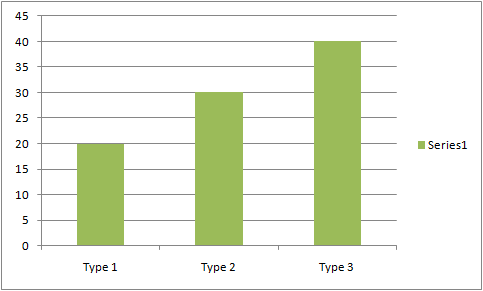
| Boring Yes, But Efficient |
3) Gauges and Stoplights are Just Plain Silly
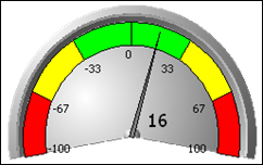
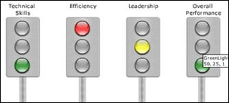
…and apparently animated bubble charts have also come under fire lately.
Is Your World Frictionless? Mine either.
Remember in physics class, how we were often instructed to ignore the effects of friction and/or air resistance? That was helpful, in an instructive way – we learned useful principles. But you can’t apply those in the real world without factoring friction back in.
A similar thing is happening here. And the friction that’s being ignored in this case is the human attention span.
Before someone can begin breaking down and interpreting a chart or other visualization, they must first decide that it’s something worth paying attention to.
And most people love eye candy. They just do. It’s fun to look at cool pictures, and fun draws people in. For example, some of my friends worried about the 3d chart appearance of the icon I chose to use for my site. “It runs counter to the prevailing advice about charts” was the concern. (You might notice that the PowerPivot field list never creates 3d charts – discretion is the better part of valor, even in software).

But when I took a vote amongst my friends and colleagues, this icon was the overwhelming favorite, with more than 2/3 of the respondents selecting it as their first choice. It was not well-liked by the other 1/3, however, who happened to be the people I already regarded as the pickiest people I know 🙂
Show Some Restraint, but Always Play to your Audience
Here’s what I now believe: the Chart Police are loud and influential, and they have good information to share, but they do NOT represent a broad cross-section of the public.
Wisdom dictates that you give your audience what they are most likely to engage with. So, if your report audience is mostly normal people, feel free to spice things up a bit. Don’t overdo it to the point that the original point is obscured, but make it fun. Make it attractive. Because your message won’t mean a thing if they don’t engage with it first.
If you know your VP likes their reports to contain pie charts, or 3d charts, or even animated bubble charts, by all means, deliver them. Don’t feel like you have to re-educate everyone about the sins of these things.
Of course, if your audience a bunch of college professors or professional graphic designers, I recommend following the chart police guidelines closely, because they very well might think you an amateur if you do not.
This isn’t a question of right or wrong, really. You just want your message to have the highest uptake possible.
Personally, I’d love to see studies that measured both the accuracy of the information conveyed by various visualizations, combined with the level of audience engagement. I really do think the Chart Police are onto something, but I think the story is unfinished as it stands.
Further Reading
I generally think of Edward Tufte when I think of the chart police. I’m not at all certain that he is the source of the venom that I see on the topic, though – I tend to think that he just identified some things that had previously been ignored, and then people who read about that picked up torches and pitchforks. Regardless, he does fantastic work, and notably is also an artist. Browsing his site is definitely a good use of time.
I also thoroughly enjoyed Eye Candy is a Critical Business Requirement.
Back Next Week
I’m visiting relatives in Chicago right now and don’t have access to my PowerPivot machines. So this was a good opportunity to cover this chart topic that’s been on back burner for weeks. Next week though, I’m moving ahead with DAX, might be finishing (!) the Great Football Project, and I have a couple of other reference topics about PowerPivot that I’d like to start compiling.
See you then!
Get in touch with a P3 team member