
The Pivot Pictured Above Acts as if We’ve Swapped Out Fields on Rows – in Response to a Slicer Click!
First off…my first post! Being one of the newest (and youngest) members of the P3 Adaptive family has been very exciting so far. As a way of introducing myself, I’d like to share a creative solution to a problem I’m sure many of you have encountered when building a report or dashboard.
Raise your hand if you’ve ever have had a challenging design request. Everyone? Ok, good.
Typical Client Report Requests:
- Simple but complex
- High-level yet detailed
- Compact yet containing everything…
Quite understandably, clients love to channel their inner Marie Antoinette by basically asking to have their cake and eat it too. I actually relish those scenarios, they allow me to flex my “think outside the box” muscles! And hey, it’s great to be working with a toolset that truly CAN accommodate the special demands posed by real-world situations.
Well one such scenario had a customer wanting a summary Pivot Table with about five columns (fields) worth of details in it. No problem, done and done! The problem we were encountering however…was that 90% of the real-estate space on our reporting page had already been used for other visuals, none of which this client wanted eliminated or reduced to make room. So I’m left with the predicament of figuring out how to fit all this data onto this dashboard…Tetris mode engage!
Unfortunately despite my best efforts to rearrange the dashboard (accompanied by my 80’s Rush Mixtape) I simply could not find any way to display a wide Pivot Table on this dashboard. So I circled back to the drawing board and asked myself what variables I could manipulate to achieve the desired outcome.
EVERY CHALLENGE HAS A SOLUTION! 
I realized that I had an assumption that the PivotTable had to be fixed, meaning that it always has to show all levels of the data. However I LOVE to design visuals for clients that are dynamic, only showing the relevant data to them (often based on slicer selections). So I politely asked my previous assumption to leave and invited over my good friend paradigm shift. After some long conversations and extensive Google searches I actually ran across a P3 Adaptive Blog Post written by Rob that inspired my eventual solution.
Discovering this post almost felt like a relay race and I was being passed the baton to cross the finish line. Using the idea from this post that a slicer could change the axis of a chart, I realized the same would work in a PivotTable. All five columns in my table were part of a hierarchy…so why not use this technique to display a single column that would DYNAMICALLY switch between any of the five levels of this hierarchy based on slicer selections. I would now be able to create a table that is both compact and would display all the data the client needed.
Time to break out the cake forks!
How I created the Mighty Morphing Pivot Table
Now for the fun part as I share this recipe for success (that was the last cake joke I promise). The general idea will be to create a hierarchy in the data model, and then reference those in an Excel set to be used in my Pivot Table. I’ll be using tables from the publicly available Northwind DW data set for this example.
Download Completed Example Workbook
Get Your Files
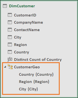
FIRST, create a Customer Geography Hierarchy in the data model on the DimCustomer Table.
Hierarchy in the Data Model table:
SECOND, create a new DAX Measure called “Distinct Count of Country.” This will be used in our set to indicate whether or not a selection was made on our country Slicer.
=DISTINCTCOUNT( DimCustomer[Country] )
Now some of you technically savvy readers may be thinking “why didn’t he use the DAX Function HASONEVALUE?” I’ll explain more on this later when I explain how to write the set using MDX.
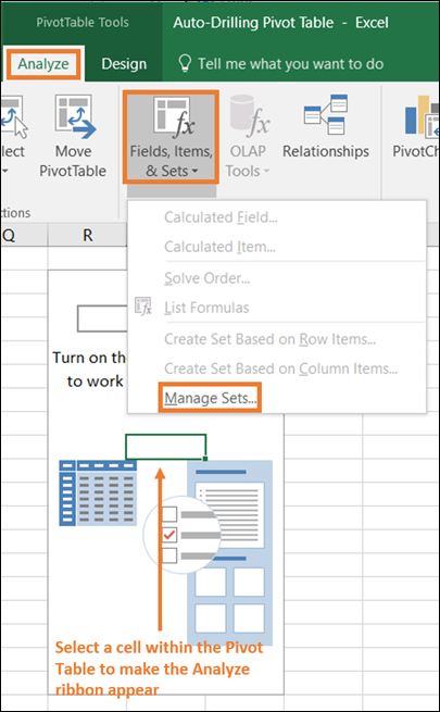
THIRD, create a new set for your pivot table referencing our recently created Hierarchy and DAX Measure. Note that the only way to access your sets is through a conditional ribbon that is displayed only when a cell selection is on a Pivot Table.
Opening the Set Manager window:
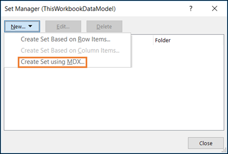
Creating a new set using MDX:
Writing the MDX Code:
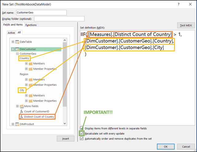
This MDX query works by utilizing an IIF statement, which operates the same was as in DAX or Excel. It checks to see if our (Distinct Count of Country) DAX Measure is greater than 1 (indicating no slicer selection). If TRUE it returns the Country column from our hierarchy, if FALSE (slicer selection has been made) then it returns the City column. It’s important to note that I must reference the columns in the hierarchy, if you were to put just the column names in this query it would not run. It’s also important that the “Recalculate set with every update” box is checked, this makes sure the MDX statement is calculated every time someone uses a slicer, otherwise it’ll appear like the set isn’t working.
Pause for an MDX magic trick
Keen observers take note! Here’s where I explain WHY I used a DISTINCTCOUNT rather than HASONEVALUE in my DAX Measure. Let’s say a client would like to multi-select countries in the slicer and still have it display the City column on rows in the Pivot Table. If I were to use HASONEVALUE in my DAX Measure I would only switch to the city column when a single value was selected.
The way I’ve designed it we can change the value in the MDX query from 1 to any number we’d like (E.g. 2, 3, etc.) which gives us the flexibility to allow multiple slicer selections and still have it switch to the City column.
“Clever Girl…”

I’m not actually sure if I’m supposed to be the hunter or dinosaur in this analogy from Jurassic Park…but either way I felt clever for that last step.
Now back to our regularly scheduled walkthrough
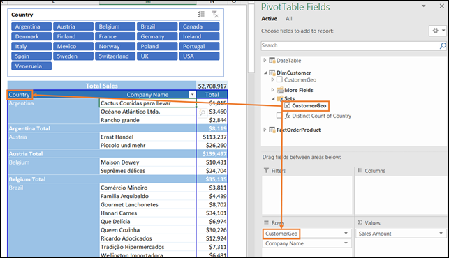
FOURTH, we can now use our newly created set in a Pivot Table. You’ll notice that a new folder called Sets is now nested in our DimCustomer Table.
Placing the Customer Geo set on rows in our Pivot Table:
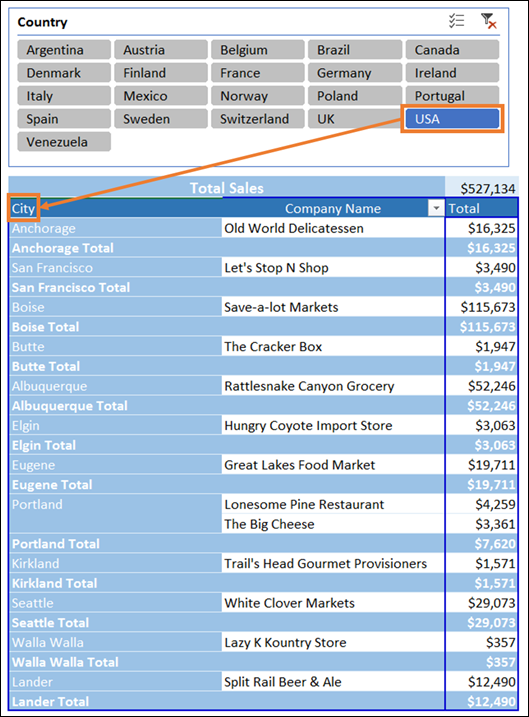
Making a slicer selection to observe the dynamic switch from Country to City. Pretty cool!
My client’s reaction could be summed up in a single word spoken by the immortal Keanu Reeves…
”Whoa…”
Now some of you may have noticed that I have a Total Sales value at the top of my Pivot Table. Now’s my chance to point out one unfortunate drawback of using sets on rows, it eliminates the totals row at the bottom of the Pivot Table. All is not lost though my friends, for every every problem a solution can always be found! In this case I created an artificial “Total’s row” at the top of the Pivot Table. I did this using the tried and true CUBEVALUE function to call the measure I’m already using in my PivotTable. NOTE that you need to make sure you connect all slicers (via the slicer_name) in the cube string for them to slice the CUBEVALUE as well. Finally, just a bit of dash formatting and some elbow grease and we have ourselves a Totals row!
CUBEVALUE Formula used in the cell for totals:
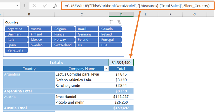
There you have it, your very own Mighty Morphing Pivot Table.
Get in touch with a P3 team member