Wham! It’s a hands-on technique!
In a recent post, I hinted that I’d be using the Football Project V2 as my “platform” for some future techniques-oriented posts. That future starts today! And while I certainly have enjoyed writing my more change-management-oriented posts this year like this one and this one, it’s good for me to still get my hands dirty a bit from time to time.
Besides, there’s a certain “back to our roots” quality to be found when I write DAX and M posts. That’s how it all started here.
In that previous post about the football project, I showed you a report without explaining any of it. In particular, the “football field” scatter chart representation of a passing chart served as the focal point, and it’s a pretty “hot” visual…
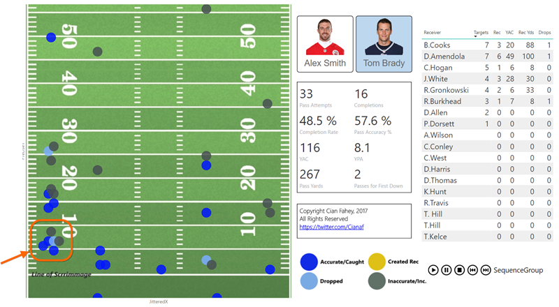
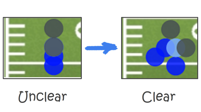
This Post is Primarily About How I “Jittered” the Highlighted Cluster of Dots to make Said Dots More Visible
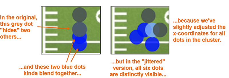
In the Original Power BI Dashboard, My Dots Were Hiding One Another
A Quick Glance at the Data
I can’t make this PBIX downloadable since it contains intellectual property of Cian Fahey, but here’s a quick glance at what the primary data table contains:

This Shows Most of the Columns of My PassData Table
(Ex: in the Second Row, Tom Brady threw an accurate pass 50 yards in the air, outside
of the numbers painted along the left side of the field. Brandin Cooks caught it
and then ran 4 additional yards as indicated by the [YAC] column)
And here’s what that second row of data looks like when it’s ultimately plotted on my scatter chart:
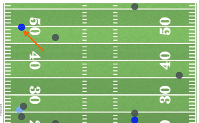
The Dot Corresponding to the 2nd Row of Data Above: 50 Yards in the Air, Outside the Numbers Left
(I don’t try to visualize the 4 yards he ran after catching it – at least not yet)
I’d like to thank Chandoo (Again)
Right before I started building this visual, I’d fortunately been reading an article by my good friend Chandoo, in which he “jittered” some dots in an Excel scatter chart.
So when I encountered the problem indicated in the left side of the image above, I knew exactly what I had to do, but this time with a Power BI twist!
But First… The Underlying Football Field Image!
I know. Many of you are probably most-interested in the underlying image part of this technique, or at least more so than you are interested in the jittering.
Not that you’re interested in football, of course, but there are MANY other cases where a custom underlying image from your business would/will be appropriate.
So let’s give it a quick treatment. Here’s what I did:
- I purchased a piece of football field clipart, and trimmed it down to the size I needed (few QB’s can throw a ball more than about 57 yards in the air, so I didn’t need the entire field).
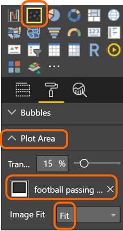
- I inserted a scatter chart into my report, set the background image of the plot area to be my modified clipart file, and changed the Image Fit to “Fit” rather than Normal:
- I then translated the [Pass Distance] column from my data into a [PreciseY] column using a DAX calculated column (this formula assumes the [Pass Distance] column contains values ranging from –5 to 55, and maps them to a Y-value ranging from 0 to 61:

- Then I used [PreciseY] as the Y Axis column in the field list:

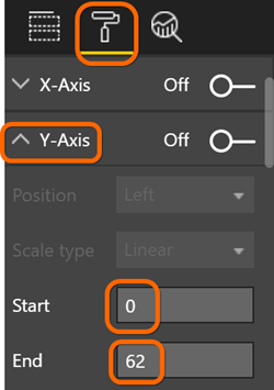
- Next, I set the Y-Axis of the Scatter Chart so that it ranged from 0 to 62 (experimentation showed me that 62 worked better than 61 – I encourage you to NOT consider this an exact mathematical science, and instead, just trust your eyes):
- Lastly, I repeated a similar process to generate a [PreciseX] column, based on a related table lookup (note that I only get five different original values for “X” location, as compared to the hyper-granular and precise Y location I get from the [PassDistance] column):
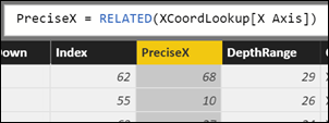
The Formula

The XCoordLookupTable
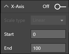
- Which of course also necessitates I set the range of the X axis of the chart as well. Note that I used 0-100 even though my [PreciseX] only goes from 10-91, because I do NOT want dots appearing on the far right and left edges, as that would place them “out of bounds” from a football perspective:
61 Distinct Values for [PreciseY] but 5 Distinct Values for [PreciseX]
OK, that sets up our problem nicely – our dots are going to be pretty well-spaced by default along the Y-axis, but the small number of distinct values of X is going to lead to some serious “clobbering.”
And since we have a “bigger” problem on the X axis, that is the one I chose to jitter, but with a slight “nod” to the Y axis as well (as you will see).
First, We Need a Unique Identifier for Each Dot
I quickly realized I needed a new column in my model, one that uniquely identified each dot.
Why is that? Well, I want every single row of my data to get its “own” dot on the graph, and the Power BI scatter chart is quite insistent on there being such a column:
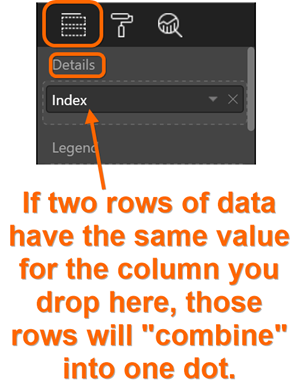
Now, sometimes you may WANT multiple rows to combine into one dot, but in this particular case, I want to see each row of my source data as its own dot.
When adding a new calculated column, there are LOTS of ways to uniquely “stamp” each row with its own distinct value. I could do this in DAX, but it would require concatenating/combining enough columns together (in this case, probably [Game #], [Qtr], and [Time], since no two rows can “happen” at the same time in the same game.
But for other reasons that you will see shortly, I need the unique identifier to be a number, and I don’t want to go through the contortions of converting text values to numeric, plus as you can see, the data is incomplete in the [Time] column (lots of blanks).
So I went back into the power query that fetches this data in the first place, and added an Index column:
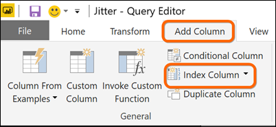
Add an Index Column to the Query…
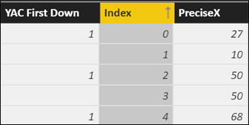
…and here it is after running said modified query!
(Not sure why I chose to start the column at zero. Doesn’t matter, 1 would have been fine too)
Now, I drop that [Index] column on the Details dropzone of the scatter chart (as pictured a few images up), and I’m now assured of “one dot per row of data.”
Come for the Techniques, Stay for the Business Value!
We get it: you probably arrived here via Google, and now that you’ve got what you needed, you’re leaving. And we’re TOTALLY cool with that – we love what we do more than enough to keep writing free content. And besides, what’s good for the community (and the soul) is good for the brand.
But before you leave, we DO want you to know that instead of struggling your way through a project on your own, you can hire us to accelerate you into the future. Like, 88 mph in a flux-capacitor-equipped DeLorean – THAT kind of acceleration. C’mon McFly. Where you’re going, you won’t need roads.
Time to Get Jittery!
Everything we’ve done so far gets me to the place where my dots are all appearing in their [PreciseX] and [PreciseY] locations, but “clobbering” each other:
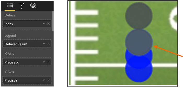
Our “Story So Far” Gets Us to This Place
(Our scatter chart field list at left, dots hiding each other at right)
All we need is a [JitteredX] column!
We need an alternate version of our [PreciseX] column, one that slightly shifts the X-position of a dot left or right to avoid clobbering its close neighbors. Just a little nudge left or right, one that doesn’t move it TOO much.
But how do we know which dots even NEED jittering/shifting?
First step: Identify the “clusters.”
If a dot is completely off on its own, its X coordinate doesn’t need to be adjusted. We only need to pay attention to dots that are clumped together.
So… how close together is too close? I experimented a bit before coming to the following conclusion.
A “cluster” is defined by:
- A shared [PreciseX] value, AND
- A [PreciseY] within a 2-unit “block”
In English, what I decided was that if two dots shared a [PreciseX] and were “really close” in [PreciseY] value, they were “clobbering” each other and required jittering.
We need a [Cluster]! To the DAX Cave!
I added these two calculated columns using DAX:
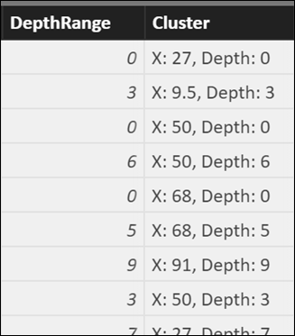
The formulas are:
DepthRange =
IF (
[Pass Distance] < 0,
-1,
IF ( [Pass Distance] <= 2, 0, 1 + INT ( [Pass Distance] / 2 ) )
)
Cluster =
“X: ” & [PreciseX]
& “, Depth: “
& [DepthRange]
DepthRange simply “compresses” pass distances into 2-yard increments. (I could have used [PreciseY] as the input here instead of [Pass Distance], again with the “divide by two” approach – this value is never going to be displayed to the user, so it doesn’t need to be semantically meaningful, but it DOES need to “lump” similar Y coordinates together, which it does).
Cluster then merely concatenates [PreciseX] and [DepthRange] together, but in a somewhat-friendly format (which helped me to debug).
OK, now for DAX “Magic”
Now, I add three more columns – two intermediate columns that “build up” to the third, which is the [JitteredX] we desire:
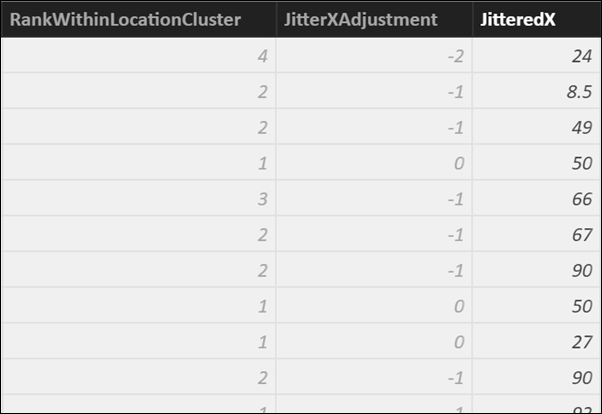
The formulas are:
RankWithinLocationCluster =
RANKX (
FILTER ( PassData, PassData[Cluster] = EARLIER ( PassData[Cluster] ) ),
PassData[Index]
)
JitterXAdjustment =
CALCULATE (
AVERAGE ( PassData[RankWithinLocationCluster] ),
FILTER ( PassData, PassData[Cluster] = EARLIER ( PassData[Cluster] ) )
)
– [RankWithinLocationCluster]
JitteredX =
[PreciseX]
+ ( [JitterXAdjustment] * 2 )
And here they are explained:
- RankWithinLocationCluster – among all rows/dots that share a Cluster value with this dot, how does this one “rank” in terms of its [Index] value? In this case, we’re not ranking in the “scoring” sense – the Index value is pretty damn arbitrary here, but since [Index] is numeric and unique, we can use RANKX to essentially make sure that we don’t move dots around and simply “jitter” them right back on top of one another.
- JitterXAdjustment – ok, THEN we calculated the average of the ranks within this cluster, and subtract THIS dot’s rank within the cluster. This yields a set of positive/negative/zero integer values, with NO duplicate values within a cluster, which allows us to shift both left and right for a nice even “spread.” Furthermore, in clusters of size 1, we get a 0 here (no shift). This also happens to handle odd- and even-sized clusters quite well (if you have three dots in a cluster, their ranks will average to 2, and the middle dot’s rank will be 2, so it stays put).
- JitteredX – I then take [JitterXAdjustment], multiply it by 2 to make the “spread” a bit wider (again, an eyeball-driven adjustment), then add that to [PreciseX] to yield my NEW x-coordinate, [JitteredX].
Final Step: Use [JitteredX] on the scatter chart!
Instead of [PreciseX], we now use [JitteredX] as the X-Axis field, as illustrated here…
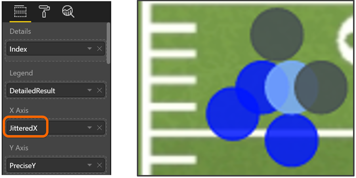
And… we’re done!
Questions? Ideas of where you’re gonna use this?
I suspect/hope that the two techniques demonstrated in this post (underlying image with translated X/Y coordinates, and then the jittering) will get your mental engines revving hard, and there will be questions like “wait, can I use this to do XYZ?” and/or “what if you wanted to jitter both X and Y?”
Bring ‘em on. Even if you “just” already know how you’re going to apply this, we’re curious/excited to hear it.
The comment thread is now officially open for business
Get in touch with a P3 team member