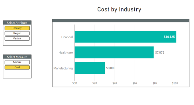
Slicers are Empowering!
There have been several blogs and articles written on dynamic measures and how to implement them in Power BI Desktop or Power Pivot using “Harvester” measures and disconnected slicers. See here & here. These techniques are popular with report users because they let report users choose the items they want to see and take control of the report. When one your customers ask for a report to be sliced a certain way, you don’t build them a new report, you add a slicer to a current report and teach them how to “click the button.” Ahh, empowerment!
Three Flavors of Disconnected Slicer
So for us report builders disconnected slicers enable us to empower our users, and we’ve been doing this for years. With the emergence of Power BI, disconnected slicers are more important than ever. The Power BI canvas is smaller than the Power Pivot canvas, and slicers of all kinds (especially the disconnected kind) let us turn one report into many reports. Dynamic measures is one type of disconnected slicer technique. The other two techniques are dynamic parameters (made much easier with the release of variables in Power BI) and dynamic attributes. This last technique, dynamic attributes, hasn’t gotten much attention, so let’s fix that!
What are Dynamic Attributes?
How often have you heard something like this. “I know I asked you to slice this Cost report by region, thank you for doing that. Now would you mind creating a version that shows the exact same Cost data but that’s sliced by industry.” For those of us in the reporting world, we have this conversation all the time. Without dynamic attributes, you would likely end up creating a new version of the report every time you get a question like this – maybe you end up with Cost by Region, Cost by Industry and Cost by Vertical reports. In Power BI this means creating three separate report pages, or at the very least three separate visuals.
Wouldn’t it be nice to have a button that says “What would you like to slice on?” and the report user can choose “Industry, Region, or Vertical.” When Austin and I first discussed this, we agreed it would be great – we just had no idea how to do it. 🙂 So let’s agree that creating 3 separate report pages or 3 separate visuals takes up too much real estate in Power BI and that 1 visual with a “Slice By” button makes more sense. Imagine if you could have one visualization and allow the user to dynamically select the attribute they want to visualize. This is dynamic attributes.
Example Data
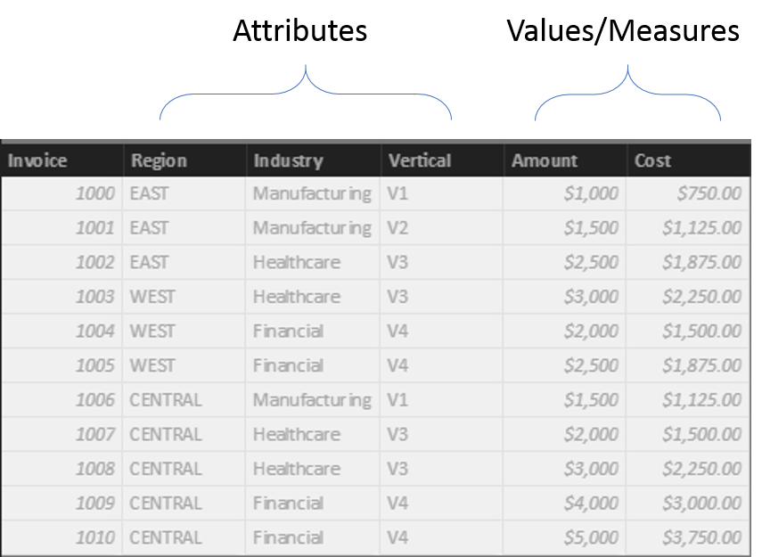
Let’s start by looking at our example data. Below is a data table that contains the important information for our report. The attributes you want the user to select dynamically are Region, Industry and Vertical. The values we have are Amount and Cost columns, and these will end up being measures. If you want to follow along and do this yourself, download the sample data here and use Get Data from Power BI Desktop to import into your model.
The Old Way
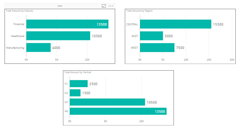
In a typical approach, you start by pulling the data into your model, creating a couple of simple measures called Total Invoice Amount and Total Cost. For the sake of time, let’s assume you know how to create simple measures such as this. You then quickly slap three visualizations on the page to analyze the Total Invoice Amount by the various attributes. This works but isn’t very exciting or dynamic.
The Beginning of Your New Dynamic Life!
Here’s a piece of wisdom you can keep with you. If you want to put something in a slicer it needs to be in a column. For example, if you want to be able to choose between Region, Industry, and Vertical then you need ONE column that contains those THREE values. If you’ve worked with disconnected slicers before then you’re used to creating a table with all of your options.
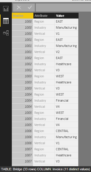
To begin the process of making these attributes dynamic, we need to do something with our data model. A middle table, sometimes called a bridge table is needed. A bridge table is generally used when a many-to-many relationship is needed. This is what our bridge table will end up looking like.
Let’s Build A Bridge
In the above image. each invoice is represented by three rows because we have three attributes we want to dynamically select. If you had 5 then you would have 5 rows for each invoice. The total rows in our bridge table will be the number of rows in our data table multiplied by the number of attributes you want to dynamically select.
Prior to Power Query and Query Editor, our bridge table would have been developed with a set of SQL statements implemented as part of a data process or ETL operation. Now, with Power Query and just a few clicks, you can create a version of a bridge table from your data table. Let’s walk through this one step at a time.
Step One:
Pull in your data table via Get Data and click on Edit Queries to open the Query Editor.

Step Two:
Make a copy of your data table. You do this by right clicking on the data table and selecting Duplicate.
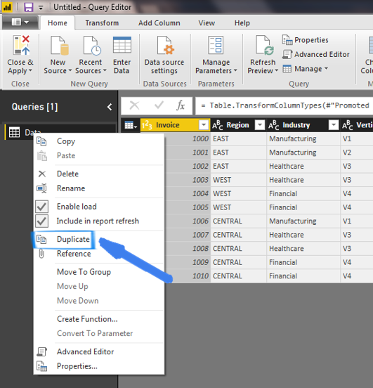
This will make a copy of the Data table called Data (2). You will want to rename this new table and call it Bridge.
Step Three:
You will need to use the Unpivot function. This is a powerful function that turns multiple column headers into a single column but in rows and stores their values in another column. To do this, highlight all three columns (Region, Industry and Vertical) by holding down the CTRL key and selecting each column. Then, with these three columns selected, click on the Unpivot Columns button on the Transform ribbon option. Notice how your table is now taller and thinner. The default name for the unpivoted columns is Attribute and Value.
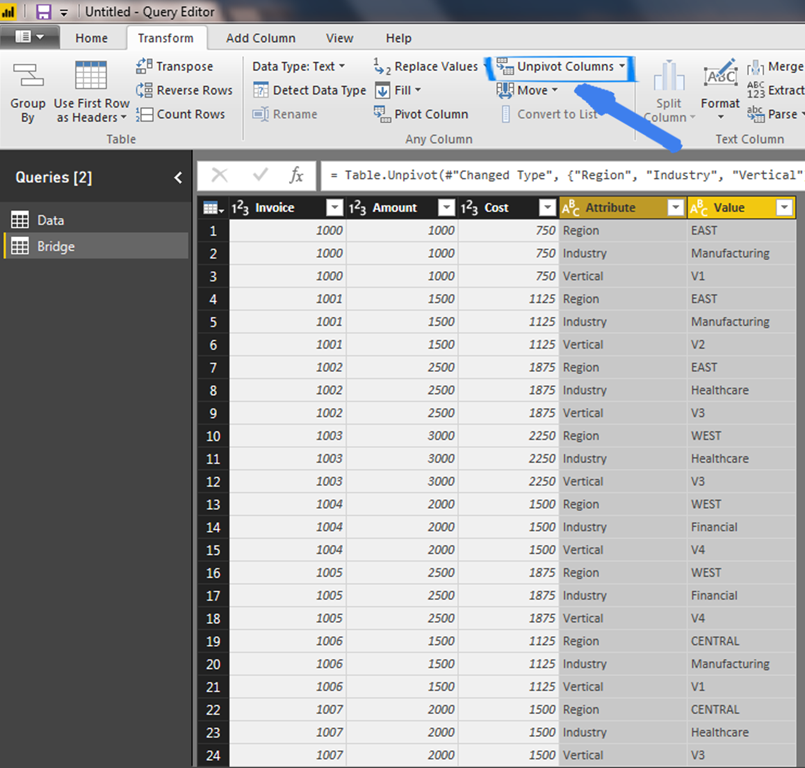
Step Four:
Remove the Amount and Cost columns by going to Home and selecting Remove Columns.
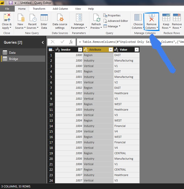
You now have an easily created bridge table thanks to the genius of the Query Editor. Click the Close and Apply button and now you are ready to proceed to creating a Slicer attributes table.
The Fun Starts Now: Create a Slicer Attribute Table
You need to create a table that will contain the attribute values that you want to be dynamic. This table will be used as the source to a slicer that will eventually be put on your report. Let’s start by making a copy of the Bridge table you just created. For the sake of time, do the same thing you did in Step 1 when creating the Bridge table except this time Duplicate the Bridge table and rename it to AttributeSlicer.
Next, we simply need to remove the Invoice and Value columns by selecting Remove Columns with both columns selected. Since this table will be a lookup table and used to source a slicer on your report, you only want distinct values in this table so another useful Query Editor function can be used called Remove Duplicates. This function can be found under Remove Rows on the ribbon. Once you do this, the result of your AttributeSlicer table should contain only distinct values for each attribute that you want to dynamically select.
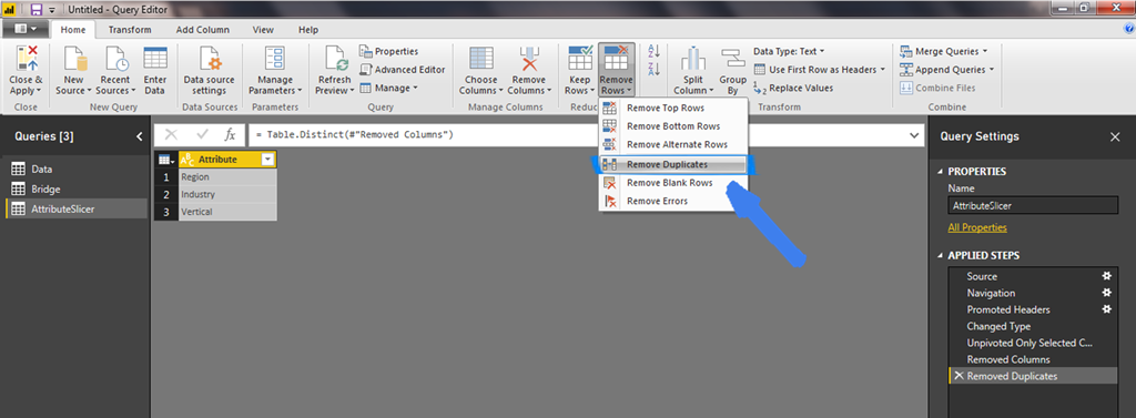
Click the Close & Apply button and let’s move on to the next part of this process.
Relationships
Relationships are the key to an enjoyable life. They are also extremely important when working with Power BI. For things to work the way you want, relationships are needed between the tables you have created.
Create a relationship between your data table and the bridge table on the Invoice column. Create another relationship between the AttributeSlicer table and the Bridge table on the Attribute column. This is how it should look.
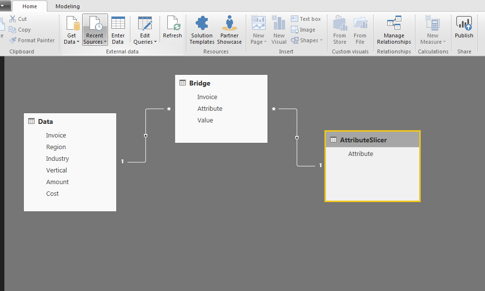
Time To Build The Report
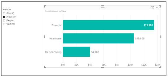
Start by creating a slicer and use Attribute as the value from the AttributeSlicer table. Then, create a clustered bar chart with the Value attribute from your Bridge table on the Axis and the Amount column from your data table as the values. Turn on and format your data labels and it should look something like this.
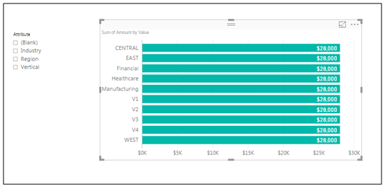
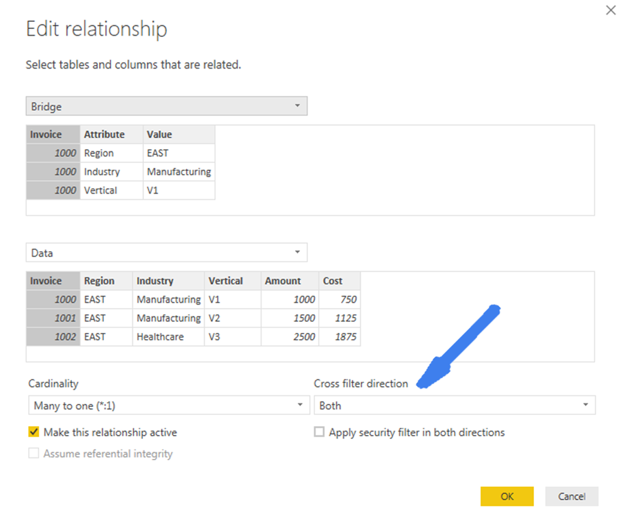
Now, select an attribute from your slicer and see what happens to the visualization. It is filtered to only show the values for the attribute you selected. Great! But wait, there is a problem. All the values are the same!!! This is because the AttributeSlicer table has a relationship between the Bridge table but the Bridge tables relationship to the Data table, where the Amount is coming from, is only one-way. If you change the cross-filter direction to be Both then you get the correct amounts. Double-click this relationship and change the Cross Filter Direction to Both and then notice the bi-directional arrow on the relationship diagram as seen below.
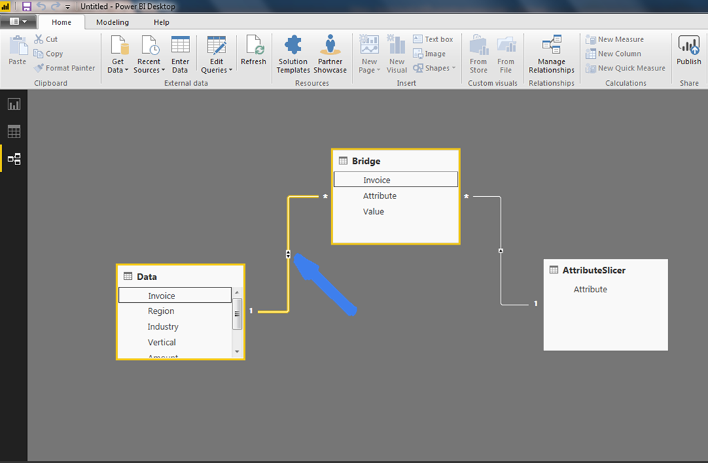
The report now looks and acts like you would expect and you can dynamically select which attribute you want to visualize. Go ahead, play with it and be proud of yourself.
Let’s Make It Better!
This is good progress but is still not good enough. Let’s make it better. First, let’s create measures for the two columns that we want to aggregate, Amount and Cost. Call them Total Invoice Amount and Total Cost using the following two DAX formulas:
Total Invoice Amount = SUM(Data[Amount])
Total Cost = SUM(Data[Cost])
Dynamic Measures
Now let’s create a MeasureSlicer table so we can make our measures dynamically selectable as well.
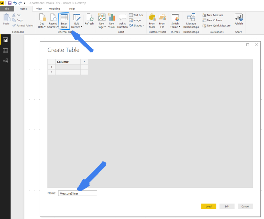
Click on the Enter Data button on the Home ribbon bar. A table editor will appear where you can add data. For now, let’s add Amount and Cost to the rows and label that column Measures. Add a second column and call it SelectedPosition and put the values 1 and 2 accordingly. Finally, name your table MeasureSlicer . Now click Load to add it to our model.
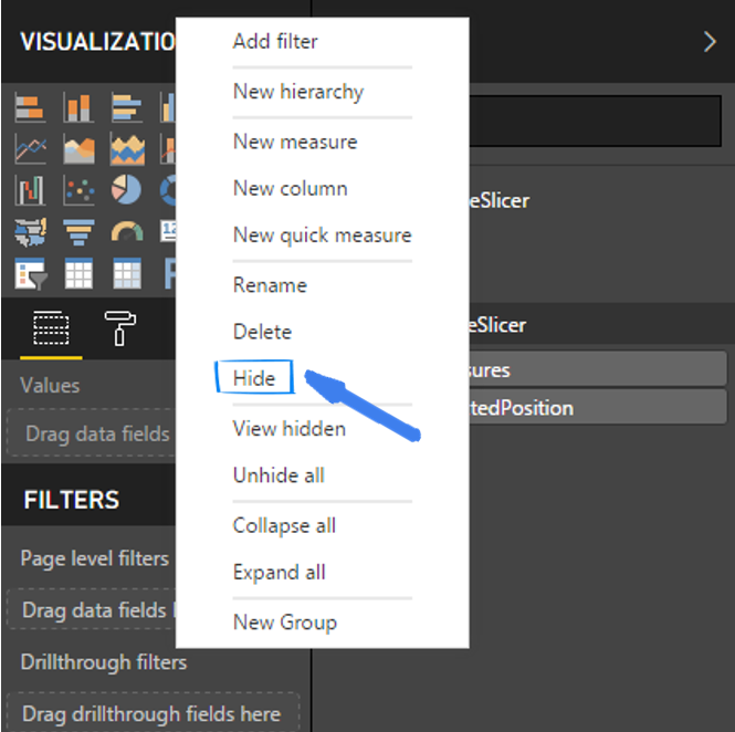
Once in your model, it is a good idea to hide the SelectedPosition column on your new MeasureSlicer table.
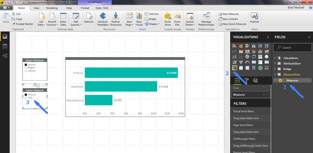
Ok, let’s add a slicer so the user can dynamically select the measure they want to visualize. To do this, 1) select Measures in the MeasureSlicer table so that it is added as a new visualization to your report. 2) Then, change the visualization type to Slicer.
It Doesn’t Work!!!
CAUTION! It won’t do anything just yet because we haven’t created the secret sauce, the Magic Formulas.
So, to make this solution totally rock, let’s create one more table to hold our “Magic” formulas. These three formulas or measures will allow us to toggle between the two measures and dynamically adjust the title of the visualization based on the selected attribute and measure.
Just like before, click Enter Data on the Home ribbon, give this table a name called Calculations and click Load. That’s it. You don’t even have to enter anything. Now, for the work. You will create three measures by right clicking on your new Calculations table and selecting New Measure. You will find the code below (bold) for these three measures with a brief explanation of each.
SelectedIndex = Min(MeasureSlicer[SelectedPosition])
The SelectedIndex measure’s job is to get the SelectedPosition value for the measure that is filtered via the Measures slicer you just added. In this case, the SelectedPosition value will be either 1 or 2.
Magical Formula = IF(HASONEVALUE(AttributeSlicer[Attribute]) && HASONEVALUE(MeasureSlicer[Measures]), Switch([SelectedIndex],1,[Total Invoice Amount],2,[Total Cost]))
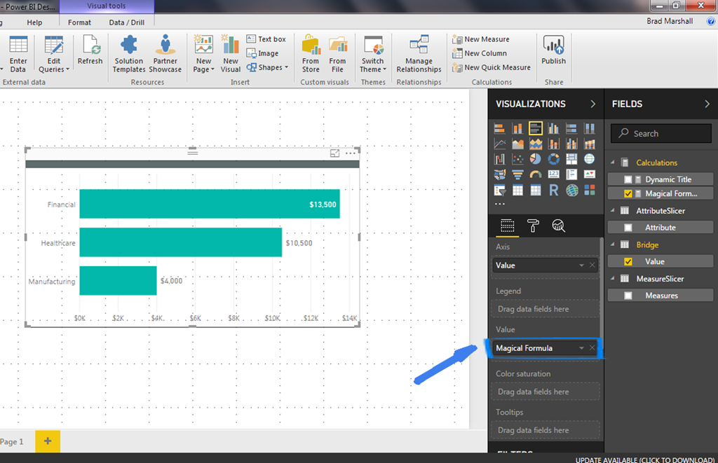
The Magic Formula’s job is to ensure that only one attribute and one measure is selected and if so, use the Switch command to set, hold or “Harvest” as Rob Collie would say, the name of the measure that is to be visualized. Go ahead and add the Magic Formula to the Value area of the visualization. Now, you can dynamically select either Amount or Cost in the slicer and watch the measure dynamically change on the visualization.
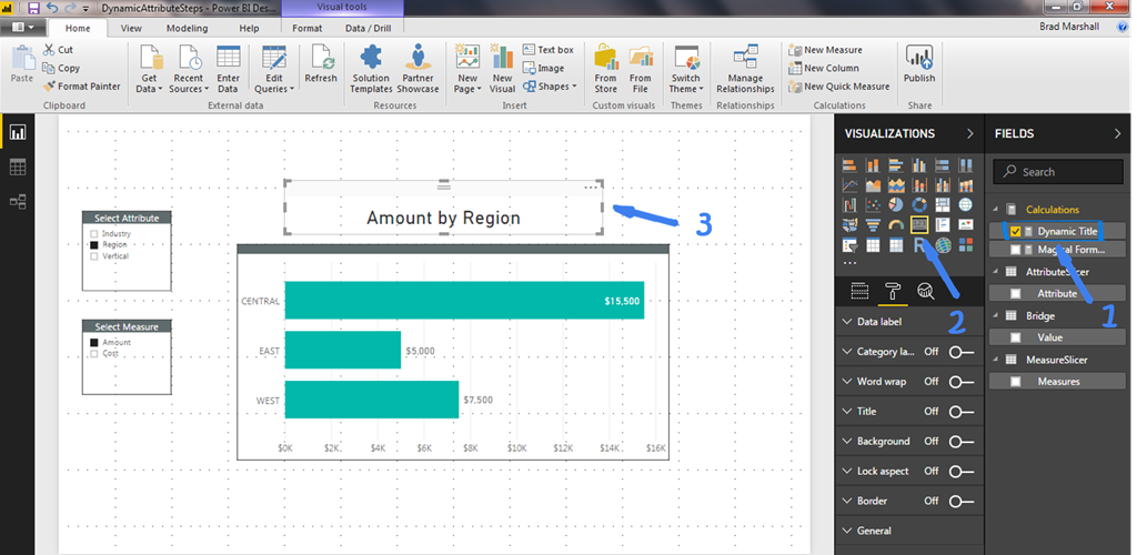
Dynamic Title = IF(HASONEVALUE(MeasureSlicer[Measures]) && HASONEVALUE(AttributeSlicer[Attribute]),VALUES(MeasureSlicer[Measures]) & ” by ” & VALUES(AttributeSlicer[Attribute]), “Pick One Measure & One Attribute”)
The Dynamic Title’s job is to again ensure that only one measure and one attribute is selected and then dynamically build a measure based on the selected Measure and Attribute. Add this measure to a Card visualization and place it above the chart so it will read something like “Amount by Region” or “Cost by Industry” and it will be a title that lets the user know what they are looking at in the visualization. If none or more than one attribute or measure is selected, the measure will read “Pick One Measure & One Attribute”.
Clean House
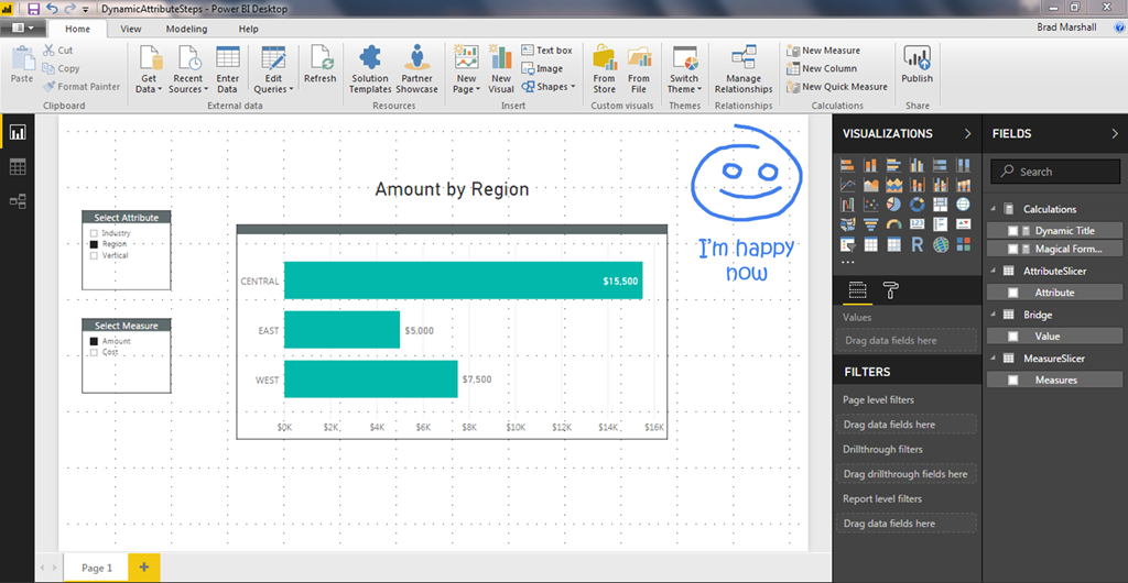
Finally, let’s hide all of the trickeration and remove the clutter. You can hide the Data table completely. Hide Column1 and SelectedIndex in the Calculations table and the Attribute and Invoice columns in the Bridge table so your solution now looks clean and usable.
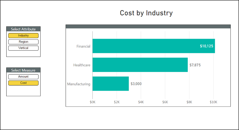
Since we have occupied so much of your valuable time, we will forgo the steps to make this report look sexy. You can add your own style, maybe use a Chiclet slicer (which I love) instead of the default Slicer visual and you have something that is extremely flexible and is starting to look pretty good as well.
Get in touch with a P3 team member