
We get it, you’ve got lots of data. And we’re sure you know that using that data for insights is the key to your business. Spoiler alert: spreadsheets aren’t going to cut it. What does make a difference is using data visualization to analyze your data and ‘see’ what it’s telling you.
Power BI is a reporting and analytics tool that enables you to create data visualizations made up of various charts (including common ones like line, bar, and pie charts and more complex ones like Decomposition Trees). Another cool chart—and the focus of this blog—is a histogram. A histogram is a visualization chart that shows how numbers are distributed in your data. Think of it as your data’s heart rate monitor, showing how your numbers are spread out, where they spike, and where they drop. No more rows and columns … instead, a clear visual that shows you patterns and trends within your data.
Power BI consulting can help you design histograms that are tailored to your business goals and empower you to see what your data has to say. Let’s see how histograms in Power BI can help drive better decisions. And how the right guidance can help.
How Do You Create a Histogram in Power BI?
Power BI comes with a wide variety of native visuals for reports and dashboards, from the basics like line, bar, and pie charts to more advanced options like Decomposition Tree and KPIs. Histograms in Power BI organize a large set of data points (in what looks like a bar chart), making it easier to make sense of how values are spread. They group continuous data into ranges, showing you where values cluster, how they’re spread out, and their frequency. You’ll have an easy-to-understand chart where you can spot patterns, outliers, and trends by seeing if data is skewed or follows a normal distribution. Where histograms differ from bar charts is that they highlight the scale of continuous data vs. separated categories. A Power BI consultant knows how to design a histogram properly for your use cases.
So, when should you use a histogram? Anytime you want to understand how numerical data is distributed across ranges, say weight, temperature, or dollar amounts. For example, you might use one to see peaks in customer spending, track website traffic, or check if a manufacturing process is consistently hitting high standards. Marketers can use them to segment customers by demographics or buying behavior, helping to tailor campaigns more effectively.
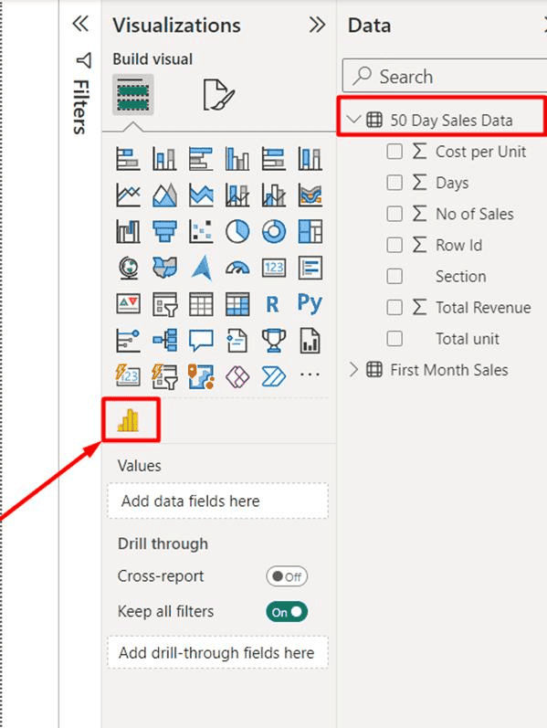
Currently, Power BI does not have a native histogram visual. A consultant’s knowledge makes a big difference here. They can help by adding a histogram visual using third-party options, such as a Power BI Histogram visual download from Microsoft AppSource, or you can simulate a histogram by creating bins with the “New Group” feature and plotting them on a column chart, or by using custom DAX. For instance, once you import Histogram chart add-ons for Power BI, you’ll see a Histogram icon in your Power BI visualizations. (See below.) You can also download a Statistical Process Control (SPC) Histogram custom visual from AppSource.
How To Create a Histogram Step by Step?
Histograms are a great tool for visualizing data, but creating one takes a bit of know-how (hint: Power BI consultant). Let’s break down the steps a consultant will use:
Step One: Start With Solid Data
Histograms show the distribution of a single, continuous variable, so there are a few crucial things to keep in mind for your dataset. Make sure data is clean, well-formatted, and includes one column of numerical, quantitative data, like prices or temperature. Histograms work better with larger datasets, at least a few dozen data points, but ideally much more for reliable (and meaningful) insights. Power BI lets you connect to a variety of sources like Excel, CSV files, SQL databases, SharePoint, web APIs, and websites.
Step Two: Create Your Data Bins
Next, a consultant will set up your Power BI Histogram bins (the intervals that group your data). Size and frequency matter here—you need the right balance. Too few bins can oversimplify things and hide patterns; too many bins can make your histogram look cluttered and hard to read. For frequency, you’ll need to count how many data points land in each bin, giving you the frequency for that interval. Without frequency, the bars in a histogram wouldn’t give any meaningful info. It’s the patterns across bins that show the shape of the data’s distribution (as in bell-shaped curve, skewed, or uniform distribution).
Step Three: Make It Dynamic for Smarter Insights
Dynamic binning gives you control to interactively adjust bin sizes from the dashboard using a parameter. This means you can change the histogram’s appearance and granularity, like zooming in for finer detail or zooming out for a broader view. A consultant will set this up by creating a dynamic binning measure using DAX, dragging that measure to the visual in Power BI, and adding a parameter.
Step Four: Your Histogram Visual Brings Data to Life
Here’s where an experienced Power BI consultant helps. Whether you want to create a classic column chart histogram using the tools in Power BI or create more custom visuals with Power BI Histogram visual downloads from AppSource, it takes experience to design them the right way and to apply more advanced techniques. Custom histogram visuals allow you to play with colors, add overlays, and adjust bin sizes, titles, and labels with formatting.
Statistical Process Control (SPC) Histograms: A Few Tips
When building SPC histograms in Power BI, a few tweaks (and the right guidance) goes a long way. First, be sure to adjust your bin sizes; you don’t want things cluttered with too many or to miss important patterns with not enough. Add reference lines for averages or control limits so your chart tells a clear story about process stability. Take your visuals a step further with custom SPC visuals or overlapping histograms to compare distributions. Little touches like data labels, DAX measures, and formatting can enhance the visual clarity and make it easier to take action.
How to Convert Data Into a Histogram?
Binning helps shape raw data into actionable insights. A consultant leverages binning and grouping of data in Power BI to organize it into more meaningful chunks. They may categorize numerical data into defined ranges—for example, grouping health data like blood pressure reading into categories like normal, elevated, or high vs. looking at thousands of individual readings, or instead of plotting the duration of every website visit, they might bin sessions into ranges to see how long people typically hang out on your site (i.e.,1-2, 3-6 minutes). This will highlight overall trends and make patterns jump out, making it easier to see shifts in customer behavior, compare prices, or track performance over time. The bottom line: binning and grouping make insights easier to see, interpret, and act on by transforming raw data into insights for better, data-driven decisions.
A consultant takes Power BI histograms further by leveraging DAX measures. These more customized calculations can add extra depth to your visuals. For instance, they can create measures to highlight outliers by flagging and counting values that fall outside expected ranges, to unusual data points that pop out right in the chart. Or they can use a time-intelligence measure to see how distributions shift month over month.
Here’s the thing: histograms are way more than pretty charts. Power BI consultants (like the P3 Adaptive folks) have the expertise and experience to leverage all the things we’ve discussed to build histograms that help tell powerful data stories that help drive strategic business decisions and keep you ahead of your competition.
What Is the Difference Between a Histogram and a Bar Chart in Power BI?
So, what’s the difference between a histogram vs. a bar chart? Sure, they look alike, both using bars to show data points, but what you use them for is quite different. And knowing the difference matters, so you can choose the right one to tell the right stories of your data. Here’s a quick look.
Bars Charts: Quick Comparisons at a Glance
Bar charts are great for comparing differences between discrete categories and business dimensions (only one value per each) with bars separated by gaps to show they’re distinct categories. Bars can be rearranged in any order that shows patterns like largest to smallest, chronological, or alphabetical order. Use bar charts when you want to see which categories lead or lag, showing revenue for each division in the company, or seeing how many units of each product are sold in a month.
Histograms: Seeing the Shape of Patterns and Trends
Histograms are used for continuous numerical datasets to show the distribution of values (based on the heights of each bar) to reveal patterns and trends so you can see clusters of data, gaps, or unusually high or low values. They must follow numerical order, no reordering here, and the bars are touching to show a continuous numerical scale. Histograms are great for plotting customer ages to see which age groups are more represented or visualizing daily sales numbers over time to identify highs or lows in performance.
Let’s talk strategy. A solid business strategy is a game-changer for your business. Aligning histogram insights with stakeholders’ high-level business strategies can make a big difference, too. But how do you do that? First off, let a data strategy consulting firm be your guide. They’ll help you define the key questions you want to answer from your data, like identifying high-value customers. Use histograms to visualize relevant metrics, like customer spend or product usage, so patterns stand out. The key here is paying attention to the distribution shape to interpret skewed, normal, or bimodal patterns to find actionable insights.
Then, translate those insights into steps (think personalized offers or loyalty programs for customers), and most importantly, communicate the data story clearly to stakeholders. A consultant can also help you define and track KPIs to measure impact and to refine your business strategy.
Making Histograms Work for Your Business Strategy
Histograms are a powerful data visualization tool to unlock deeper organizational intelligence. They can help you to get more in-depth info than simple averages to dig into problem areas, spot variations, and make data-driven business decisions. They can be used across your organization, from tracking process variations in manufacturing to analyzing software defects, helping to increase operational efficiency and improve quality control.
Power BI can (and should) play a central part of your data strategy. With the right Power BI consulting partner, you can tap into the game-changing business intelligence that it delivers. Even better, Power BI is a core part of Microsoft Fabric, which unifies data and analytics in one platform. A Microsoft Fabric consultant can show you how.
Histograms can help you gain business intelligence by understanding your data’s distribution. The shape of your data’s distribution is clearly displayed on a histogram chart; you can easily see where data is skewed, normally distributed, or bimodal, and you can connect those insights to see trends over time, identify performance issues, and ultimately make better business decisions.
P3 Adaptive’s expert consultants will partner with you to create and analyze histograms to improve decision-making. Our team has the experience needed to enhance your data analysis by leveraging advanced visualizations and combining histograms with other visualizations to dig deeper into your data. The bottom line? Histograms are a simple, yet super powerful, tool to take your data analytics to the next level. We know exactly how to take full advantage of them as part of your business strategy. Let’s develop a data strategy that grows your business … and leaves the competition barking at your heels.
Get in touch with a P3 team member