
Surfs Up
A long time ago a peer in Financial Planning and Analysis said “Financial Planning starts in the home.” I modified the statement to “Data analytics starts in the home.” This means that I have a host of personal databases and analytics dashboards.
When I was a kid, I counted fish by the thousands and wrote them all down in a loose-leaf binder. I grew up discovered Excel and kicked myself for missing out on this beautiful tool when I was ten years old. Many moons later I learned Microsoft Access and would eventually count calories by the millions learning less is more. I bought an electricity monitor and started measuring the wattage used in my house every minute for more than five years, tens of millions of watts. My conclusions were the light bulb was killing my electric bill. Those old, smoky incandescent bulbs were to blame CFL’s, and LED’s cut my bill in half overnight. These skills extend to my work life, counting loaves of bread in the hundreds of millions, barrels of oil in the billions and most recently vitamins in the hundreds of billions. Some people say I have an obsession with counting.
I live on the coast of California in Half Moon Bay. I surf to stay sane in an otherwise crazy world. A decade ago, I converted to surfing Stand Up Paddling boarding to catch more and bigger waves. I became an accomplished big wave surfer and most recently a foil surfer. I found a great way to combine my passion for counting with surfing and on October 18, 2012, I started counting waves. Like counting fish, I would mentally tally up the waves, come home and write them down this time in my favorite medium Microsoft Excel. 7,379 waves later I bought a TRACE GPS monitor for surfing.
You can follow along by downloading the TRACE gpx file here.
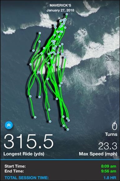
The TRACE attaches to a surfboard and records the GPS coordinates along with speed and direction. After a surfing session, I connect my cell phone and TRACE will upload the data and return a nice pretty picture of every wave that I caught overlaid, with Google Maps I assume, on the exact spot I just surfed.
A typical TRACE view looks like this:
I wrote the designers of Trace, David Loskin, and asked if I could get access to the data directly. He sent me a developers handbook and started to download the GPX files to a box site. Two years ago I attempted to uncork the data using Excel. The GPX format was spicy enough that I couldn’t cleanly open up the row-based data. I gave up for more than a year.
In September of 2017, I started to study the effects of fins on surfboard performance. Specifically, I was interested in how fast was I going with the various fins I was using on my surfboard. Was a single fin, thruster or quad setup faster? I took another attempt at uncorking the TRACE data.
I work for a firm with heavyweight data scientists. I grabbed one of the millennials named Ben and said “Ben can you crack open these GPX files? I need to get the detailed speed and trajectory data from these files.” Ben hammered the files and said, “Wow, this data has longitude, latitude, azimuth, speed, and elevation, no way!”
I figured I would make another attempt to crack open the GPX files. I had recently taken a course with PowerPivot pro on DAX and PowerQuery. Where I had failed with Excel to open the GPX files, PowerBI and PowerQuery would shine.
In summary, I do the following:
- Download the latest GPX file to a common directory
- Define using a set of Parameters the latest “GPX Source” for the PowerQuery retrieve
- Extract the MetaData from the GPX File
- Use the Parameters to Perform a Full Data Pull of the GPX files
- Create a Secondary pull of the GPX file à Offset the data by one record
- Define a Wave-based upon changes in the row base data recorded in the GPX file
- After I surf and log all my GPX (GPS) data from TRACE, I will upload my data using the application on my iPhone.
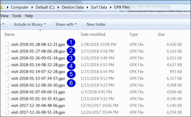
1. Within a few minutes, the GPX file shows up in my sync’d box site. I then download the GPX file to a directory on my PC.
The files look like this:
2. I built a Parameter table to define the “GPX Source” for each pull from the GPX file. The Parameter table may be beyond the scope of this write-up, but it essentially allows me to use an applet for each time I update the PowerBI visuals to define a specific pull from the GPX file. The parameter definition is as follows allowing me to specify the A) FilePath, B) File and C) extension. A and C rarely change, so I just update B and hit refresh from the PowerBI interface.
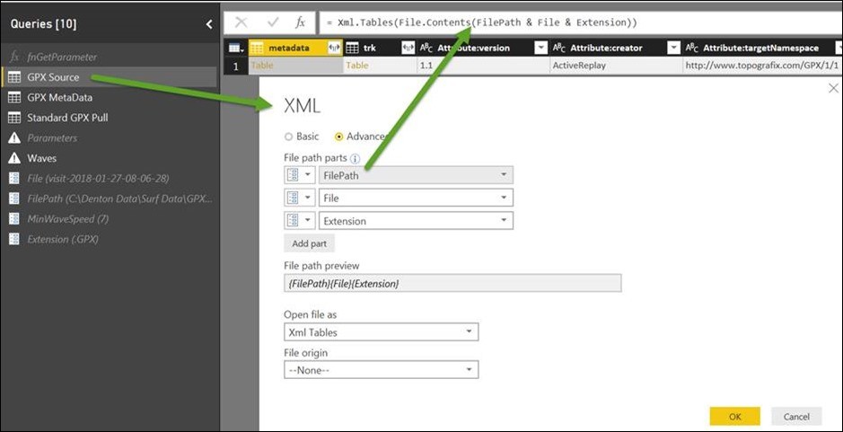
3. The GPX MetaData then pulls specific attributes about the file using the “GPX Source” defined above. In this example, the “Source” is defined as = #”GPX Source” which is referencing the preceding query step. Some file attributes can be accessed by double-clicking on the various field “TABLE” references as shown in Step 1 below.
Step 3 Part 1

Step 3 Part 2
Expanded the “Table” of available information in the Metadata field.
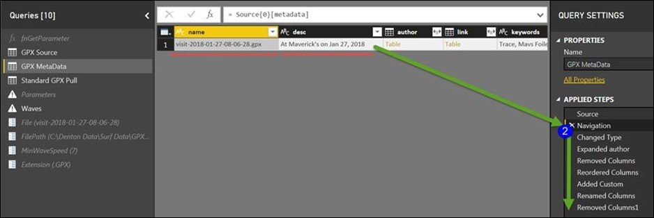
Step 3 The final step
Delivering a concatenation of my username with the GPS identified location, provided by TRACE and the Date of the session
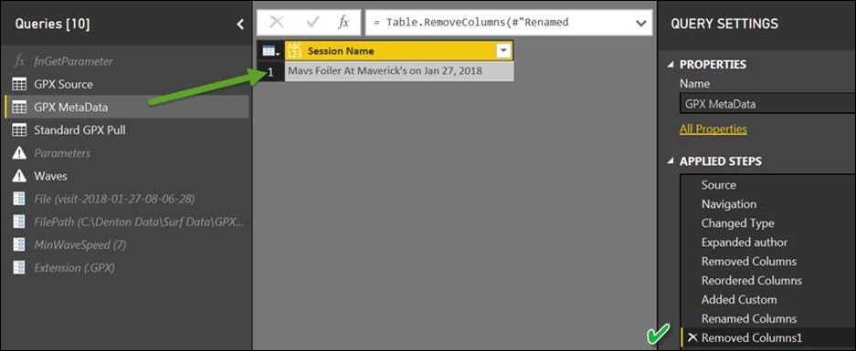
4. To pull the full GPX data, I once again reference the “GPX Source” from step #2.

The great thing about PowerBI is that you can simply keep clicking around on a foreign dataset and eventually learn how to crack it open. In this case, a few clicks through the data file and I discover the following fields of data in the GPX file:
· Time: Every 1/5th of a second
· Speed: Meters per second
· Azimuth: Orientation North / South
· Latitude
· Longitude
· Elevation Meters
· Sub Seconds Measured in 1/100 of second increments

5. The GPX data delivers a static record per 1/5th of a second. During a 1+ hour session, this results in 10,000’s records of data. To identify a wave caught requires measuring an increase in speed from one record to the next. In this example, I am creating a second pull of the GPX file and offsetting it by one record. By merging the file with itself, I allowed for a comparison of one record with the next. A significant jump in speed, for example, from below, to above six mph, can be used to identify the start of a wave.
6. Once a wave was identified, from a discreet change in speed above the threshold six mph, a summary of all measured waves was built in an additional table grouping the attributes, based upon start time, of each wave.
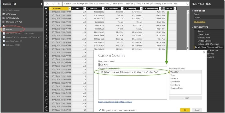
The Final result allows for a linkage between the “Waves” table and the Standard GPX pull linking on the WaveStart field further filtering on the True Wave field = “Yes.”
Selecting Home à Edit Queries à Edit Parameters bring up the following applet:
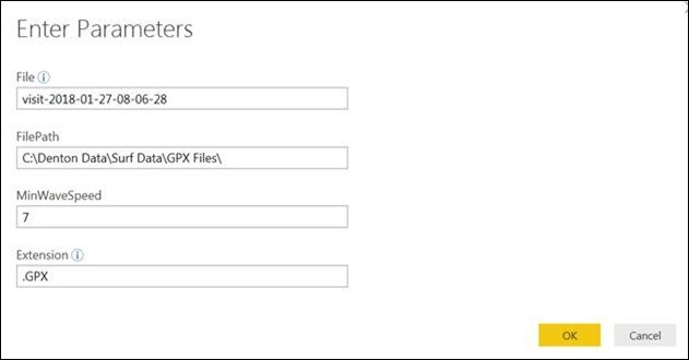
Selecting OK and apply performs a full retrieve of the source data using PowerQuery to load the visualization.
The result is delivered to Power BI’s front end allowing the user to select each True Wave defined above as lasting more than 4 seconds and longer than 50 yards. The Latitude and Longitude are fed to a custom visual “Route Map” imported from the Power BI store. The Route Map overlays each ride on a picture of the local surfing spot with the orange line. An additional visual at the bottom of the page shows a bar graph with the Minimum and Maximum speed for each second. The red line shows the change in elevation during the ride.
The picture looks like this and becomes completely interactive:
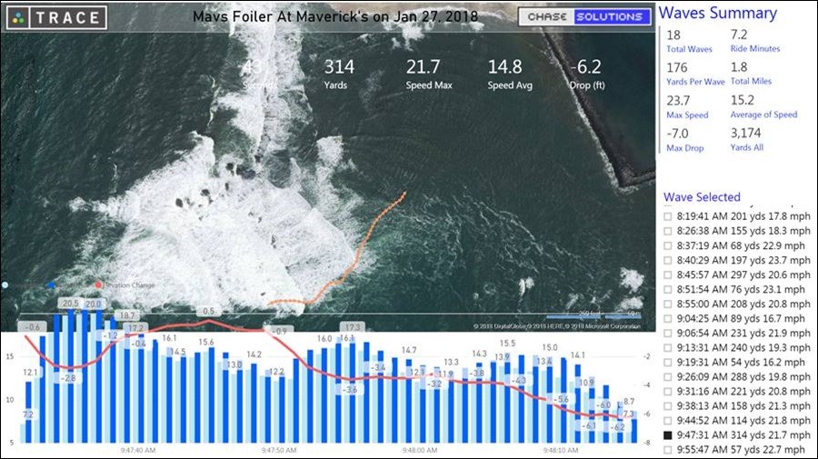
This perspective was for a smaller day 4 to 7 feet on the inside of Mavericks in Half Moon Bay, CA. Even more thrilling was that I had been using my TRACE for more than two years. I had all the historical data and was suddenly awash with data.
Big Wave Drop
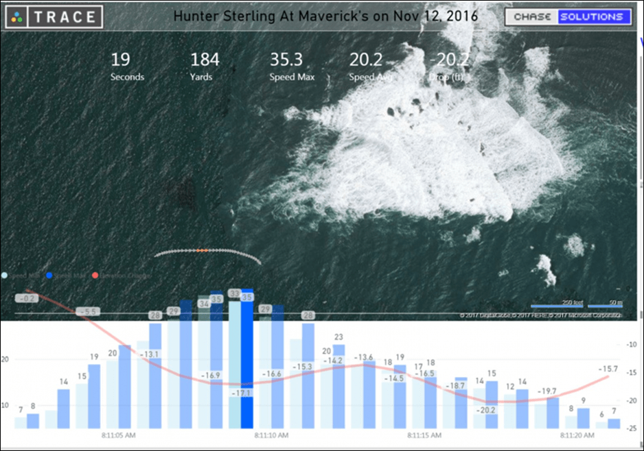
I went back and opened up data on this wave from Nov 12th, 2016. A big wave Saturday at Mavericks. Waves caught at Mavericks have shown to have a stepped nature. They drop, come up a little bit, and then drop again.
This data suggests I descended 17 feet on the initial drop, shown in the picture below. I then ascended 4 feet and then fell another 7 feet before kicking off the wave to the south.
A full drop from Peak to Crest would likely result in getting hammered by the wave. Best practice might suggest leaving a healthy trough below your feet and progressing down the line to survive until the next wave.

Big Wave Crash
Here was another wave caught on camera, video and with my TRACE.
The takeoff is shown in the 1st photo.
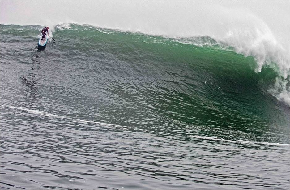
I maxed out at 34 mph and was cruising in front of the breaking wave when a someone caught this image, a still frame, from the video below.
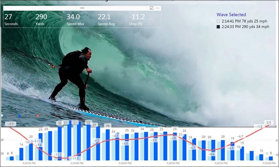
The wave was fun for me but ironically made the World Surf League’s Wipeout of the Year entry for another surfer who was caught a bit deeper in the same wave.
WSL Wipeout of the Year
I use my Power BI application with TRACE nearly every weekend to get an accurate wave count; distance traveled, maximum and average speed for the entire session. A video demonstration of the features of my TRACE applications is as follows:
Some more fun using the TRACE overlay on video I made of more modern Foil Surfing. TRACE provided the overlay, but you will see the Power BI graphic summarizing the flight at the end of the wave.
Microsoft’s platform is the world’s most fluid & powerful data toolset. Get the most out of it.
No one knows the Power BI ecosystem better than the folks who started the whole thing – us.
Let us guide your organization through the change required to become a data-oriented culture while squeezing every last drop* of value out of your Microsoft platform investment.
* – we reserve the right to substitute Olympic-sized swimming pools of value in place of “drops” at our discretion.
Get in touch with a P3 team member