Recap of Part One
If you missed Tuesday’s history lesson AKA Part One, don’t worry, here’s the summary:
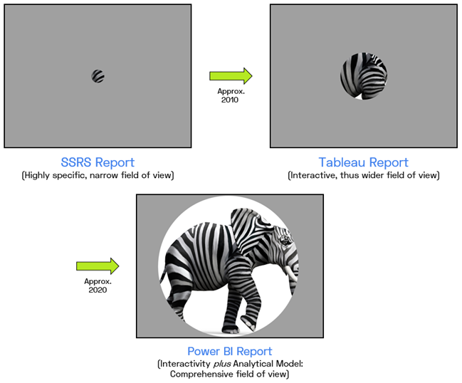
- For a long time, Reporting was the dominant force in BI, with Interactive Analysis a distant second
- This wasn’t because Reporting was better – it was just because Reporting was easier
- Reporting only provided the business with a pinhole-sized field of view
- This led to a proliferation of reports AND an overwhelming dependence on Excel
- Tableau was a breakthrough of Interactivity for the business, expanding the field of view considerably – but still insufficient
- Power BI marries Interactivity with an underlying Analytical Model, providing the most comprehensive field of view
This is a Good Thing, But…
Yes this represents tremendous progress! The purpose of BI is to see what is going on, and then use that vision to drive improvement. Pinhole-sized fields of view (Reporting) don’t cut it, and neither do spotlight-sized fields of view (Tableau). You need to see as much as possible. “See EVERYTHING” is a difficult goal to attain, but it IS the only goal which makes sense.
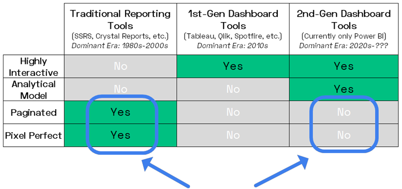
But let’s revisit the other diagram from Tuesday, because there’s something significant to be gleaned:
Interactive Dashboard Tools Aren’t Good at Everything
Interactivity Tradeoff #1 – Not Pixel Perfect
Technologies always come with tradeoffs, and an interactive canvas is ultimately a place where you arrange a bunch of pre-built objects. In Power BI, the objects in question are mostly called “Visuals,” like charts and slicers, but we also have Textboxes, Images, Buttons, and Shapes.
Pre-built objects are GREAT building blocks for building interactive dashboards! I don’t want to design a chart from scratch. I just want to drag it onto the canvas and then tweak the formatting to suit my needs. And then I want it to offer the user things like filtering controls.
But pre-built means “less than 100% flexible.” The things a graphic designer can come up with frequently will NOT quite be doable in a drag-and-drop canvas environment – but ARE feasible in a pure HTML environment. Power BI has done an amazing job making their visuals flexible, and you can get some incredibly-polished results, but they cannot possible think of, nor implement, every possibility. “As flexible as HTML” will never be attainable, not even close.
Here’s something that’s not the BEST example of Pixel Perfect, because it’s simple enough (design-wise) that Power BI could get you probably 95% there, but it’s a handy example and not client-sensitive. It’s the email report I got from the very last time I went to the gym before COVID scared me off:
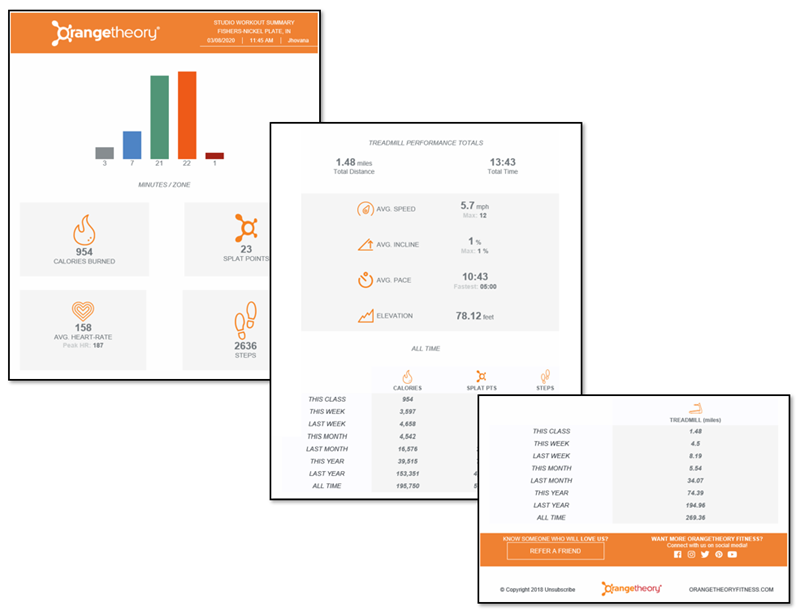
Yeah, you could get CLOSE to this in Power BI, but there would be a few things “off.”
(Not to mention the aspect ratio – this is several screens tall)
Plus, Interactivity ITSELF necessarily introduces some “clutter” in the form of on-hover controls and effects. We need these for interaction purposes, but in an airtight, graphic-designer-driven environment, that sort of clutter can spoil an otherwise perfect design.
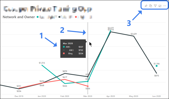
Three On-Hover Elements on a Simple Chart:
1) Legend and data labels 2) Indicator line for the X-axis 3) Filter controls
In a rudimentary chart like the above, those 3 elements of clutter are No Big Deal, but in a highly-stylized situation, they might be quite unwelcome. (Imagine the filter controls hovering PRECISELY where the designer would like the company logo to be). And even when Power BI lets us turn those sorts of things off, it still highlights the tradeoff between “total control over design” and interactivity – you get one or the other, never both. (BTW, the real-world scenario above with redacted labels reflects a TRIPLING in effective advertising costs in reaction to COVID-19 disruption in a particular market. June’s figures so far seem to indicate a reversion TOWARD normal, but still significantly more expensive than pre-COVID).
Interactivity Tradeoff #2 – No Pagination
Dashboards are meant to be… dashboards. As in, everything you need to see – IN ONE PLACE. It would be kinda the opposite of the Dashboard Ethos to have them… scroll. Or to have them feature “go to next page” type of controls. If you need that stuff, it’s not a dashboard.
Plus, interactivity loses its punch when you have to scroll all over the place. Click a filter, then scroll to see the impact. Oh wait, that’s not the right selection. Scroll back up to the filter, repeat. Nope, not a good experience. So neither Power BI nor Tableau support this kind of thing.
Here are a few examples which illustrate the loosely-defined concept of Pagination:
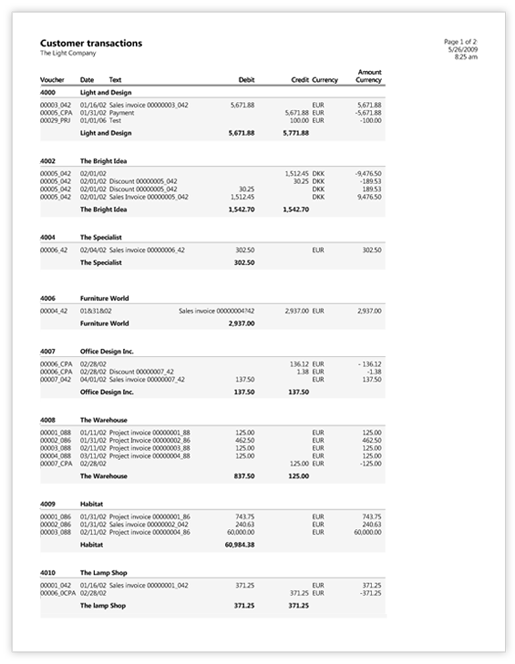
Multiple Pages Long and Contains Variable Number of Sections. Can’t Be Done with Matrix or Table Visuals.
Pretty Much Impossible in Dashboarding Tools like Power BI.
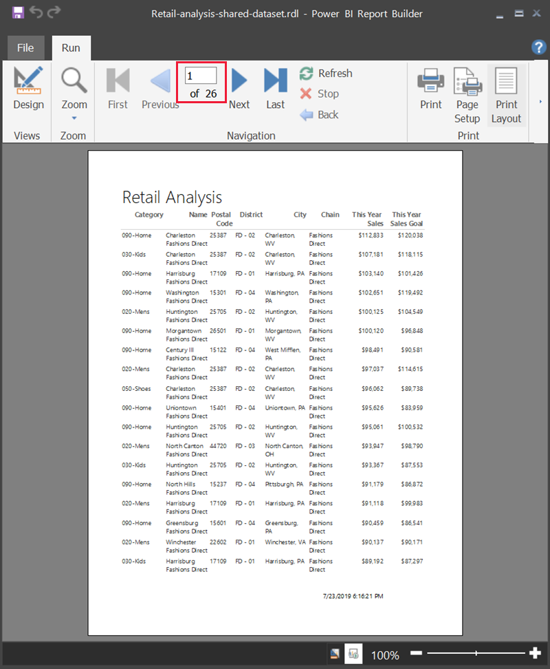
Could ALMOST be Done With a Single Table Visual in Power BI – Which DOES Scroll.
But… There’s a Page Break and a Footer on Each Page. And a Next/Back Page Nav. Nope, Power BI Can’t Do It.
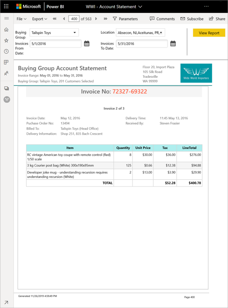
Next/Back Page Nav Again (400 of 563!). Clean Page Breaks for Printing. Flirting with Pixel Perfect for Added Difficulty.
Again: Pretty Much Impossible in Dashboarding Tools like Power BI.
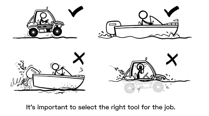
It turns out, most businesses have significant need for things like the above. And if Power BI reports were your only tool, you’d end up like our friends from the top of this article – flooded or grounded, depending on which metaphor you prefer.

Also? Mo Details, Mo Pages
Another “meta characteristic” of paginated reports is that they TEND to display details rather than aggregations. EX: specific transactions rather than emergent trends. In paginated reports, you’re MORE likely (but not guaranteed!) to be looking at “raw” rows of data from the original database, whereas in a Power BI report, you’re more likely (but again, not guaranteed!) to NOT be seeing raw individual rows, but rather intelligent aggregations of MANY rows. But either way, more detail means you’re more likely to need multiple pages.
And since details seem to be more self-evident in terms of action they imply, it’s a good time to bring back my flowchart from part one…
An Action-Oriented Distinction
While they are perfectly-useful distinctions, I’m far from the first to write about “Pixel Perfect” and “Paginated” as factors tilting you toward the Traditional Reporting end of the spectrum. And at P3, one of our rallying cries is that BI is for Action, and information is merely a means to an end. So I thought I’d try to contribute something new, as a second lens, by contrasting the two in terms of “where will your report fit into the Action flow?”
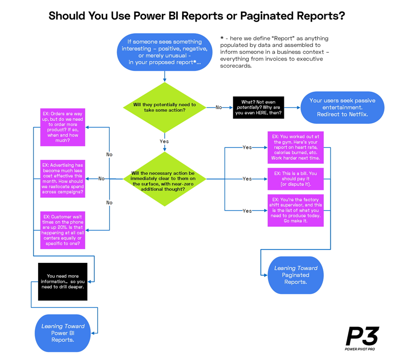
Click for Larger Version
Thus far in this article, I’ve talked about things which fall on the right side of that flowchart, whereas Part One focused primarily on the left side. If you didn’t read part one, and aren’t interested in doing so, no worries – this flowchart is the last piece of part one you’d be missing. You’re welcome. Now let’s move on to some important actions of a different flavor – namely, Do’s and Don’ts for your organization.
DON’T Use Power BI as the New Traditional Reports!
(AKA Power BI is NOT a Visualization Tool)
Pet peeve time, or actually, “Oh My God Please Don’t EVER Do This” time: don’t fall into the trap of using Power BI as just the latest reporting tool. When you hear someone refer to Power BI as a “visualization” tool, you should be very suspicious, because either they have no idea what Power BI can do, OR they are actively trying to suppress its adoption. We have seen plenty of both.
Here’s a quick acid test. Open a PBIX and and flip it to Model View. Does it look like this?
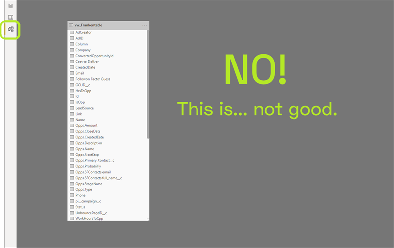
If Your Power BI Model View Looks Like This, You’re Not Getting the Full Benefit of Power BI – NOT EVEN CLOSE
(And yet, this is very common, because old habits die hard)
This is 100% worth calling out, because it’s usually a dead giveaway, and all too common. Most of the time (with a few exceptions), a model view that looks like the above indicates a lack of understanding of Power BI. But it’s often “perpetrated” by IT professionals with long histories in BI, which is understandable given the history of the industry (OK, maybe there’s a reason to read Part One after all). Given the long-dominant Reporting mindset of “do some SQL, make flat views, then format as reports,” a model view like the above is precisely what we should expect if a longtime BI practitioner just assumes Power BI is some newfangled version of the tools they’ve used forever. Which it’s not.
True story time: P3 Adaptive was involved in a very large enterprise project in which we were not the only consulting firm engaged. The other half of the project was staffed by a Big Four firm, and the Big Four firm had brought out the Big Guns. They had sent one of their “absolute best Microsoft BI experts” to lead their half of the project, and we believed them. A month went by, and our half of the project was going well, but the other half kept floundering. We offered to help, and were told in no uncertain terms to Stay In Our Lane. And we good-naturedly did. We assumed the other half of the project was just a lot more complicated than we realized, and went back to work. Another month passed, and the other half of the project STILL lagged well behind schedule. Late one night, after hours, the project sponsor quietly asked us to take a look. And we saw a model view that looked like the one above. Their Microsoft BI Expert might have indeed been the real deal in 2009, but knew absolutely nothing about Power BI or SSAS Tabular. We had their problem fixed in three days.

I can’t show you an example of bad without showing you an example of good, so here ya go…
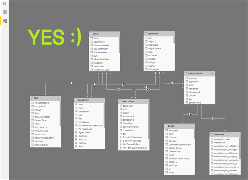
It Doesn’t Have to Look Exactly Like This, Nor Even This Complicated – But You Get the Idea
DO Have Both Tools in Your Repertoire!

Same Quality Table, Now With 33% More Columns!
Pretty obvious: if your org has both kinds of needs, you need to know both tools. Not just so that you can DO both kinds of work, but just as critically: knowing both helps you CHOOSE the right one at the right time. For that reason, having both skills on staff, but living in their own siloes, will still be problematic. The ability to tell the difference, and utilize the right tool at the right time, DOES seem to be a bit lacking right now, which was the whole trigger of this multi-part series of articles.

Ready for Anything – Where You Want to Be
(But You Still Need to Know When to Use the Wheels or the Propeller)
Part Three is Now Live!
In the third and final installment of this series, I:
- Go on a bit of a rant about product naming
- Question whether Microsoft even “gets” all of this
- Provide some examples of how the two toolsets can integrate – the Better Together cliche, yes, but there’s a lot of truth to it here
Get in touch with a P3 team member