
“Navajos say it is good plan to have two arrows for one bow”
– Chief Thundercloud
Thanks to Rob Collie for letting me do another guest post. There will be a bit more Excel than PowerPivot in this post, but that’s what you get when you give MrExcel access to the blog!
Donald Farmer issued an interesting 3rd challenge for the Alpha Geek Challenge contest. He was looking for interesting visualizations created from PowerPivot pivot tables – something beyond the regular charts.
Please take a look at the contest and vote for your favorites.
Update: Here is a link to an animated GIF showing the tag cloud in action. Watch the slicers along the right as well as the tag cloud and the SmartArt. Also, when you click on the next image, you should see a higher-resolution screen capture.
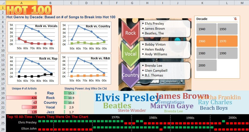
My entry uses 40,000 rows of Billboard Hot 100 Music Chart data and throws just about every visualization that I could think of:
- A Decade slicer. This slicer was dragged outside of the bounding box so that I could make the buttons larger than usual and use two columns.
- Four paired line charts that compare the decline of the Vocals genre and the rise of Country and Rap. These charts are static and use pivot tables that are not tied to the slicer.
- A blue data bar that shows the average numbers of weeks on the chart by genre. These data bars are static and are not tied to the slicers.
- A red data bar that shows the # of Unique Artists by genre for the selected decade(s). This required a DAX Measure with =COUNTROWS(Distinct(Table1[Artist])). This data bar uses one of the new feature in Excel 2010 where the data bar runs right-to-left. This is a cool feature for creating comparative histograms.
- A set of 10 Win/Loss Sparklines that show year-by-year history for the top 10 artists. (Top 10 is based on song-chart-weeks. If Elvis had 10 songs on the chart for 10 weeks each, that would count for 100 chart-weeks.) More about this sparkline later.
- The range F3:J18 contains some SmartArt that is dynamically refreshed to show (a) the top 3 genres for the selected decades, and (b) the top 3 artists in those genres for those decades. Now, since SmartArt is always static and never dynamically updated, this one was quite a trick.
- The range E19:M23 contains a Tag Cloud of the top 10 artists for the selected decade. More about this one later.
A Bit About the Data
The data set was ugly. There were 20 columns of identifying data that provided year, genre, artist, title, beats per minute, followed by 67 columns listing the rank of Week 1 through Week 67. The original data set went back to 1890. Since I eventually hoped to publish a non-PowerPivot example on my public SkyDrive, I trimmed the data down dramatically. I added some calculated columns to count the # of weeks on the chart, the peak, a calculation to look for songs that hit #1 and other songs that peaked at #2 (see the “First Loser” chart on the SkyDrive version). I added a calculation in Excel to calculate the Decade. I deleted the song titles since this would screw up the Vertipaq compression and I did not plan on reporting at that level of granularity. I deleted the 67 columns of weekly data. The final file was 29K rows x 17 columns.
Initial Pivot Tables
My first pivot table had genre in the row area. Chart Weeks was in the value area, sorted descending. From this, I learned that Rock, Vocal, Country, Rap, and R&B were the top genres since 1950. I initially created a single chart showing all five lines, but then I used a trick from my Charts & Graphs book where four smaller charts can communicate more information that one large chart. These four charts became the first visualizations in the top left corner of the dashboard.

Creating the Sparklines
Sparklines are new in Excel 2010. Professor Edward Tufte imagined Sparklines as tiny, intense, word-sized charts in his book, Beautiful Evidence. As I was working on my book for Excel 2010 charting, I started to realize that (a) the best sparklines are larger than a single cell, (b) benefit from outside labels, and (c) benefit from manual gridlines.
In the image below, you can see that Elvis Presley had a song on the Hot 100 every year from 1958 through 1977, then hit the chart again in 1981, 1982, and 2004. In the second row, Elton John charted every year from 1970 through 2001, except for 1987. Fascinating stuff, right?
To make a sparkline larger than normal, you can increase the height and width of a cell. If that is not possible, then you can merge cells. (As MrExcel, I despise merged cells and I am a bit horrified that I am actually suggesting that you merge cells, but merged cells let you fit a lot of sparkline information into an area). In the screenshot below, cells B25:M25 are merged into a single cell and represent a single sparkline. Cells B26:M26 are merged into a single cell. I had to keep merging each row one at a time.

The data for the sparklines are off to the right of the screen. There are years from 1958-2009 stretching across the columns. A count of the # of songs by artist occurs in each cell. These Win/Loss sparklines actually need a positive number for the green marker and a negative number for the red number. I ended up using (# of Songs*2)-1. This would force cells with zero to become -1. Cells with 1 would still report 1, and songs with 2 would end up reporting 3, but I didn’t care, as all I wanted was positive or negative values.
The labels for 1970’s, 1980’s, through 2000’s in white are text boxes that I added manually. The dotted white lines that separate out the decades are Excel drawing tools added with the Insert tab. (Tip: Hold down the shift key while drawing the line to make sure it is perfectly straight. Once you get the first line drawn in, use the Drawing Tools Format tab to change the fill color to white and use a dashed line. Once you get the first line drawn in, Ctrl+Drag to make identical copies of that line.
Creating the SmartArt
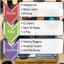
SmartArt is new in Excel 2007. Use the SmartArt icon on the Insert tab in Excel. That is a Vertical Chevron List. I created the SmartArt with “Country” as the Level 1 text in each shape and “Bruce Springsteen” as the Level 2 text three times inside each shape. This is all just dummy text to allow Excel to size and shape the SmartArt. I used the SmartArt tools to apply a style and colors.
I created a pivot table that has Genre and Artist as the Row labels and Chart Weeks in the Values area. Both of those fields are set to use a Top 10 Filter to show the top 3 items based on Chart Weeks. This pivot table uses the Decade as a slicer.
Formulas point to that pivot table to build the text that should show up inside the SmartArt. The formula for the first Genre chevron is simple: =AT40. The formula for the three bullet points next to the first chevron is more complicated: =AU40&CHAR(10)&AU41&CHAR(10)&AU42. Those CHAR(10) are line feed characters and translate to bullet points when applied to the SmartArt.
Once you get the SmartArt looking just right, follow these steps:
a) Click inside the SmartArt to select the SmartArt and display the SmartArt Tools Design tab of the ribbon.
b) On the right side of the ribbon, choose Convert to Shapes.
What did this accomplish? Well, SmartArt which is new in Excel 2007 can not do one simple trick of Shapes which have been around since Excel 97. The text in SmartArt is static. In contrast, the text in a Shape can come from a formula in another cell.
You are going to do these steps 6 times:
a) Click on the text box inside the first Chevron. You want the bounding box to be solid, not dotted. If you get a dotted text box, click on the dots to make it solid.
b) In the formula bar, type an equals sign and point to the cell which will contain the first genre.
c) Press Enter.
You now have a dynamic text box on the shape.
Repeat for the other 2 genres and for the three text boxes that contain the top three artists.
Creating the Tag Cloud
Of the whole entry, I like the tag cloud the best.
I will have to try to build an animated GIF showing the SmartArt and the Tag Cloud as you choose various combinations of decades in the slicers.

Here is how to create a dynamic tag cloud using PowerPivot. The underlying pivot table has the Top 10 artists based on Chart Weeks, using More Sort Options to keep the data sorted high to low. The pivot table respects the decade slicer. The pivot table is nothing special, as shown here.
I noticed that many artists were in the database as “Beatles, The”. I wanted to get rid of the word “The”. So, below the pivot table, I used =SUBSTITUTE(AZ40,”, The”,””) to remove the comma and the word “The”.
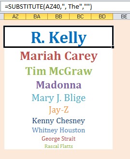
This screenshot shows how AZ63:BD63 is merged and uses a formula to point to the original pivot table.
In this new section of the worksheet, I bumped the top artist up to 36 point bold.
It is important to make the Fill Color for those 10 cells to be No Fill. This is the only way to make the area around the words be transparent when you create linked pictures.
Change the color of each value to another color.
Make the #2 artist a bit smaller, and progressively smaller as you continue down the list.
To build the Tag Cloud, you are going to use something that old-time Excellers know as the Camera Tool. The command sequence no longer uses the words “Camera Tool” anymore. Here’s what you do:
Select AZ63 and press Ctrl+C to copy that cell.
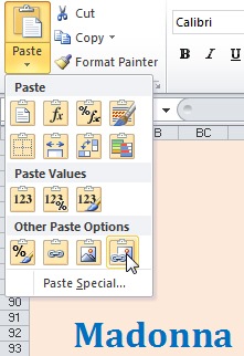
Go to the tag cloud area. Use the Paste dropdown on the Home tab and choose Linked Picture from Other Paste Options. This creates a picture of the top ranked artist. The background of the picture is transparent, so the orange color shows through. (Technical problem: I changed the decades chosen in the slicer between the R. Kelly item above and the Madonna item at left).
Continue copying each individual cell and pasting as a picture. Arrange the pasted pictures in a somewhat random fashion, trying to keep the words from overlapping. The net result is that as you choose decades from the Slicer, the 10 artists in the Tag Cloud automatically update.
Here is the tag cloud for the 50’s:

Here is the tag cloud for the 80’s+90’s:

So – there you have it – a lot of basic Excel blocking and tackling, along with a bit of cool DAX measures to calculate the number of distinct artists in a genre. Again, please take a moment to visit the contest and vote for your favorites.
Will this Work On the Server Version?
Rob and I had a discussion this morning about the running this on PowerPivot Server. Since both the tag cloud and the SmartArt replacement are using shapes, none of those will render in Excel Services. Thus, this is a client-only solution for now.
Technorati Tags: DAX,MrExcel,TagCloud,Sparklines
-Bill Jelen
Get in touch with a P3 team member