Yeah, It Really Works!
With great Excel skill comes… insensitivity to others’ lack of it
Let’s say you are a monster Excel pro. You’re a pivot master. Nothing is beyond you – even the more complex features of Excel seem easy. That’s obviously a huge strength, an asset. And PowerPivot magnifies those powers – it gives you a much bigger stage, makes you more important, and extends the reach of your work to a lot more people than before. Great stuff.
But your skill level can also blind you. The people who consume your PowerPivot applications and reports are not NEARLY as Excel-savvy as you. The things you take for granted are often hard for them, sometimes even scary to them.
That can be frustrating of course, but remember: if they understood Excel as well as you’d like them to, there wouldn’t be so much need for your skills.
Failure to understand a report is not THEIR fault. It’s YOURS.
When you share a report with someone and they can’t figure it out, your first response may very well be to groan or sigh (inwardly), and mutter to yourself about how some people can’t seem to tie their own shoes. Then you put on a helpful face and go explain to them how to use the report. You may even say something like “hey, it’s actually pretty easy once you understand.”
That’s a tempting trap. I’m not above it, trust me. But I know that’s the wrong first instinct, to explain to them the mechanics of how to do it, or to tell them it’s actually pretty easy. The right first instinct, the one I am constantly reinforcing with myself, is to think “how can I make the report easier to understand?”
And as your work becomes more important, and makes its way further up the leadership hierarchy of your organization, it becomes even more critical to have the right first instinct.
Example: “I Can’t Sort the Report!”
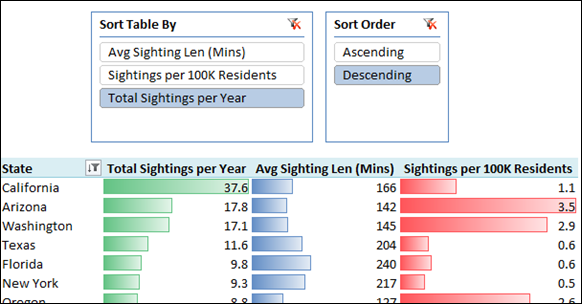
Let’s say you have published the following mission-critical pivot report on UFO Sightings in the United States:
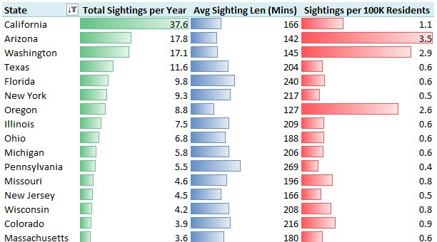
And one of the report consumers says to you “great, but how do I sort by Average Sighting Length instead?”
Well, you and I (the Excel pros) both know about that little dropdown don’t we?

This Dropdown Scares Most People. Seriously, it Does.
But that dropdown is scary. Seriously. The only people who don’t find it scary are Excel nerds like us.
And we, the Excel nerds, also know that we can right click in the Avg Sighting Len column and choose a sort option. Normal people don’t know that. Furthermore, that doesn’t work on SharePoint. And really, the report consumer is used to simply clicking on column headers to sort – in just about every single application they have ever used… except for Excel.
So in cases where sorting is important, can we give them something a little friendlier? Yes we can.
Step 1: Create Two Dummy Tables for Slicers


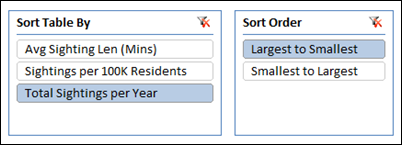
First table just lists all the measures you’d like the user to be able to sort by. Second table is just Ascending/Descending (although as an added boost to friendliness, I came back and changed those to Largest to Smallest/Smallest to Largest because Ascending/Descending often confuses even me!)
Now you can add them as slicers on the report, even though they don’t do anything yet:
Step 2: Create Measures that Detect User Selections on Those Slicers
[SelectedSortMeasure]=
IF(COUNTROWS(VALUES(SortBy[Sort Table By]))=1,
VALUES(SortBy[Sort Table By]),
“Total Sightings per Year”
)
[Selected Sort Order]=
IF(COUNTROWS(VALUES(SortOrder[Sort Order]))=1,
VALUES(SortOrder[Sort Order]),
“Largest to Smallest”
)
Both of those merely return the caption of whatever is selected. And if more than one thing is selected on a slicer, it returns a default value – Total Sightings per Year in the first measure.
Step 3: Create a 1,-1 Measure Based on Sort Order
[SortOrderMultiplier]=
IF([SelectedSortOrder]=”Smallest to Largest”,-1,1)
If the SortOrder measure defined above returns “Smallest to Largest” then this measure returns –1. Otherwise it returns 1.
Step 4: Create a Branching Measure Based of the “Sort Table By” Slicer
[HiddenSortMeasure] =
IF([SelectedSortMeasure]=”Avg Sighting Len (Mins)”,
[Avg Sighting Length in Mins],
IF([SelectedSortMeasure]=”Sightings per 100K Residents”,
[Sightings per 100K],
[Sightings per Year]
)
)* [SortOrderMultiplier]
This measure returns an entirely different value based on whatever the user selects on Sort Table By. Sometimes it “mimics” one measure, other times another.
And note that last line – it multiplies [SortOrderMultiplier], which is 1 or –1, by the whole thing.
Step 5 – Add The HiddenSortMeasure to the Pivot, Sort By It
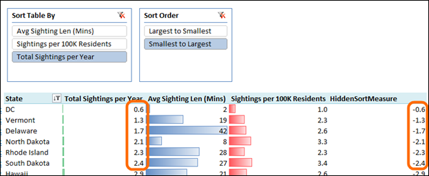
Sort the pivot by that measure. Notice how it is the negative version of the Total Sightings per Year measure? That’s expected based on the slicer selections.
Step 6 – Hide that Column of the Spreadsheet
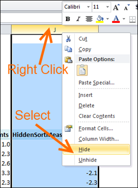
And the result:

This is actually really easy. Took a lot longer to write this post than it did to add to the report.
THIS TOPIC CONTINUED:
Adding “sort by state name” to this report
Try this report out live in your browser!
Next step, of course, is to make this thing look better, but that’s another post.
Get in touch with a P3 team member