I’ve been getting this question a lot lately: How does Power View relate to PowerPivot? Is PV a replacement for PP? (And why does PV have a space in it while PP does not?)
(For more information on the various “Power *” offerings from Microsoft, see also the newer posts What is Power BI? and The Three Big Lies of Data).
First: Understand that PowerPivot is Kinda Two Things
Let’s rewind all the way back to Office 2010, a world in which PV does not exist. (For most of you, we call this time Today. And for those stuck on 2007 or 2003, you may refer to this as Tomorrow. Or maybe even the Day After Tomorrow).
In that world, which is where this blog largely lives, it’s helpful to reflect that PowerPivot has two parts: the PowerPivot window, and the Excel window. They have the following relationship:
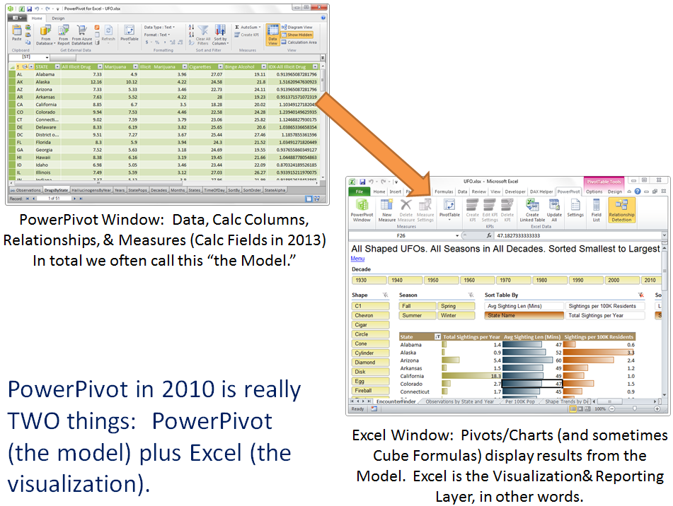
Yes, in 2010 we like to write our measures in Excel, using the field list. So we’re writing part of the model while looking at the visualization layer (Excel), rather than the PowerPivot window. The lines blur a bit there, yes, but essentially we still have the Model (data, tables, relationships, calc columns, measures, etc.) and we have the reports/visualizations (pivots, charts, etc.) in Excel.
Power View is Purely an Alternative to the Excel Visualization Layer
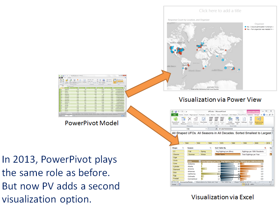
Example: The User Group Maps
You know those maps of PowerPivot/Excel user group interest I’ve been posting the past couple of days? Well those are Power View visualizations in Excel 2013:
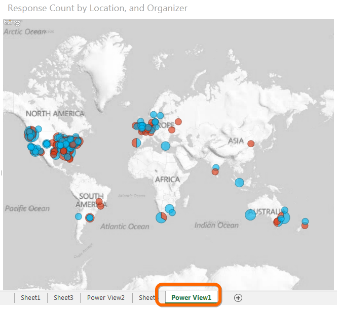
A Power View Visualization in Excel 2013.
Note that Power View Gets its Own New Sheet Type.
Now… could I have used a PivotTable for this? Maybe.
But here’s the trick: locations don’t always match in the data even though they match in the real world.
Example:
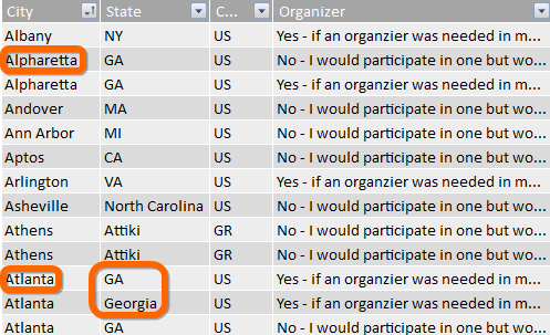
Two Problems: “GA” is the Same as “Georgia,” and Alpharetta is Part of Metropolitan Atlanta
They Should All Be One User Group – I Need All of Those to Be Considered the Same Place!
So in some sense you can think of this Map visualization in PV as a smart “grouping” feature, since it uses the Bing Maps engine to plop all of those dots in the same place:
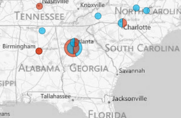
Power View Geographically Charts All of Those Rows as a Cluster On the Map, Just Like I Need!
Compare that to a pivot, which treats them as 3 separate locations:
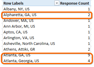
A Pivot Will Treat Those Locations Just as Distinctly as it Does Athens Greece
In Both Cases Though…
Both the pivot and the PV map connect to the same PowerPivot model and use the same measures (like Response Count). It’s just that in 2013 we get to choose different visualizations for different purposes.
In other words, ideally we would all view Power View as just a new type of Excel Chart, whereas today it admittedly feels like an alien transplanted into the Excel box. (I’m providing a lot of feedback to MS along those lines and so far it has been warmly received, which always feels nice).
We also now have GeoFlow, which honestly I’ve yet to experiment with, but will soon. In true MS fashion we now have two competing map-charts hosted in the same product! Woo hoo! Let’s hope they unify those two, and THEN unify both of those with the rest of Excel
Power View Offers More than Maps
There’s also a “Card View” (pictured below) and everyone’s favorite, the animated bubble chart.
More on these later. It is not my intent to taunt people with things they can’t use, and honestly I don’t enjoy working with 2013 that much due to a number of cosmetic issues. So I’m keeping the blog firmly rooted in 2010 for the forseeable future.
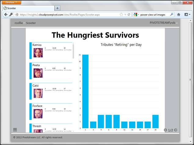
Power View’s Card View
Get in touch with a P3 team member