Recall that in yesterday’s post I linked my FactEvent table to the CleanPlayers table via a relationship. Time for the payoff.
But you know what? I’m tired of calling it the FactEvent table, and then constantly having to tell everyone that’s where the plays are stored. It’s the Plays table, damnit, so I’m just gonna right-click and rename it before moving on:

Becomes…

Which does NOT impact the relationship I made.
Just in case you doubt the value of Beta releases…
I’ve actually hit a bug here where the relationship I created yesterday prevents me from saving and re-opening the file. I’ve filed the bug and expect it has something to do with either the data cleaning I did or the fact that CleanPlayers is a linked table, because I have not seen this before. As Dennis Miller used to say, “Well at least you know it’s live…”
Time for Multi-Table Pivots!
Showing this feature is going to take discipline, because there are a number of fun things along the way to distract me (ooh! shiny!). I’ll try to note things in passing and promise to return to them later.
I want a PivotTable that shows me some aggregate data. So I go to the ribbon in the PowerPivot ribbon, click on the old reliable PivotTable gallery button, and…
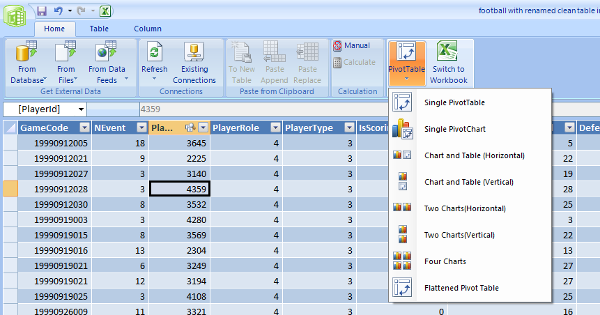
…we see a bunch of intriguing options there! But even though I designed that feature and love it like a child, I’m just gonna stick to the basics and go with a Single PivotTable 😛 (I promise, we’ll come back later!)
I choose to place this PivotTable in a new sheet, and now I see this:
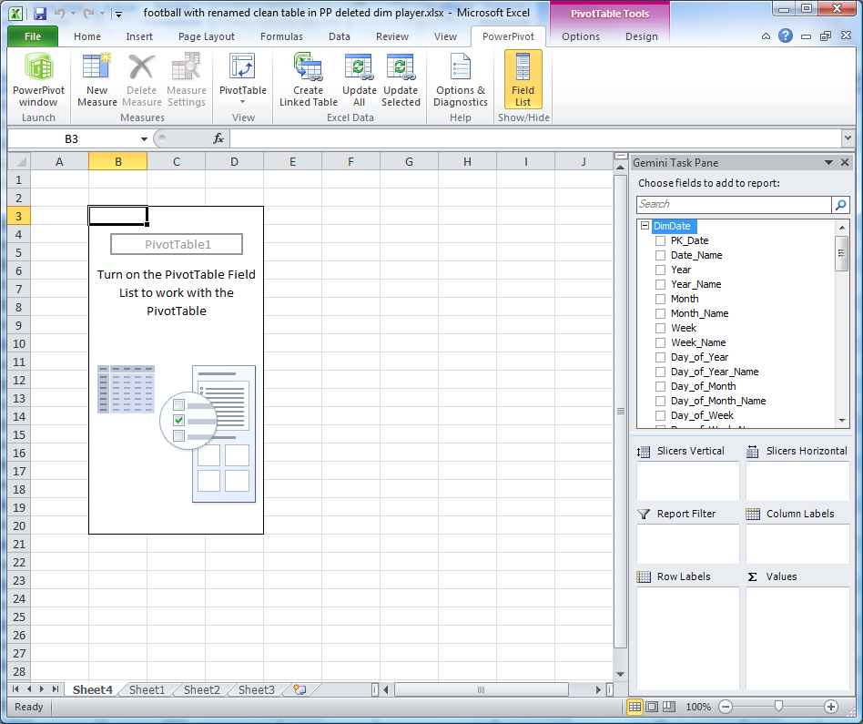
Couple things to note:
- The PivotTable is on a normal Excel sheet – that’s important. The PowerPivot addin does not render a single pixel of report or visualization. That is ALL Excel, which is good, because we want everything to render to the browser via Excel Services later.
- This is not your father’s field list – there are definitely some new things happening over there on the right side…
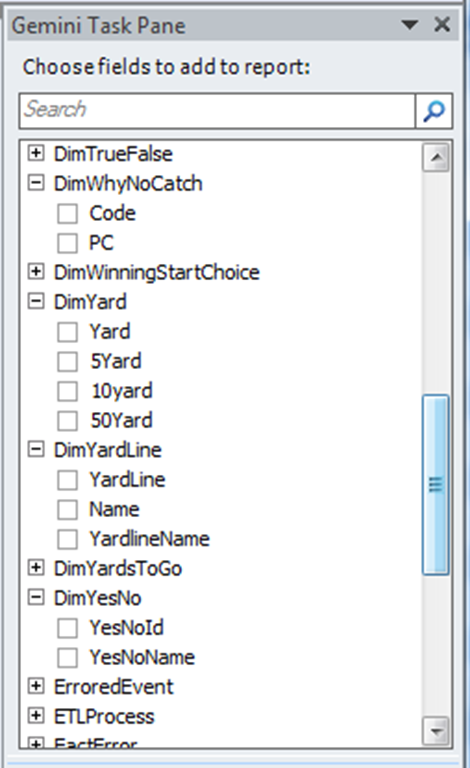
Every Table from the PowerPivot Window Appears Here
Yes, all 40+ of them. I’ve expanded a couple of the smaller ones so you can see their columns.
This is a big departure from normal Excel PivotTables, and their “one table at a time” restriction – if that seems limiting to the BI Pros out there, well, it is. See what your Excel friends have labored with all these years?
Search Box
And since that means a whole lot more fields than your average Excel field list, we’ve got a Search control at the top (great work team, getting that in!)
The bottom of the field list also contains some new goodies:
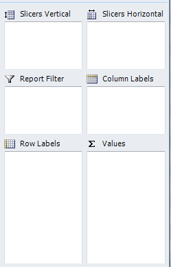
The bottom four dropzones should be familiar, but the top two – Slicers – are new. I can’t resist, so I’ll give a quick preview of those in a second. For now, though, I want to build a quick, simple report.
First, I check the Yards field under the Plays table:

which yields:

in the Excel grid.
BI Pro sez: “OK, What Happened There?”
If you’re a BI Pro and you’ve been taking notes, you know that under the hood, PowerPivot is SQL Server Analysis Services, and SSAS doesn’t just fork over numbers. It needs “measures” defined first.
Well, the addin defined one on the fly. The user checked a checkbox, the addin sees that the field in question (Yards) is numeric, then tells the PowerPivot engine that it wants a Sum of Yards measure defined. Once that is complete, the addin then tells the Excel OM to add that measure to the current PivotTable.
So… the Excel user gets the experience they are accustomed to (numeric fields default to Sum’s, in the data area of the pivot), and BI Pros can understand that a real OLAP measure has been created behind the scenes.
Moving on, I then scroll the field list down to the CleanPlayers table and check the FullName checkbox (recall that I added this field yesterday using DAX):

which yields:
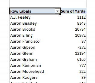
in the Excel grid.
(Translation for BI Pros – in this case, FullName was just an attribute – all columns in the PowerPivot window are attributes actually. And since the addin detected it was non-numeric, we just slapped it on rows without creating a measure. Which again mimics Excel behavior).
(Note for football geeks: Aaron Gibson, –272 yards lifetime? And look at Aaron Rodgers, still riding the bench behind Favre back in 2006, the last year for which I have data. BTW, don’t trust any of these numbers yet – I think I have a lot of work left to do).
What say you, Excel Pros?
You impressed yet? One little 4-box relationship dialog from the last post, and suddenly you are pivoting one table by the fields in another?
Still letting it sink in, eh? OK, let’s drive it home. Every field in the CleanPlayers table is now a valid field for grouping/filtering/slicing the Plays table…
The Grand Finale (for today)
Remember those two mysterious extra dropzones for Slicers?

Now I’m going to grab the BirthStateName field from the CleanPlayers table, drag it into the Slicers Vertical zone, and I get this…
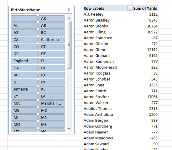
Yeah, that’s called a Slicer. A new feature of Excel 2010. Works a lot like a Page Filter (aka Report Filter), but more graphical and “Fisher Price,” to quote a former colleague.
Wanna see just players born in sunny states like FL, AZ, HI, and CA? Single click to select one, ctrl-click to select multiple:
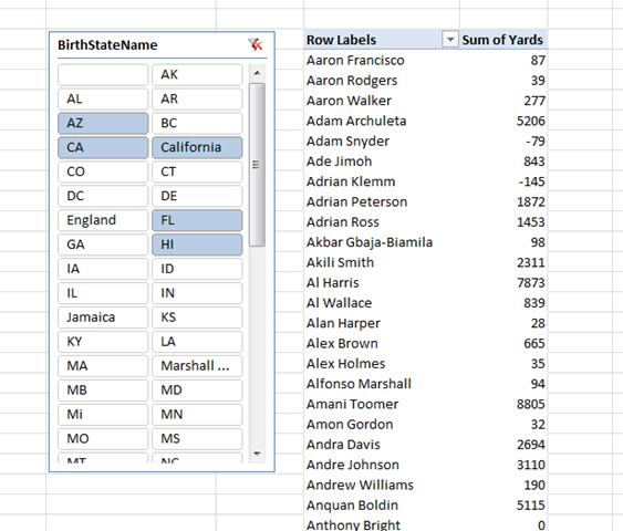
And then my personal favorite, single-clicking England:

I give you Osi Umenyiora, the only, ahem, English Football Player in the NFL.
One little relationship suddenly tells us quite a bit doesn’t it?
(It even gives us cheesy jokes that equivocate on the term “English Football.” Such power.)
Next Football Post: My First Video Post >>
Read more on our blog
Get in touch with a P3 team member