
GUESS WHO’S BACK, BACK AGAIN
Krissy’s back, tell a friend!
Guess who’s back, Guess who’s back,
Guess who’s back. Guess who’s back…
Well, as probably most of our readers know, Rob is well known for a GOOD movie reference in his blog posts every now and then.
Well, P3 Adaptive World… I might be soon known for my GOOD song lyric references in my blog posts! Only time will tell. Ha, ha!
So, with the intro out of the way, let’s get to it!
Two weeks ago I wrote a blog post about how to create a set of data with Consecutive Days using SQL or Power Query. It was UNEXPECTED and SUPER EXCITING to have Adam Saxon, from Guy in A Cube, include a review of my blog post in his Weekly Round Up. Thanks Adam! I really appreciate the “…many ways to skin a cat” reference that was included in the review! It’s like he KNOWS me and that I love a good cat reference or even better yet a good a cat meme (… in addition to my love of angry rap music) – so applause for that!

I also had lots of GREAT comments from our readers – THANK YOU so much for taking the time to share and contribute your ideas with me, our team and our other P3 Adaptive readers!
But I’d have to say what SURPRISED me the most about the comments was that the feedback focused mostly around the M code and the SQL code used in the example and how to streamline that code to make it better. WOW! I totally appreciate the attention to detail and the coding best practices shared here!
However, what I was REALLY expecting was someone to ask me WHY?

WHY would I need to do this and WHAT are some USE CASES where I might need to leverage this kind of data preparation technique? Maybe many of you have experienced the need for this technique before and this was obvious to you? Maybe you already know, all too well, the pitfalls of the “Dirty Data” that we BI professionals all live in?
Well, I think there are many USE CASES where this technique could be applied.
I think it’s a good idea that I share at least one example USE CASE – just to close the loop and help our readers better understand WHY and WHEN you might need to use this technique.
USE CASE
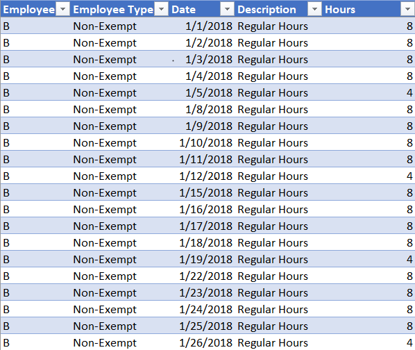
Employee Hour data is provided by a time keeping system for both Exempt and Non-Exempt employees differently.
- The Non-Exempt employees have regular hour data for every Mon. thru Fri. business day – these employees clock in and clock out daily.
- The Exempt employees ONLY have data for days when they have taken time off for PTO, Sick Time or other Leave of Absences. It is the assumed that the Exempt employee works 40 hours/week or 8 hours/day unless there is PTO, Sick Time or other Leave of Absences taken for a business day.

SO WHATS THE PROBLEM?
If one were to take the data “as-is” and load the Employee Hour data into a data model for analysis, we would not be able to accurately see Total Hours worked for both the Non-Exempt and Exempt employees.
In the example data for the chart shown below, there are three Non-Exempt employees (with 0-8 hours tracked for each Mon.-Fri. business day) and there are three Exempt employees (with only 0-8 hours for ONLY when the employee has taken PTO, Sick, or Leave Of Absence hours).
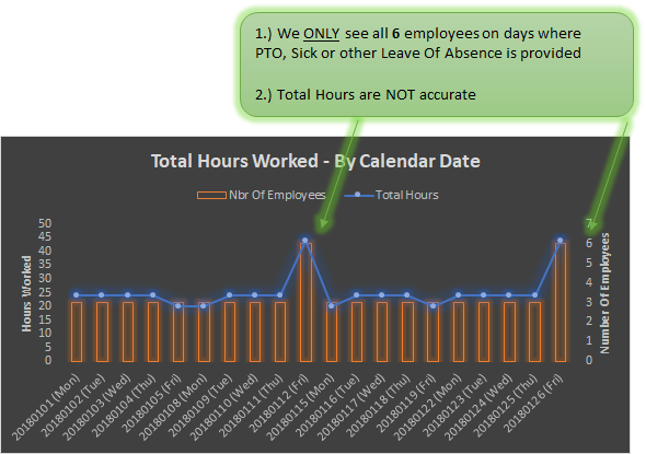
In fact, it looks like Total Hours worked is high for Fri., 1/12/2018. When in fact, that is NOT the case at all!
EXAMPLES
Let’s further look at some simple charts for the Non-Exempt and Exempt employees, separately.
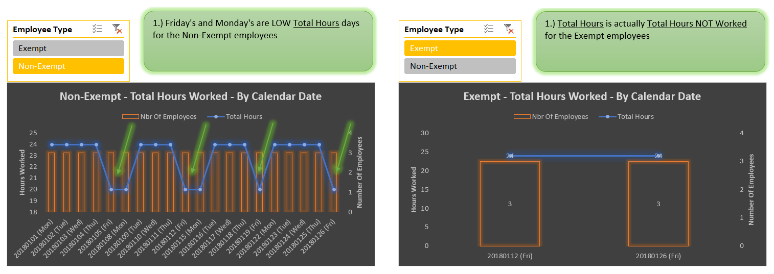
We can CLEARLY see that Friday’s and Monday’s are low Total Hours days for the Non-Exempt employees. It is NOT as clear for the Exempt employees. The Total Hours shown are not actually the Total Hours but rather the Total Hours NOT Worked! We know this by looking at the source data!
SOLUTION
So, what is a Data Modeler to do in this situation?

First, I typically talk through the problem “using just words”. Then, I begin to mock up the business problem and start to work on a possible solution. Next, I test the solution to make sure that I’m getting the results that I want. Finally, I apply the solution to my “real-world” data and QA my results.
If there’s extra time (which there never seems to be, so you must MAKE time) I will optimize and document my solution.
So, let’s get started…
USING JUST WORDS
I can use the Non-Exempt employee data “as-is”.
For the Exempt employee data, I will need eight hours for a set of Consecutive Days (specifically, Mon. thru Fri. business days) and then I will need to SUBTRACT the PTO, Sick Time or other Leave of Absences hours provided.
MOCK UP
You can get your hands on my mock up by clicking the link to download the Excel file here.
In this file, I’ve created example data for 6 employee’s (3 Non-Exempt & 3 Exempt employees)
The detail for the steps used to prepare the data can be referenced in the Power Query Editor.
To launch the Power Query Editor in Excel 2016, select Data > Queries & Connections. Then either double click on any query <OR> right click on any query to display menu & select Edit.

TEST SOLUTION
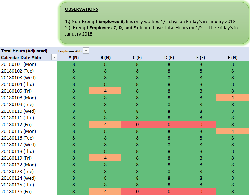
The test solution can be found on sheet/tab called “p2”. In the image below, we can now see that we have all six employees now shown for each Mon. – Fri. business day, and the hours each employee worked on that day.

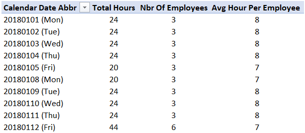
Without the Consecutive Days approach, we’d end up with two different answers, one of which is NOT correct!
This is also a good time to really stress the importance of understanding your data! Without knowing that the data is tracked differently based on the employee type, you could end up reporting inaccurate findings.
APPLY SOLUTION TO REAL-WORLD DATA
Well, my friends… I don’t have real-world data that I’m going to apply this logic against for THIS blog post. But if YOU have this USE CASE or if you have one that is similar then YOU certainly can apply what you learned here against your real-world data
Using my example data, we can create a Pivot Table and use conditional formatting to create a Heat Map representation of the data – and quickly see where employees are NOT working a full eight hours!
OPTIMIZATION & DOCUMENTATION
I’ll leave that to you, our awesome readers – as you continue to create awesome and amazing solutions using Power Query, Power Pivot and Power BI! Additionally, you can reference some of these best practices that I’ve demonstrated and called out in the Excel file that is available for download here.
… and with that, to close out this post in true lyric form… “Third verse, same as the first”? Well, in this case, (I’ve taken and adapted this from the Eminem’s 3rd verse of “Without Me”)
…I’ve been dope, suspenseful with cat meme potential ever since
Microsoft turned Excel into a BI utensil!
Have a great week! And “Peace Out”!
Did you find this article easier to understand than the average “tech” article?
We like to think that is no accident. We’re different. First of a new breed – the kind who can speak tech, biz, and human all at the same time.
Want this kind of readily-absorbable, human-oriented Power BI instruction for your team? Hire us for a private training at your facility, OR attend one of our public workshops!
Get in touch with a P3 team member