If you build it, they will come. That movie line doesn’t just fit baseball diamonds, it is often uttered when an innovative Office 365 Power BI report is created. We Power BI aficionados know, the reports we build are true game changers.
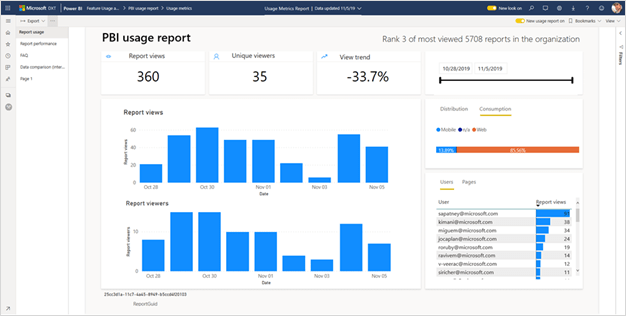
Because these reports are true game changers, we know users flock to them for their key insights. But until January 2020 there was no simple and concise way to accurately track which users were viewing and collaborating on which reports.
We aren’t saying it wasn’t possible, it just wasn’t easy. Back in January 2020, Power BI Usage Metrics Reporting received a much-needed facelift. While Microsoft is continually innovating Power BI, feature updates tend to lag slightly behind due to the desire to add so many new features. Fortunately, these updates do roll out regularly so let’s cover the Usage Metrics Reporting update details and how Usage Metrics Reporting can impact your company’s reports today.
Why Power BI Usage Metrics Matter
Let’s start with why usage metrics are important. As a Power BI developer, you are often tasked with creating a report on the latest and greatest metric. When the report is built, it is often hailed as the missing link to unlocking some hidden insight. Then, it is put into production, and you move to the next task.
Once the report is put into production, you don’t know if the report was used beyond the immediate impact it provided . . . or if it was ever truly used. The hidden value of these Usage Metric Reports is that they not only showcase who is using the report, but also create an opportunity for a conversation to discover WHY users aren’t using the report. Is the report unclear? Is there not enough training?
The report doesn’t care either way. Without usage tracking, it will continue to follow the refresh schedule using bandwidth, and did they find it actionable? Using Power BI Usage Metrics Reports to verify this information can both help you streamline content AND prioritize future projects, updates, and upgrades.
Where to Find Power BI Usage Metric Reports
Now that we have established why Power BI Usage Reports are important, let’s look at how to create them.
First, we’ll start with how and where to find Power BI Usage Metric Reports. One thing to clarify here is you do have to be an owner or a contributor of the workspace where the report is located in order to enable and collect usage data. Viewer access isn’t enough. In addition, your Power BI admin must have enabled usage metrics for content creators as well.
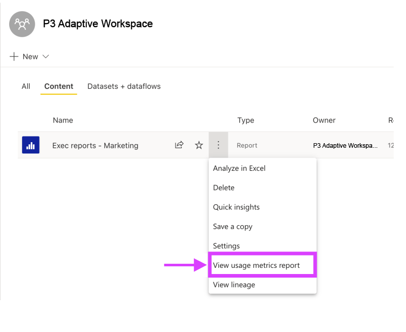
To access Usage Metrics Reporting, hover over a report in your workspace, go to the quick action menu, and pick “View usage metrics”.

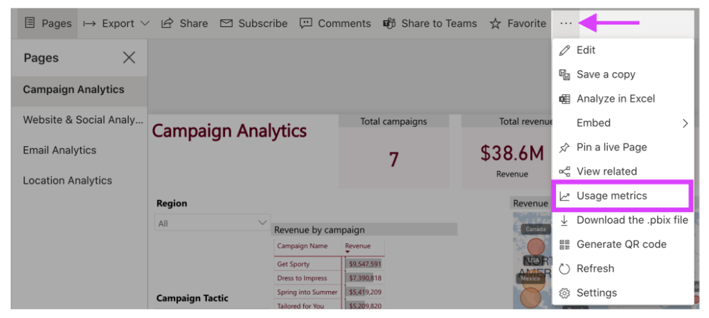
Additionally, if you’ve opened a report in your workspace, click on the quick action menu from the ribbon above the report and select “Usage metrics”.

The first time you do this, Power BI will take a few moments to collect and compile the information. Don’t worry, you will be notified when it is ready. Once that notification appears, simply click on “View usage metrics” to see the results.
Also, please know that if this is the first time you are using the usage metrics report, Power BI might open the older version. To use the new and improved version, toggle the “New usage report” switch from off to on.
Opening a Usage Metric Report for the first time in a workspace enables a hidden dataset in your workspace called the Report Usage Metrics Model. It is set to refresh daily and generally takes 24 hours to populate with statistics for a particular day. If you see data in the Usage Metric Report prior to the date you first enable Usage Metrics, you or someone else in your workspace has already enabled the process.
Save a copy of Usage Metrics Reports
While Usage Metrics Reports are designed to see the usage of one report or one dashboard at a time, they can also be customized to view all reports or all dashboards in a workspace. You just need to save a copy of the usage metric report and remove the filter for the Report GUID or Dashboard GUID in the Filter pane. You can add a slicer for the Report Name to view summary statistics for individual reports or across the entire workspace.
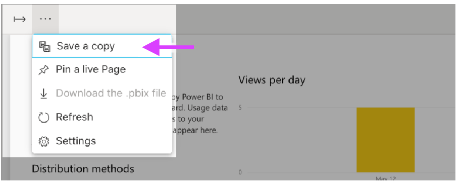
To create this workspace version, bring up a Usage Metrics Report, go to the quick action menu in the ribbon, and select Save a Copy.

You should immediately see that the Filter Pane contains the filter for Report GUID (or Dashboard GUID for Dashboard Usage) which you can remove. To add slicers for Report Name, User Name, or any other field in the model, simply edit the copy of this report on the web and modify how you see fit.
While these reports work great as a starting point, they can leave some users wanting more. If you or your company needs more insight into your usage or would like some help building out comprehensive reporting metrics, be sure to reach out to us.
This blog was created in collaboration with Angel Abundez, a Director of Client Services with P3 Adaptive and Power BI expert.
Get in touch with a P3 team member