Post by Rob Collie

Bad Data DOES Lead to Bad Results. But Good Data Can STILL Lead to Bad Results.
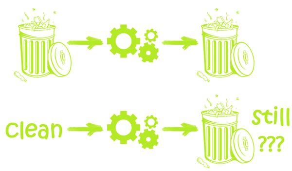
Garbage in, Garbage out. We’re all familiar with this. If you’re being given junky source data, it’s going to be hard to perform ANY meaningful analysis or reporting on said data until the quality of the inputs is addressed.
The term “Data Quality” has come to mean precisely that – the quality of your inputs.
But at my recent PASS BA presentation on the Bottom Line, I was talking at length about how we often generate poor outputs – our reports and dashboards often leave much to be desired, because we ourselves, the producers of the work, need to be better.
It’s one of my most-emphasized themes: we’ve been given this amazing new toolset (Power Pivot and the rest of the Power BI stack). We shouldn’t just use it to produce the same stuff we produced for decades (even though we can do so much faster and more efficiently than before).
We should strive for more meaningful metrics for instance – metrics that remove noise and produce a clearer picture than the age-old default of “raw dollars.”
A product may be generating more dollars than last year for instance, but that could be misleading. Is it generating more profit (it may also be more expensive for us to acquire this year)? Is it generating more profit per store (we may have increased the number of stores that sell it)? Per day (maybe it was introduced in May of last year, but this year it’s been available since Jan 1)?
(More on this topic here, here, and here.)
Similarly, we should also strive for more “verblike” dashboards, rather than the lazy “nouns” of yesteryear. (If you have never read that post I highly encourage doing so).
Anyway, at the conference, longtime reader Austin Senseman was in the audience, and suggested that perhaps we should open a new “front” in the Data Quality War. Shouldn’t we also be talking about the quality of our outputs at a similar level of importance?
It’s a good point. If Data Quality is a “Thing” on the Internet, shouldn’t we leverage that momentum and use it to encourage better outputs as well? Shouldn’t output quality be a topic of as many discussions, books, and academic papers as input quality? (And no, I don’t count visualization experts as filling this void. Visualization quality is just one component of output quality, and a sometimes-overrated one at that.)
The Big Picture
I am NOT saying that input quality is unimportant. Far from it. I don’t mean to distract our focus from input quality, but rather to encourage us to see the bigger picture:

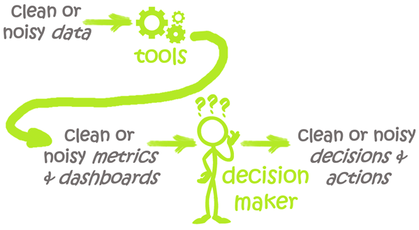
“Our” Outputs are Decisonmakers’ Inputs – and THEIR Outputs are What Ultimately Matter.
So just as DBA’s and Data Warehousing pros spend effort on the Quality of their outputs, so must we.
We can be given GOOD Data, and subsequently make NO mistakes in our formulas, models, or charts, and STILL produce results that are essentially “Garbage In” for the Decisionmakers.
What Do You Think? Do you have guidelines for such quality?
Getting Us Started: Some Guidelines
Here are two ideas. Consider them a starting point for a New Guide to Data Output Quality:
- What is the #1 most common decision that must be made based on your dashboard or report? Is the “recommended” decision/action immediately apparent to the consumer, on first glance? It should be.
- Are you reporting on Raw Dollars as the first column of your report? What are the various “noise factors” that can cloud Raw Dollars in your case, that can lead to clouded decisions and/or outright mistakes? Is there a “cleaner” metric you can produce that filters out that noise?
- <your ideas here>…
Get in touch with a P3 team member