
Power BI comes stocked with a great set of visuals that keep getting better (more options to do multiples, please). Even when the default set isn’t enough, there is also a great collection of additional visuals you can find in the marketplace. There is even a site you can go to now, add some data, create your own visual, and export it as a pbiviz file to import into Power BI (see Charticulator.com, very cool).
If you install R on your computer and enable it in Power BI, you can also pick from a big collection of R-Enabled Visuals. If those still aren’t enough, you can also write your own R code (and Python now too) to make your own visuals. By far, the most popular R plotting package is “ggplot2”. There is a lot of code out there you can copy/paste from the interweb, or you can learn to make ggplot charts yourself. A great one-page guide can be found here. There are many other packages out there too, which are useful to build Venn Diagrams, Gantt charts, etc. when the available charts just aren’t what you need.
If you don’t want to learn how to create a ggplot, you can also use a great new R package called “esquisse.” To use it, install the “ggplot2” and “esquisse” packages in R, put an R visual on your report page, add a few columns and/or measures, and enter the following R code:
library(ggplot2) #load the ggplot2 package which is used by the esquisse package
esquisse::esquisser()
These two lines will launch your browser with a Tableau-like chart building environment with the columns/measures you added. Once you are done making the chart you like, you can simply copy the ggplot/R code back to Power Bi (in place of the above R code above) and enjoy your new visual. More instructions [link removed due to 404] here.
If you really like a certain R visual, you can also package it as a pbiviz file to share with others. Once you set up the foundation to create the first pbiviz, it is easy to crank out many more just by replacing the R code and repackaging it (into a different pbiviz file). See instruction here.
But this post isn’t about making charts. It turns out you can hijack the R visual to do lots of other things too. Below are a few examples:
Note: I am no R expert. The examples below are relatively simple and cobbled together from similar things online. They may be a little clunky, but worth it, in my opinion, to be able to dynamically leverage many more of the R capabilities through Power BI.
Export Data
Once you add at least one column to an R visual on your report page, the world of R is open to you … and you don’t even have to use the “dataset” (dataframe) created for you. For example, you can just put “plot(1,1)” in as your R code, and you will get a simple one-point plot.
There is a handy function called write.csv() which does what the name implies. You can add columns and measures to an R visual and then use the code below to write it to a CSV file.
Write.csv(dataset, “C:/Export/exportmytable.csv”) # generates the csv of your table in specified path/file
Plot(1,1) # plot added to prevent error message that a visual was not returned
Of course, there is a new great feature to copy from table/matrix, or you could do the same with DAX Studio (one of many cool things you can do). The above is just another tool for the box. You can also run R script in your query, but doing it in the visual lets you export data from measures and/or the results filtered by slicers. Of course, each time you change a slicer value, the file will be overwritten. This approach is also governed by the 150,000 row limit for R visuals, so you’ll have to use DAX Studio or other means if you want to go beyond that.
Paginated Reports
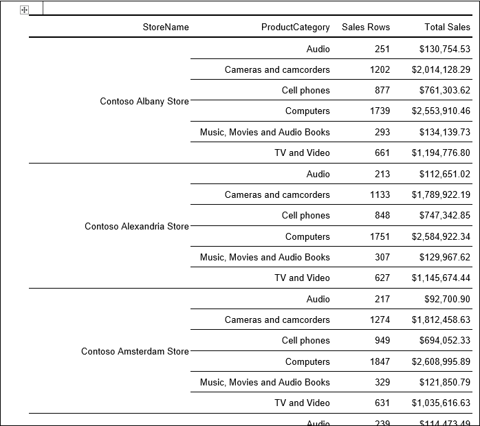
The upcoming use of paginated reports in Power BI for more than SSRS is going to be great. While not as easy to learn, it is also possible to generate paginated reports in R, using packages like “knitr,” “xtable,” “huxtable,” and more. You can even leverage R Markdown and LaTeX programs like MikTeX to really go next level. The script below generates a docx file from an R visual containing two columns and two measures from a Contoso data model. In this case, the StoreName column is grouped to generate a 62-page (!) Word document (see screen grab from one of the pages).
# Create dataframe
#dataset <- data.frame(StoreName, ProductCategory, Sales Rows, Total Sales)
# Remove duplicated rows
# dataset <-unique(dataset)
library(flextable)
library(officer)
myft <- regulartable(dataset) # create a “flextable” from my columns/measures
myft <- merge_v(myft, j = c(“StoreName”) ) # group the row headers on StoreName
myft <- colformat_num(x = myft, col_keys=”Total Sales”, big.mark=”,”, digits = 2, na_str = “N/A”, prefix = “$”) # format sales as $
myft <-autofit(myft) # automatically adjust the column widths to avoid wrapped text
doc <- read_docx() # start a Word doc
doc <- body_add_flextable(doc, value = myft) # add my table to it
print(doc, target = “c:/Pat/example.docx”) # create the Word doc
plot(1,1) # gratuitous plot to avoid error
Note: It is also possible to generate paginated reports using SSRS Report Builder directly from a Power BI Desktop file. More info here.
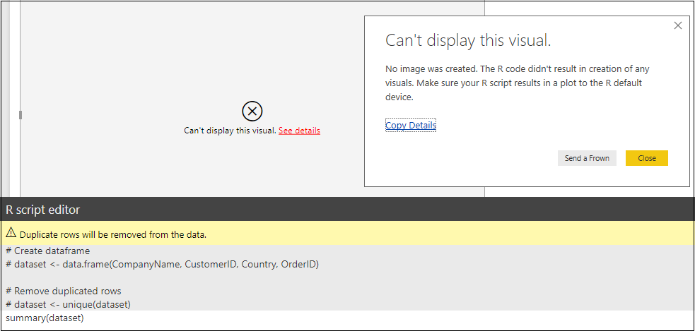
View a Data Frame
A dataframe in R is basically a table holding your data and one called “dataset” is created when you add columns/measures to an R visual. R has many useful functions like summary(), which summarizes the data in each column of your dataframe. However, if you try to summarize a dataframe as shown below, you get this error because it did not return a visual (e.g., not a png image).
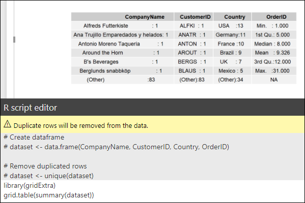
However, if you use another package called “gridExtra,” you can display a dataframe as a grid/visual. The grid.table() function returns a “grid” of the desired summary table. This visual would then respond to slicers, etc.
Note that if you have too many columns/rows in your data frame, the returned image can be bigger than the visual dimensions. There are parameters that can be adjusted within the grid.table() function to resize it but that may not be worth the effort. Another approach is to actually write an image of the grid/data frame to a file on your computer with a specified size, and then read it back in and “raster” it into your visual. This would only work in desktop (where you can write a temporary file), and it probably isn’t that practical. I only share it in case the approach might be useful to someone. I’m sure there is a way to store the image in memory too (so this approach maybe could be used on the service) but I stopped after this small success.
data(mtcars) # note in this case data not from the data model are loaded (don’t do that through a visual, just interesting to note)
library(gridExtra)
library(png) # needed package to write and read png files to/from disk
setwd(“C:/Export”) # set the working directory where your file will be written
k <- summary(mtcars) # store the summary in a variable
png(filename=”exportedimage.png”, height=150, width=1100) # saves the “device”/display to a png image file with an easily adjustable size
grid.table(k) # display the summary so the png “device” can capture it
dev.off() # turns the png() device off and finishes writing the file
img <- readPNG(“exportedimage.png”) # reads the image back into R in a variable called “img”
grid::grid.raster(img) # displays the image back in your R visual
Visualize Results not Returned in a Dataframe (e.g., statistical modeling)
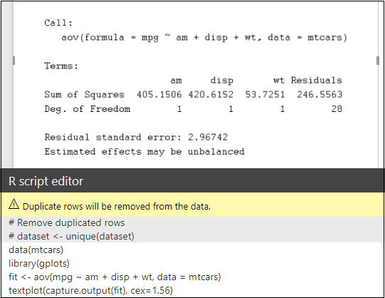
Sometimes you want to use R to do more advanced statistics, machine learning, etc. that would be impossible (or very impractical) in DAX. Often those type of analyses don’t return a dataframe, so the above approaches won’t work. For example, to do an analysis of variance on the “mtcars” dataset, one might use this R code:
data(mtcars)
aov(mpg ~ am + disp + wt, data = mtcars)
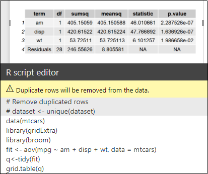
The above returns an error, even if I use the grid.table() function, as the aov() function returns a list of lists instead of a dataframe. However, you can use the tidy() function from the “broom” library to convert the aov() output to a dataframe which can then be displayed with grid.table(). The resulting visual is also shown, which would respond to slicers, etc. as it might be desired to do dynamic statistical modeling/analysis.
The above returns a formatted table, but it turns out that there is an even easier way to return anything that would normally display in the R console (if you don’t care about formatting). With the code below and the capture.output() function, we can display the console output one would have seen if the R script had been run in Rstudio (for example). The CEX term can be adjusted to maximize use of the window.
Summary
With the pace of upgrades and new features in Power BI, the need to leverage R is decreasing. However, the R (and Python) visuals give us a doorway to tons of functionality/analysis beyond visuals. Perhaps the comments section will correct/improve my beginner R code scripts above, but I thought I’d write this post in case it helps someone fill an unmet need.
Microsoft’s platform is the world’s most fluid & powerful data toolset. Get the most out of it.
No one knows the Power BI ecosystem better than the folks who started the whole thing – us.
Let us guide your organization through the change required to become a data-oriented culture while squeezing every last drop* of value out of your Microsoft platform investment.
* – we reserve the right to substitute Olympic-sized swimming pools of value in place of “drops” at our discretion.
