Hello again P3 Adaptive Nation! I’m SUPER excited today to talk about an updated feature in Power BI Desktop. This month had a bunch of updates, all of which are pretty great. Some of my favorites are that bookmarks are now out of preview, among others. In fact, that full list of updates can be found here.
What I’d like to talk about, however…was my FAVORITE new feature in months. What I’m talking about, is the newest (and AWESOMESAUCE) addition to Tooltips. Now, Tooltips have been around for a few years in PBI Desktop. However, they legitimately changed everything about Tooltips. It’s better, faster, stronger, cooler. Trust me when I say you’ll be amazed at what they can do now.
“We Can Rebuild It”
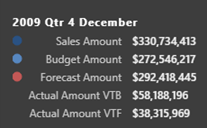 The old Tooltips were pretty cool, you could show additional information on a card type visual when hovering over a chart. However, you were limited to ONLY a text version of whatever DAX could produce. You’d get something very similar looking to what I have over on the right. Don’t get me wrong, I LOVED the old Tooltips, they were super helpful in allowing more information to be given about a chart, without cluttering the visual. But there were limitations, if you started putting too many DAX measures in a tooltip, it would max out the available space, and actually cut off your remaining information. NO BUENO!
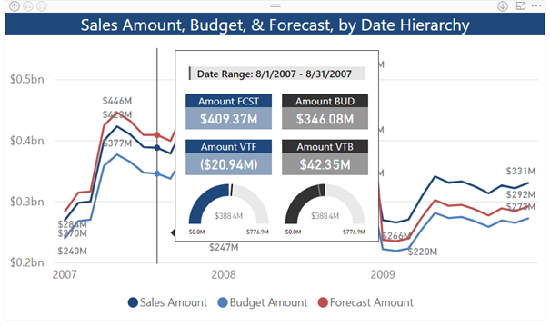
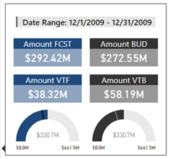 So Microsoft did something really really really really (…I cant’ stop) cool when they updated the Tooltips. NOW…instead of just showing a text box of information, you get a portal into another dimension. Well…to be less hyperbolic, another report page. You see that pocket-sized report page to my left? That’s not another report page my friends, that is, IN FACT, a tooltip box! You can now design a mini-report page that will appear whenever you hover over a chart of a graph. Seriously. Mind = blown.
Just like ANY other report page, you can design the Tooltip page with ANY VISUAL. The sky is the limit on what you want, or don’t want to include. It get’s even better too! Just like the old Tooltips, the section you’re hovering over has filter context. That filter context is being applied to the values in that Tooltip. Well, the same applies to the NEW Tooltips! Whatever filter/category you’re hovering over will pass that filter context INTO this mini-report, and show you the relevant data.
New Tooltips when hovering over a line chart:
Some of you may have noticed that the new Tooltips have a date range at the top. This is something I actually made myself. Since the Tooltips are now just a mini report page. There’s no automatic filter display at the top of the window. But when there’s a will, there’s always a way. So I used a couple DAX formulas and a bit of clever engineering to solve that issue. Alright, enough talking and trumpeting of this feature, let’s dig into how I did it. ![]()
How I Did IT (AKA The Part You Care About)
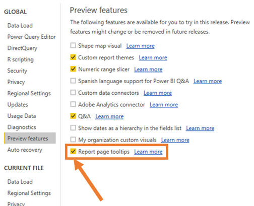
So there is a bit of configuration involved to get this working in your version of Power BI Desktop. NUMBER ONE is to make sure you’ve updated to the latest version of PBI Desktop. If you haven’t already I’d STRONGLY recommend you download the Windows Store Version, since it AUTO UPDATES. Once you have the latest version installed, go ahead and turn on Report Page Tooltips in the preview settings.
Report Page Tooltips Preview, found in the options menu:
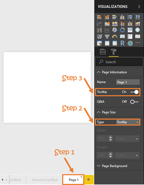
Once you’ve successfully turned report page Tooltips on, there will be a few steps involved to set up a new page. As I’ve stated previously, the new tooltip is an actual report page! So STEP ONE will be to create a new page. There’s then a few page settings you’ll need to toggle in order for this page to be utilized as a Tooltip. STEP TWO will be setting the Page Size to Type = Tooltip. STEP THREE will be turning on Tooltip under Page Information.
One other really cool thing about Tooltips…technically the Tooltip can be ANY PAGE SIZE. The Tooltip size is 320 by 280 pixels. But if you want to do a custom size instead, you absolutely can. IN FACT, that’s what I did for mine! I needed extra room for my Date Range visual so I increased my height to 280 pixels.
Steps 1, 2, & 3 for creating a Tooltip Page:
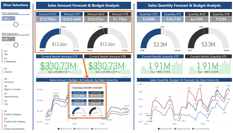
After you’ve completed the first three steps, then it’s only a matter of deciding which visuals you want. I built my Tooltips into an Actuals, Budget, & Forecast Report I created. For this example, I took some of the visuals I already had on the report page and re-used them in the Tooltips Report Page. The goal is to have a nice comparison of the all-up values VS the same visuals, filtered to the section I’m hovering over in the chart.
Tooltip report page VS original visuals at the top of the page:
Again, the amazing things about the report page Tooltips is that you can design it ANY WAY you want. It’s like Burger King’s slogan…”Have it your way.” I won’t go into the weeds and show every step to get those visuals into the report page, a few steps of copying/pasting is all I did. I will, however, walk you through that handy Date Range card visual at the top of the Tooltip. I only needed to create a single DAX formula to accomplish this.
Tooltip Date Range = “Date Range: “ & MIN(‘Dim Date'[Date]) & ” – “ & MAX(‘Dim Date'[Date])
After I created the DAX Formula all I did was put that into a multi-row card visual, and applied a bit of formatting magic. It took a few attempts of trying out various visuals to figure out which one worked the best and took up the least space. But I personally found the multi-row card visual to be effective for this scenario. In a perfect world, it could display the filter context identically to how it showed up in the old Tooltips. Technically I could write some complex DAX to do so, but I’ve learned NOT to over-engineer things. ![]()
Date Range DAX used and formatted in a multi-row card visual:
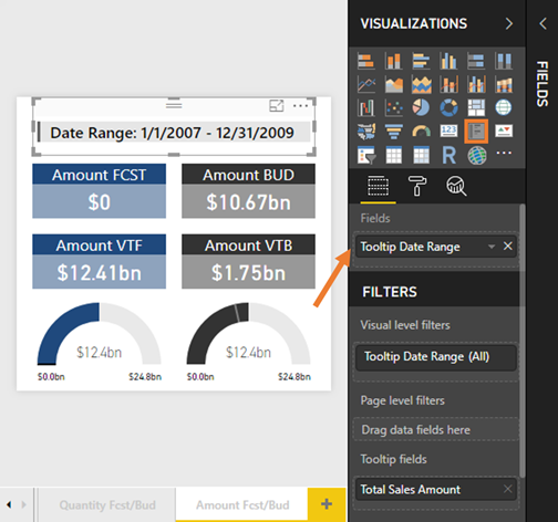
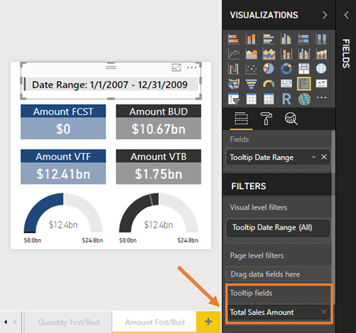
This will be a good spot to mention there are TWO ways to link your Tooltip Report Page to other pages. There’s a pretty cool automatic way, that’s similar to how drill through works. Then there’s also a manual way. I, of course, will show you BOTH! As I’ve already mentioned, the automatic way is very similar to how you’d set up the filters for drill through functionality. Located in the filters section of your Tooltips Report Page is a placeholder to add data fields.
Any DAX Measure you place in here will then auto-link to any visualization that uses that same measure, and allows Tooltips. It’s a really nice and is quickly set up this way. Plus, by doing this you don’t have to setup every single visual individually, doing it once here (shown below). Opposed to customizing every single visual you wanted to use this with, that’d much more of a pain! So I appreciate this auto-link capability a LOT.
Adding Total Sales Amount here means it’ll auto-link with any visual that uses that DAX Measure:
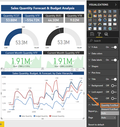
Alternatively, you can also manually assign a Tooltip Report to any Tooltip compatible visual. This can actually be VERY useful if you have a visual that you’d like to link, but doesn’t share a common DAX Measure. So far that’s the primary reason I can think of for this use case scenario, but I’m sure others will get mentioned in the comments. Those settings can be found if you select the visual you want to edit, navigate to the format section, and look for a sub-section titled Tooltips.
Changing the Tooltip setting from Auto to a manually assigned Tooltip Report Page:
The only thing left to do after this is to hide your report page, so it won’t be visible when you publish online. It’s really as easy(ish) as that! The rest, as they say, is history. Similar to “bookmarks” I think people are going to find some incredibly clever ways to use the new Tooltips feature. I’m sure I’ll come up with many more clever designs for this in the future. What you see in this post is only from using them a single day! Unfortunately, since it is in PREVIEW, Tooltips doesn’t work in embedded. So no embedded report today. However, I will give you a link to download the report still below.
You can download the workbook here.
A few more things…if you want to know how some of these other cool things were made in the report. Here are the links to the other posts that mention those.
My Top 5 Power BI Practices: Transforming Good to GREAT: Article talks about a lot of the formatting and design practices you see above, plus the DAX Formulas table.
DAX Reanimator Series: Moving Averages Controlled by Slicer (Part 1): Article talks about the What If scenario you see above. Specifically the FCST & BUD Adjustment Slicers.
Using SELECTEDVALUES To Capture Slicer Selections: Article talks about the slicer selection cards you see on the right side of the Tooltips page.
How To Connect One Slicer To All Your Power BI Reporting Pages: Article talks about the slicer landing page I created, that filters other reporting pages.
Video Version of This Article Available Below
I have a video version of the blog post for anyone interested. I know some of you learn better by watching, rather than reading. ![]()
PBI Spotlight: NEW & IMPROVED Tooltips
Microsoft’s platform is the world’s most fluid & powerful data toolset. Get the most out of it.
No one knows the Power BI ecosystem better than the folks who started the whole thing – us.
Let us guide your organization through the change required to become a data-oriented culture while squeezing every last drop* of value out of your Microsoft platform investment.
* – we reserve the right to substitute Olympic-sized swimming pools of value in place of “drops” at our discretion.
